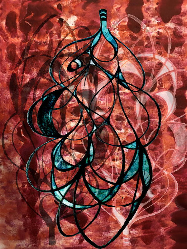
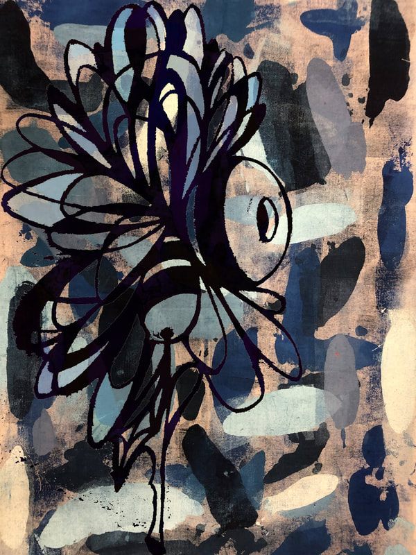
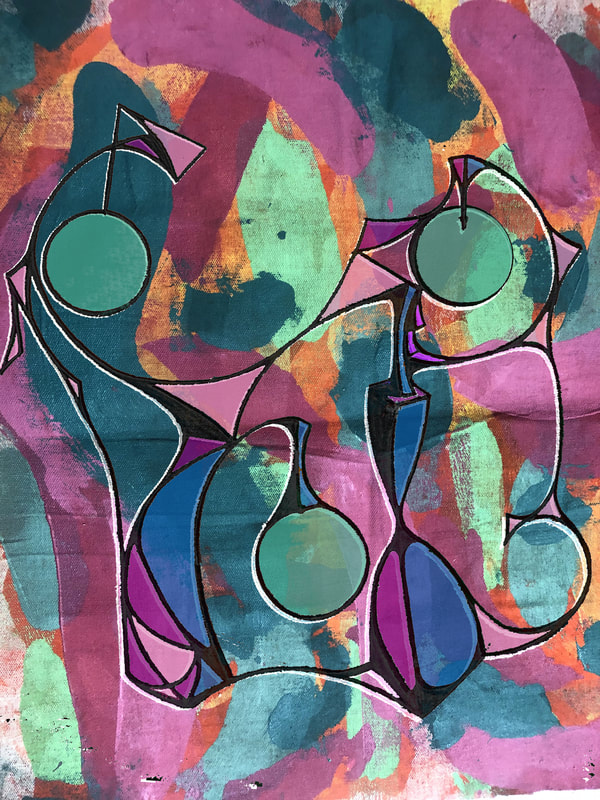
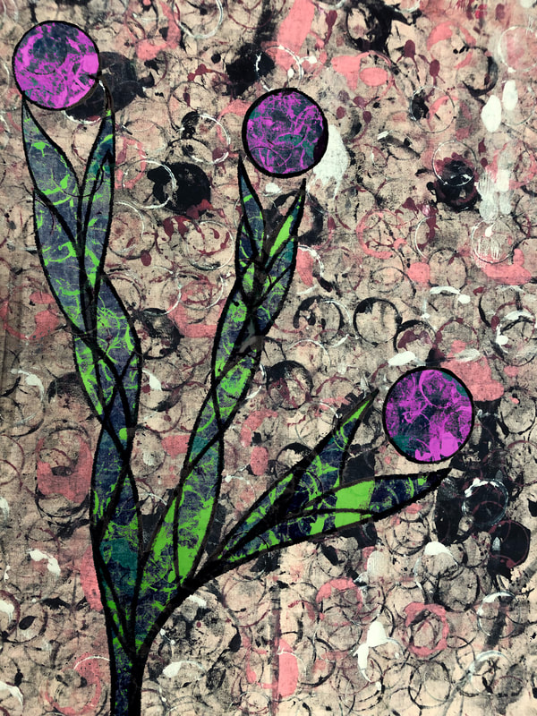
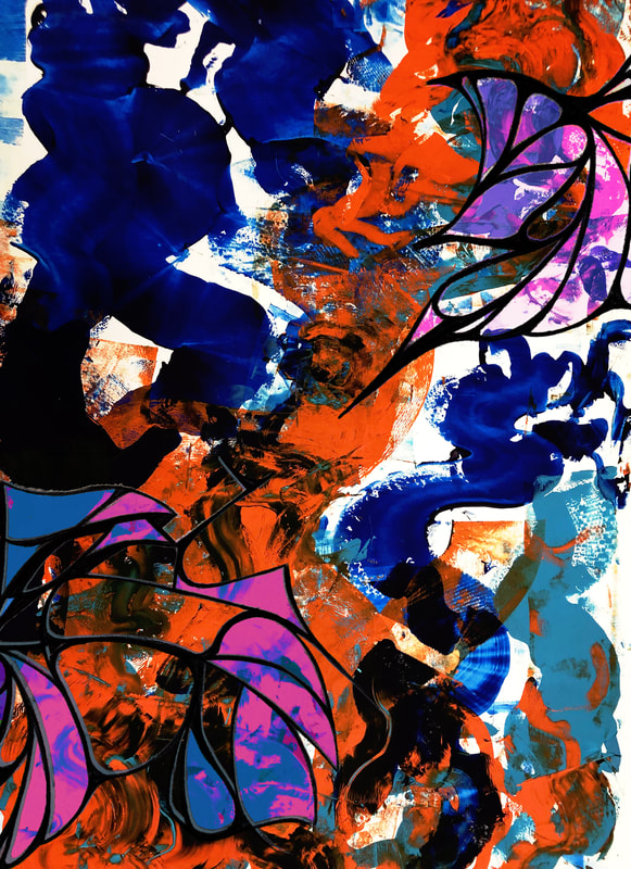
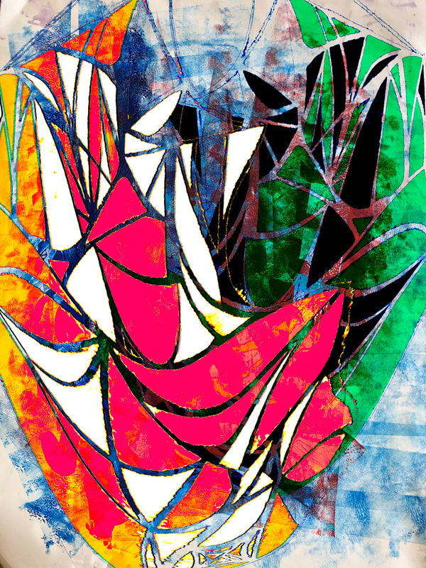
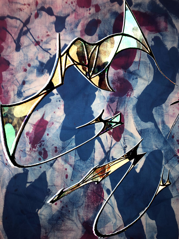
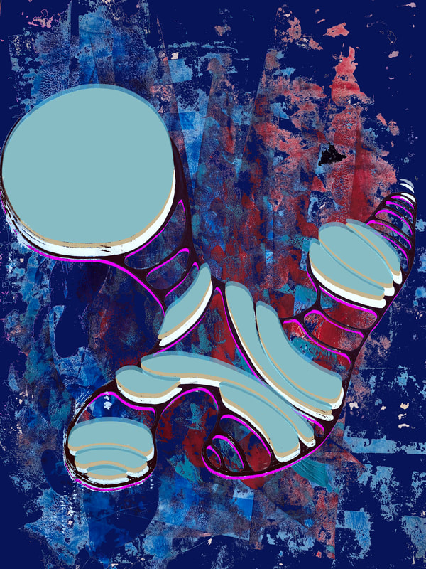
AP Studio Art: Drawing
2022 PORTFOLIOS
|
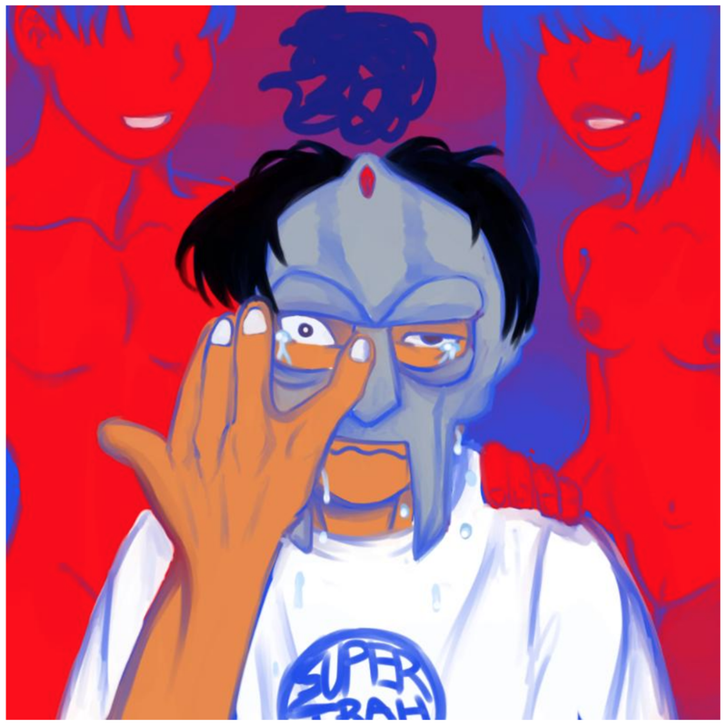
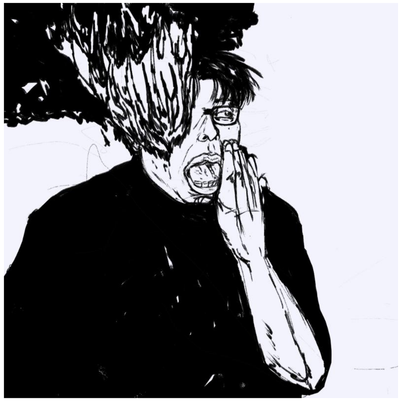
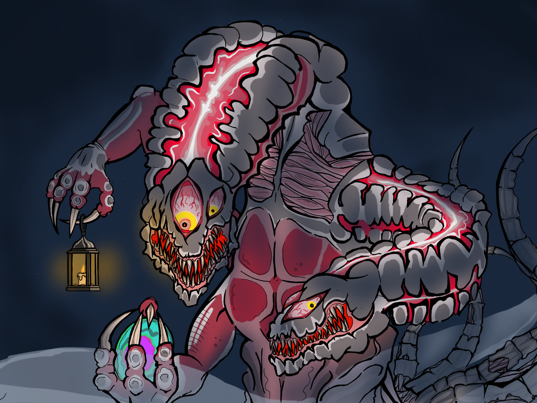
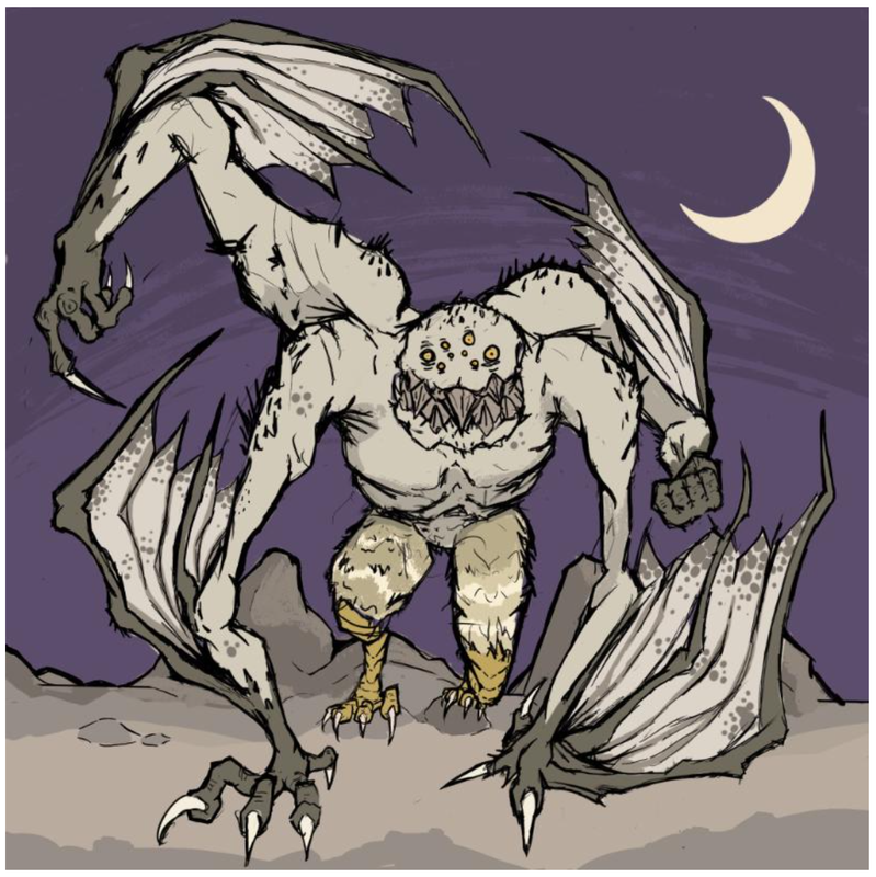
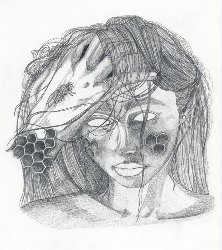
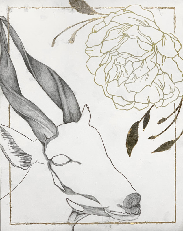
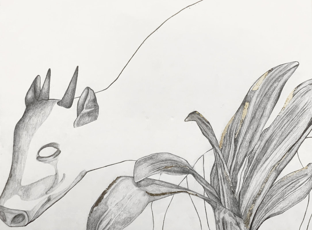
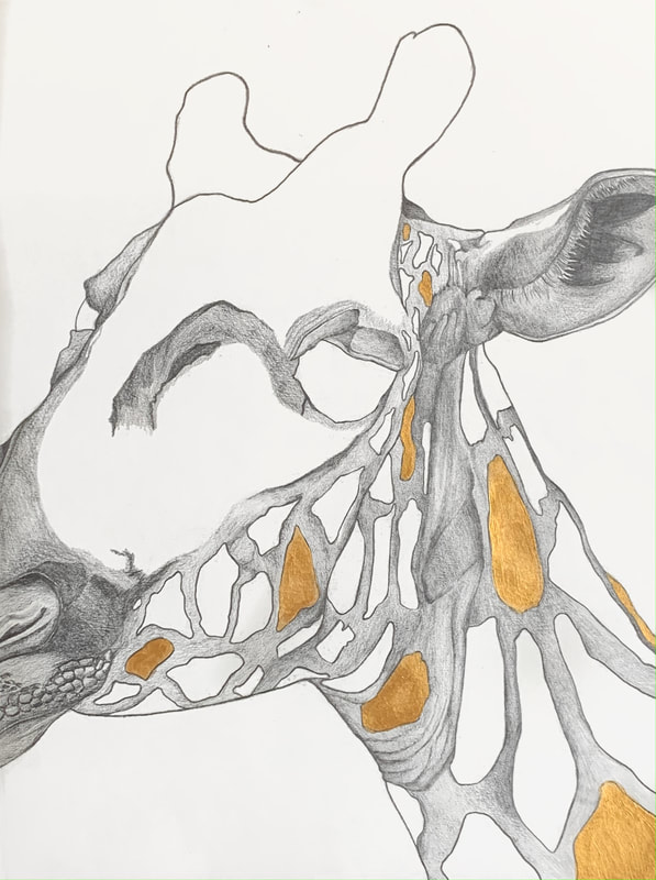
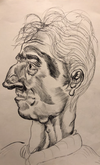
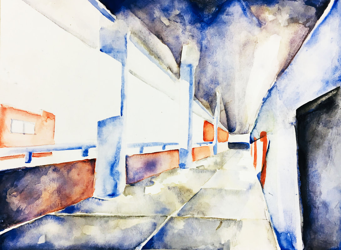
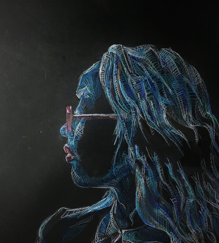
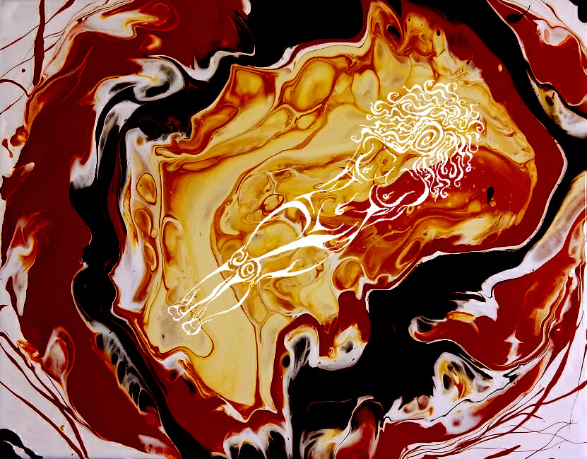
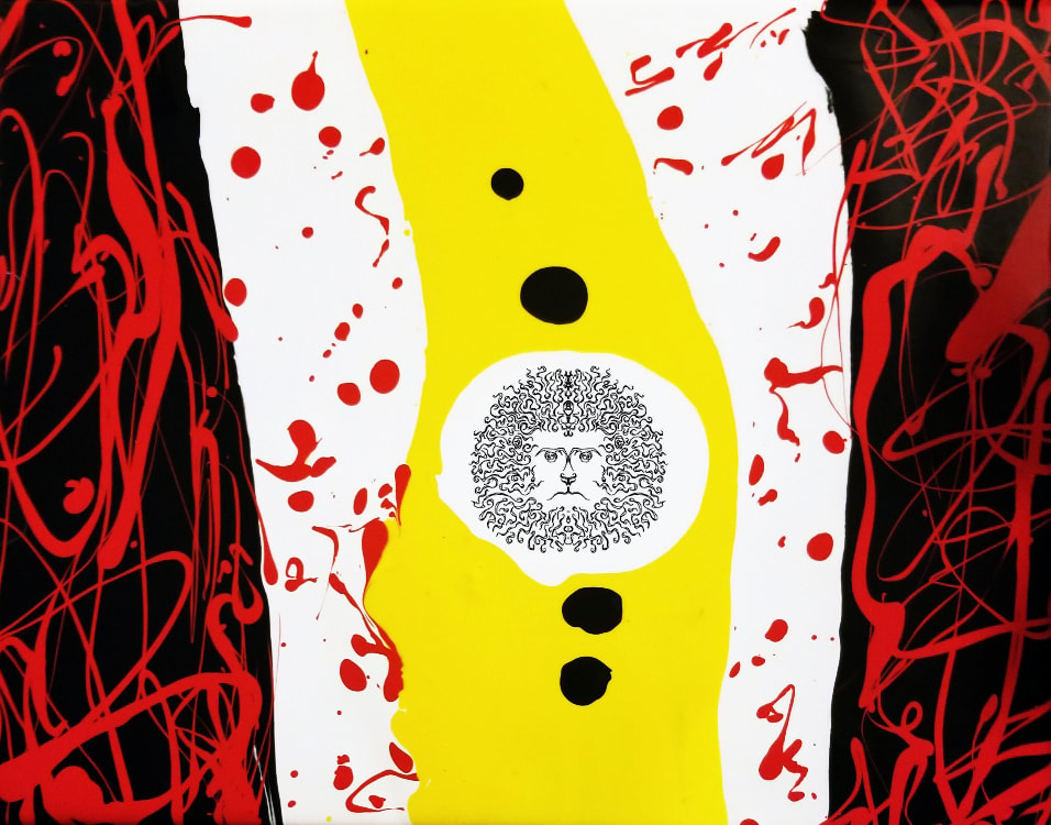
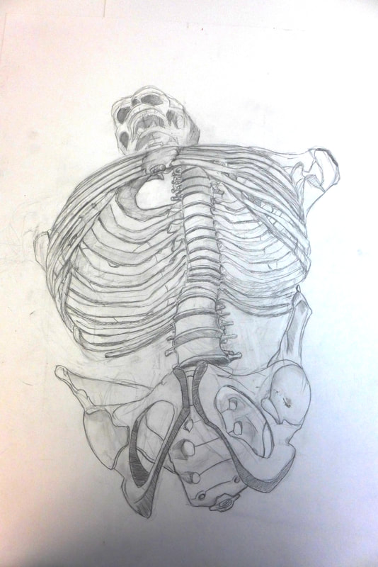
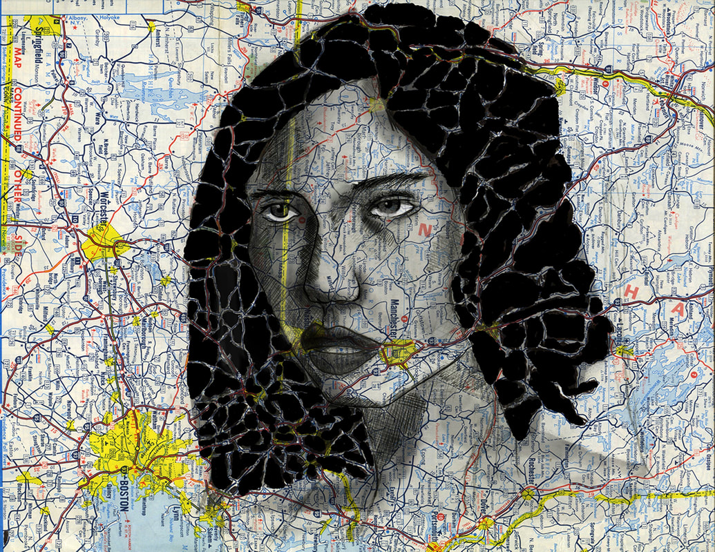
MEGAN CHWA
|
SELECTED WORKS
|


|
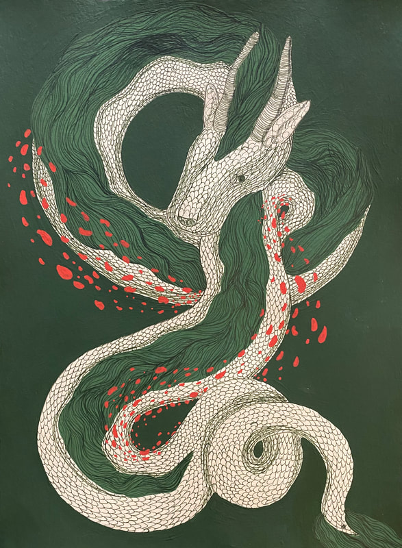
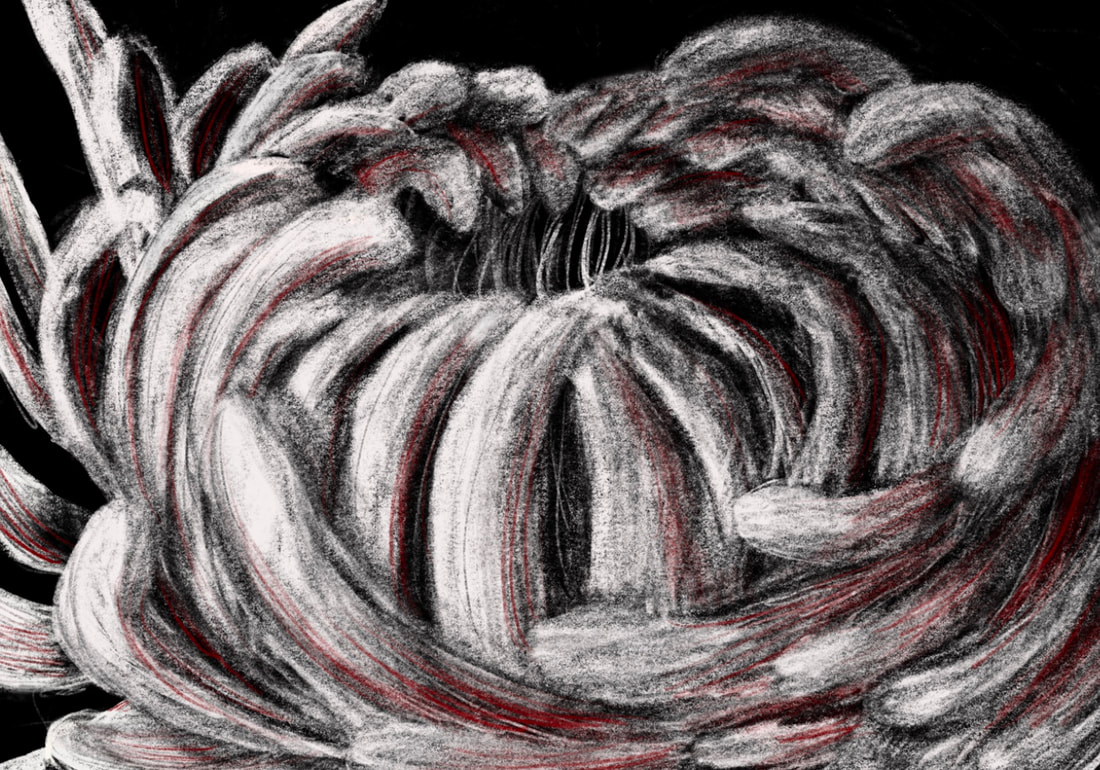
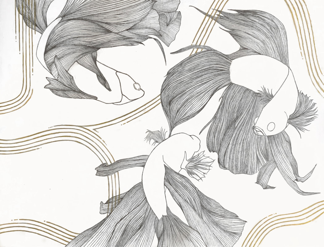
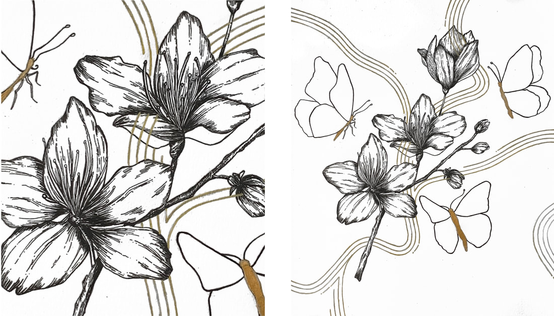
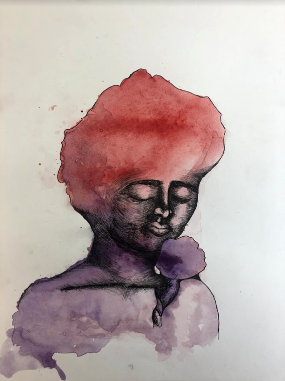
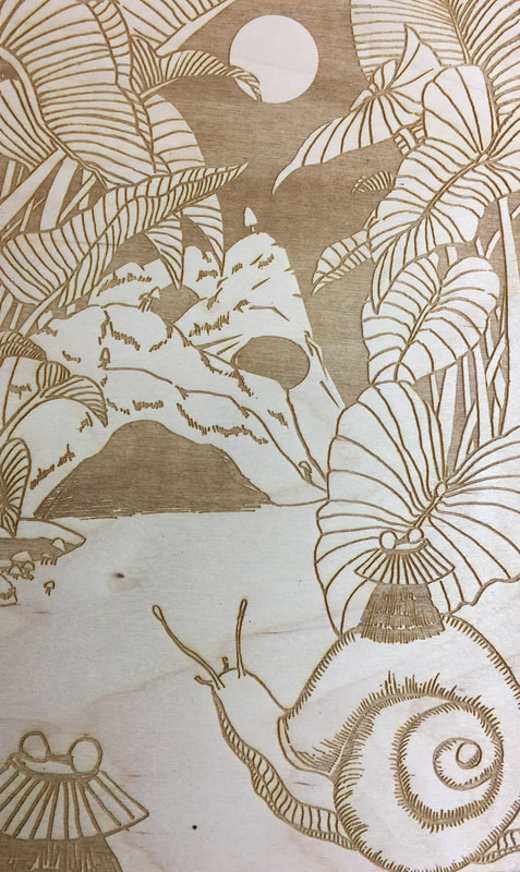
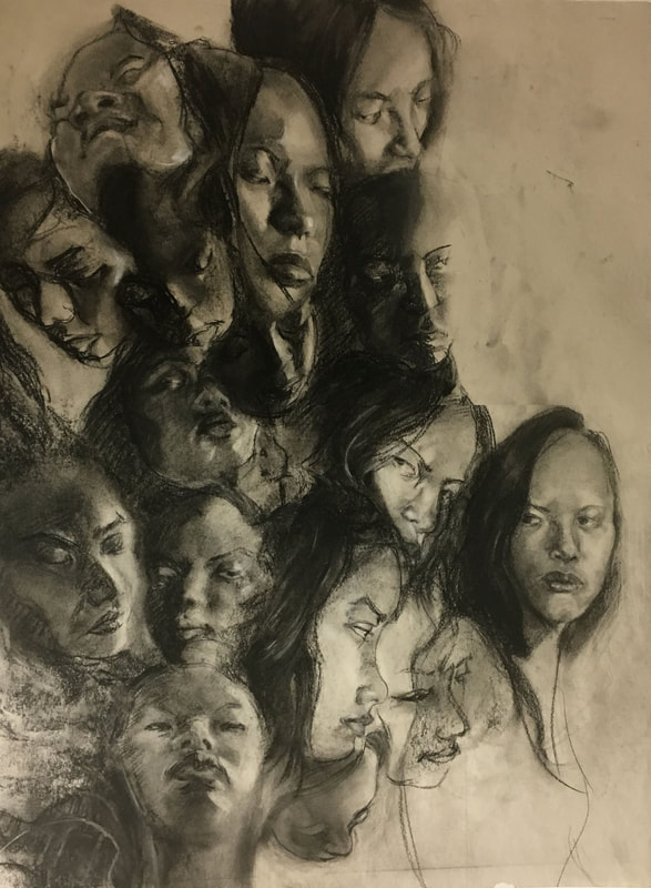
KIMBERLY LY
|
SELECTED WORKS
|


|
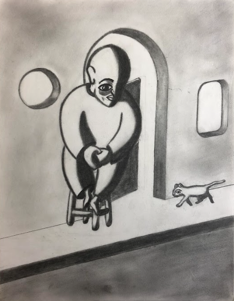
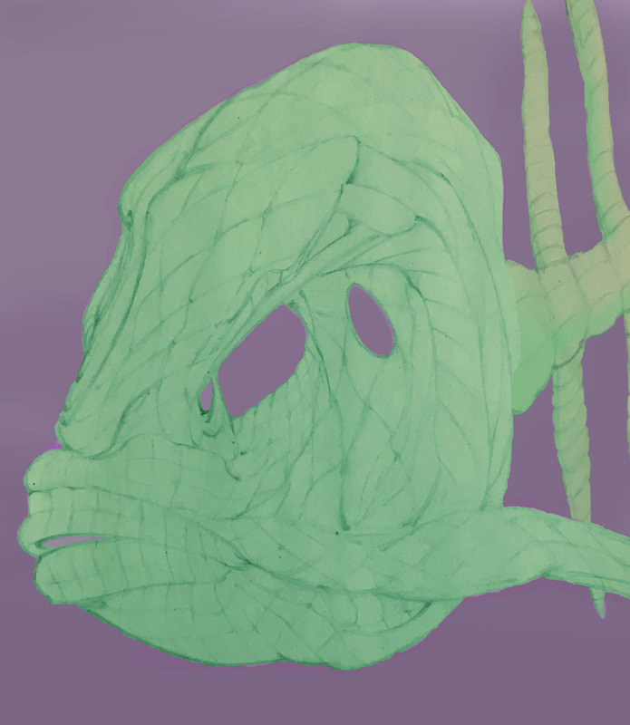
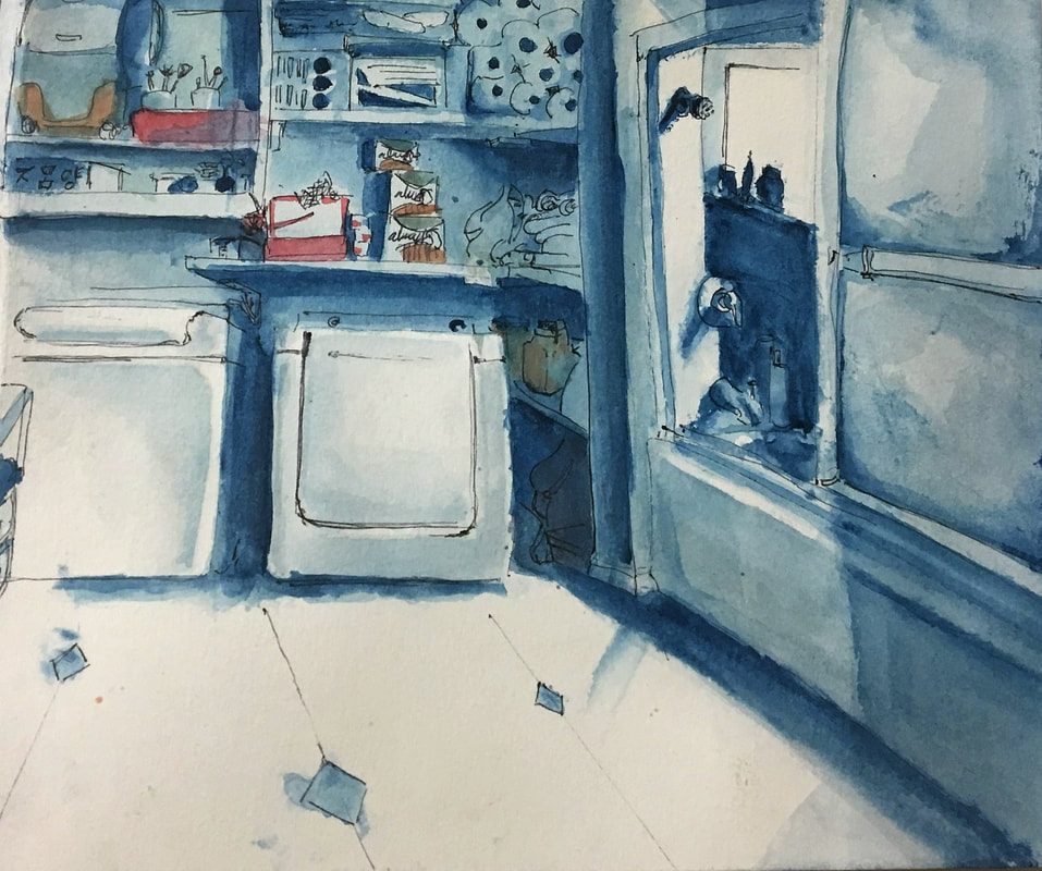
HANNA WONG
|
SELECTED WORKS
|


|
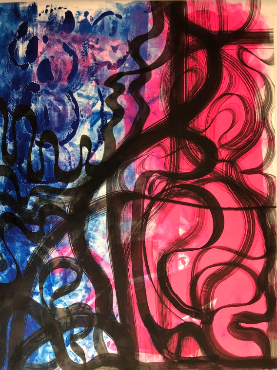
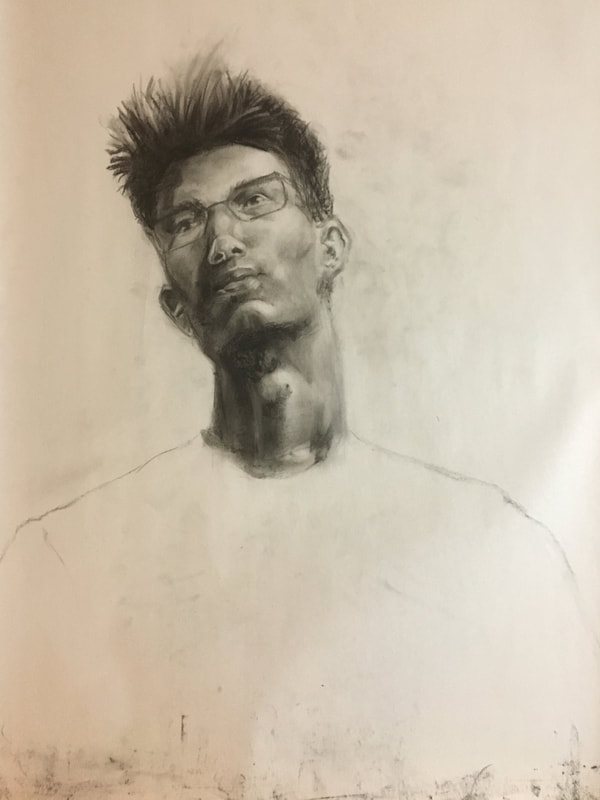
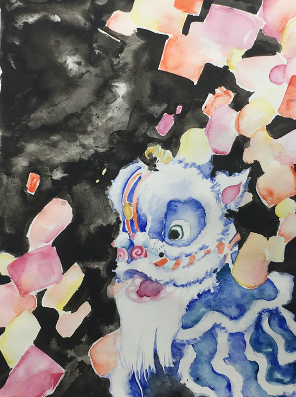
ORALIS WARD
|
SELECTED WORKS
|


2021 PORTFOLIOS
|
MOYA
HOARD AP SCORE
5 |
SELECTED WORKS
|


|
SYDNEY
SOOHOO AP SCORE
4 |
SELECTED WORKS
|


|
MIGUEL
MAYA AP SCORE
3 |
SELECTED WORKS
|


|
RACHEL
QUACH AP SCORE
3 |
SELECTED WORKS
|


|
KYLE
KOK AP SCORE
3 |
SELECTED WORKS
|


2020 PORFOLIO
|
AMANDA
CHUM AP SCORE
5 |
QUALITY PORTFOLIO
|


2019 PORTFOLIOS
|
ALEJANDRO
PASTEN AP SCORE
5 |
QUALITY PORTFOLIO
|


|
DENISE
AU AP SCORE
5 |
QUALITY PORTFOLIO
|


|
LONDON
STEPHENS AP SCORE
3 |
QUALITY PORTFOLIO
|


2018 PORTFOLIOS
|
DIEGO
ALVEAR AP SCORE
4 |
QUALITY PORTFOLIO
|


|
ELLISA
AU AP SCORE
5 |
QUALITY
|


|
JACOB
VAN OOSTEN AP SCORE
5 |
QUALITY PORTFOLIO
|


|
JOSIAH
CHRISTENSEN AP SCORE
5 |
QUALITY PORTFOLIO
|


|
KATIE
KWOK AP SCORE
5 |
QUALITY PORTFOLIO
|