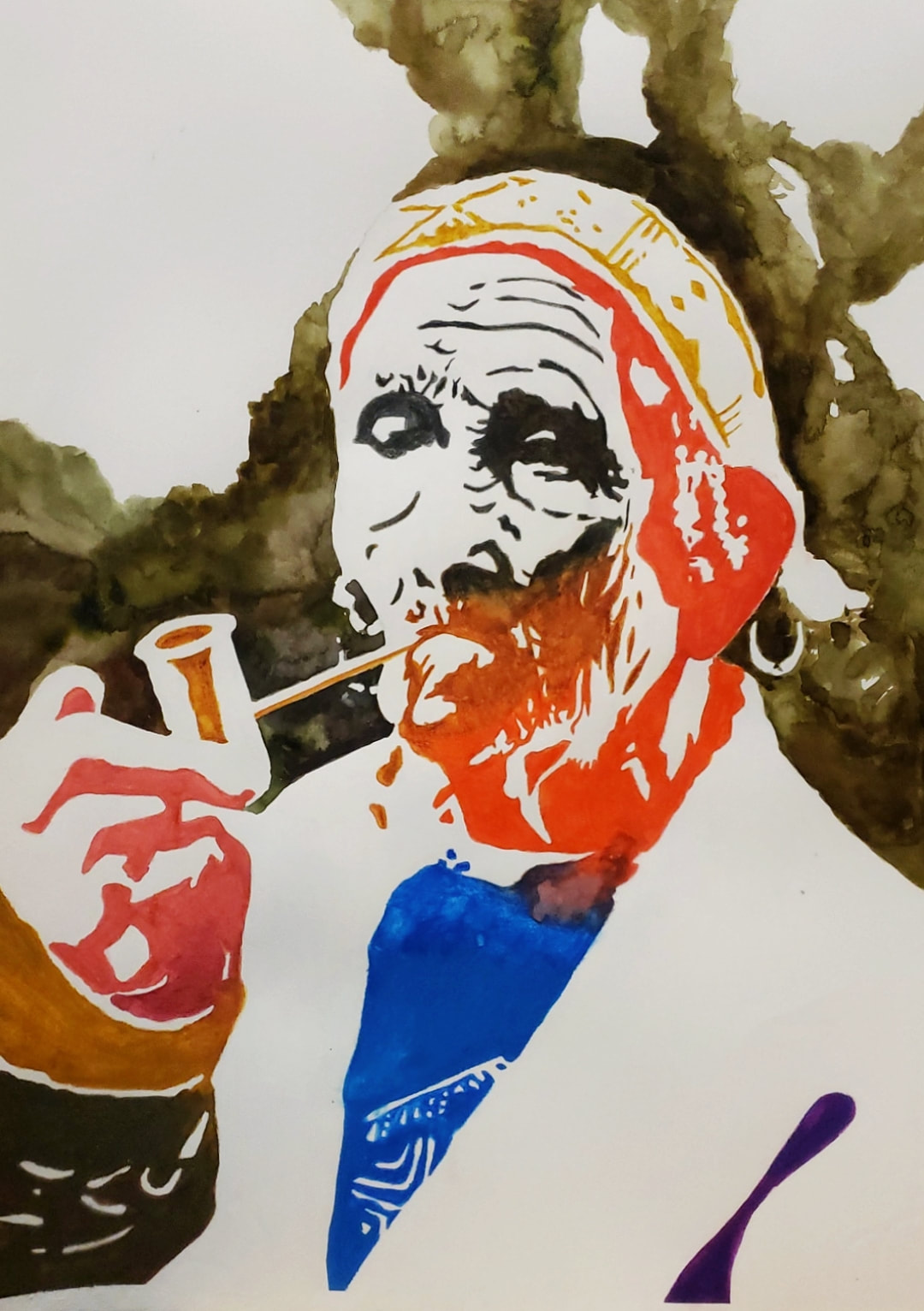
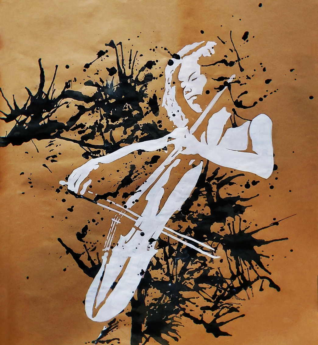
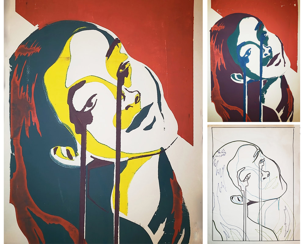
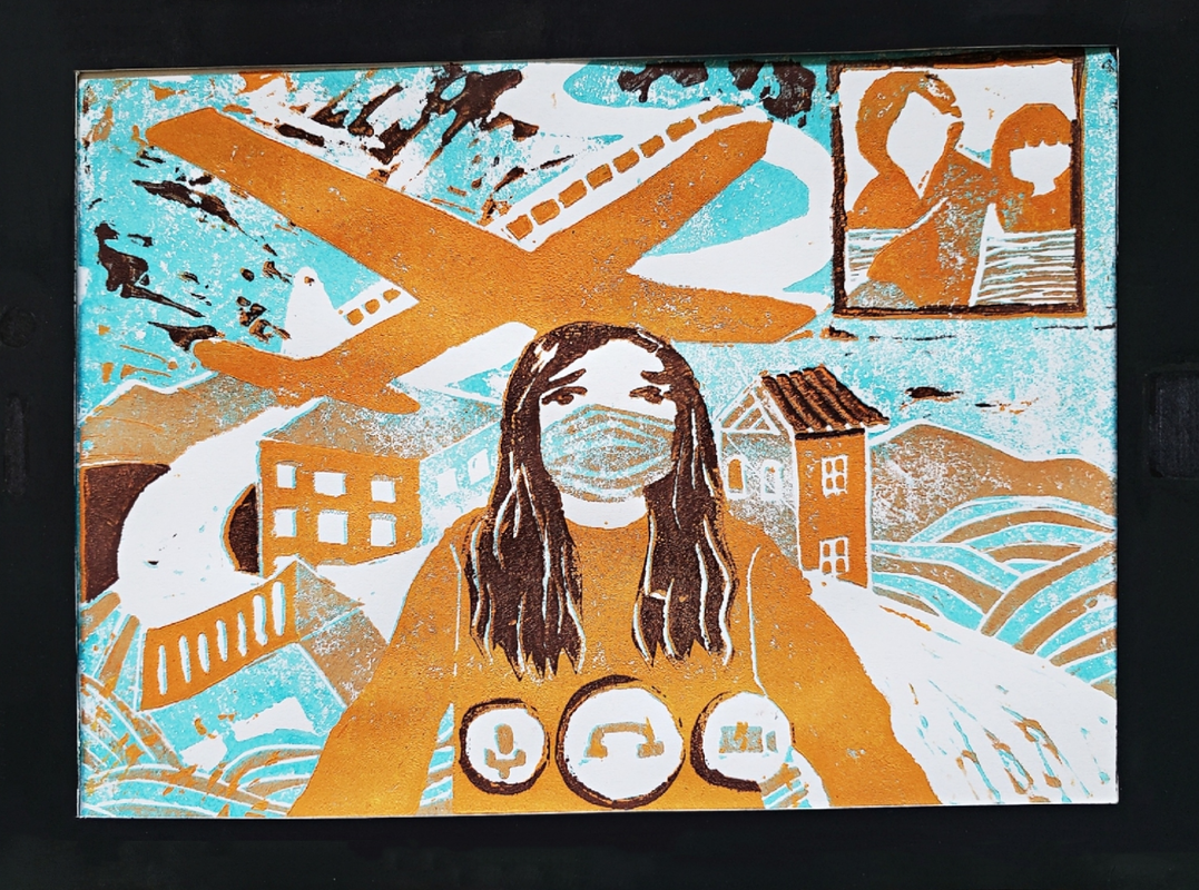
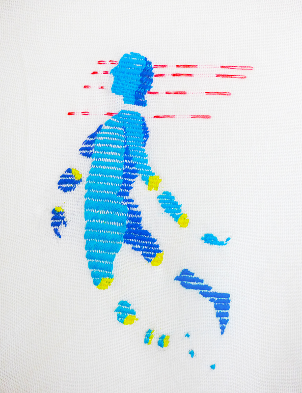
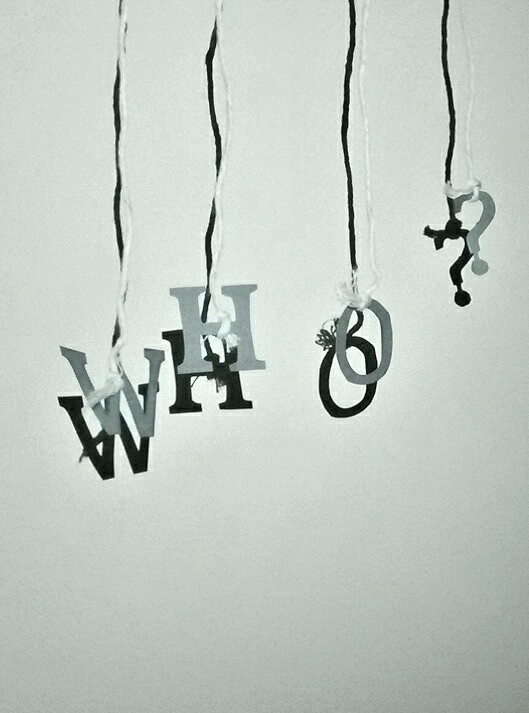
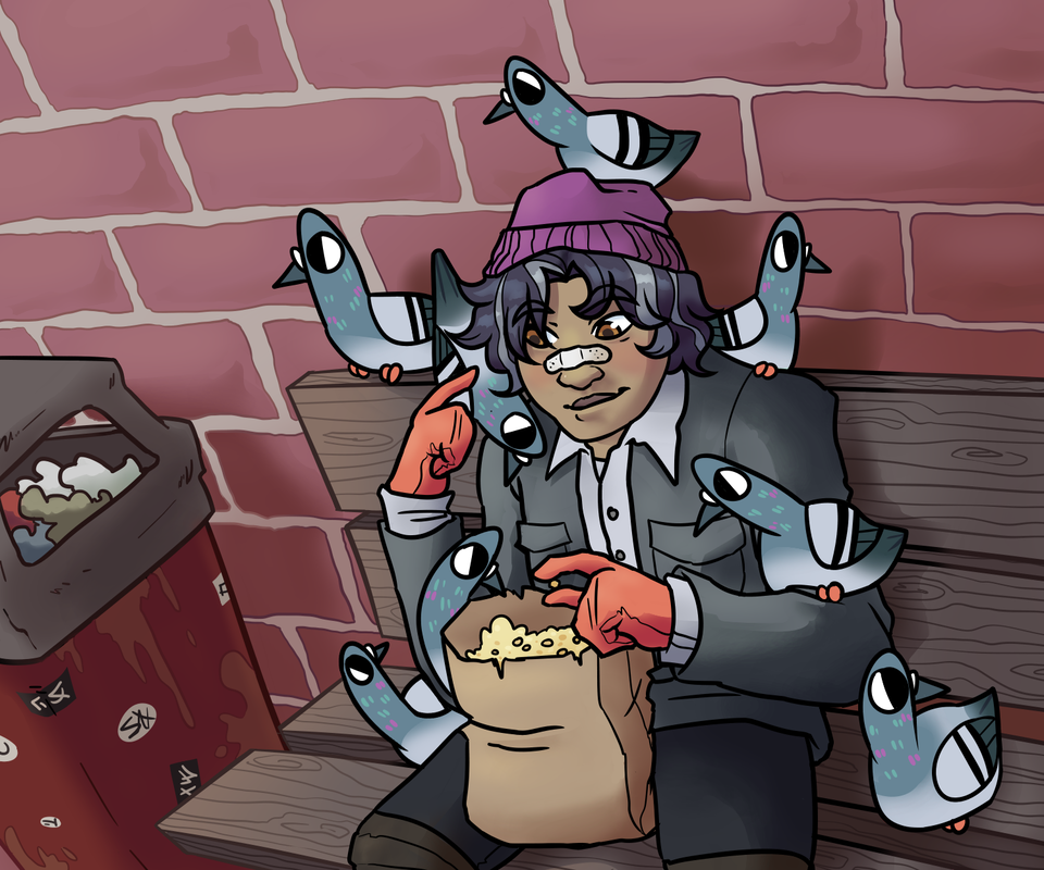
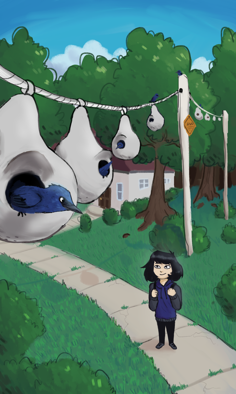
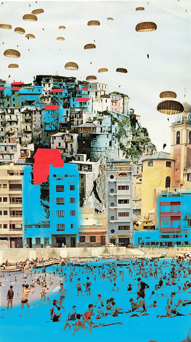
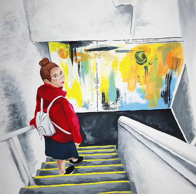
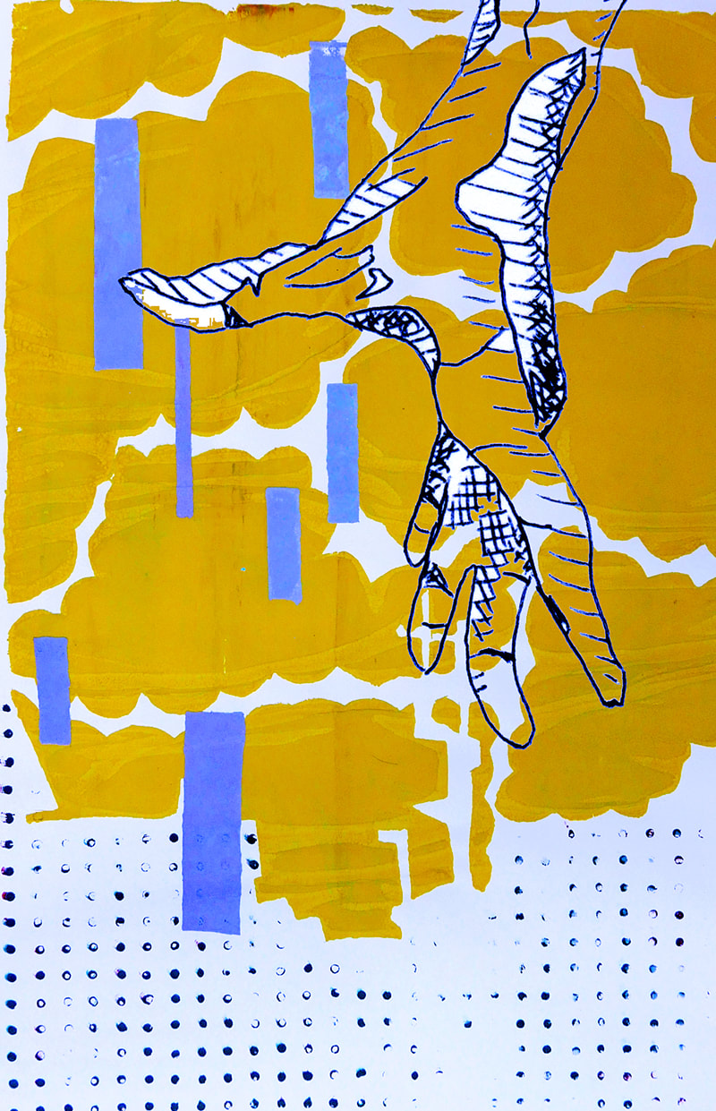
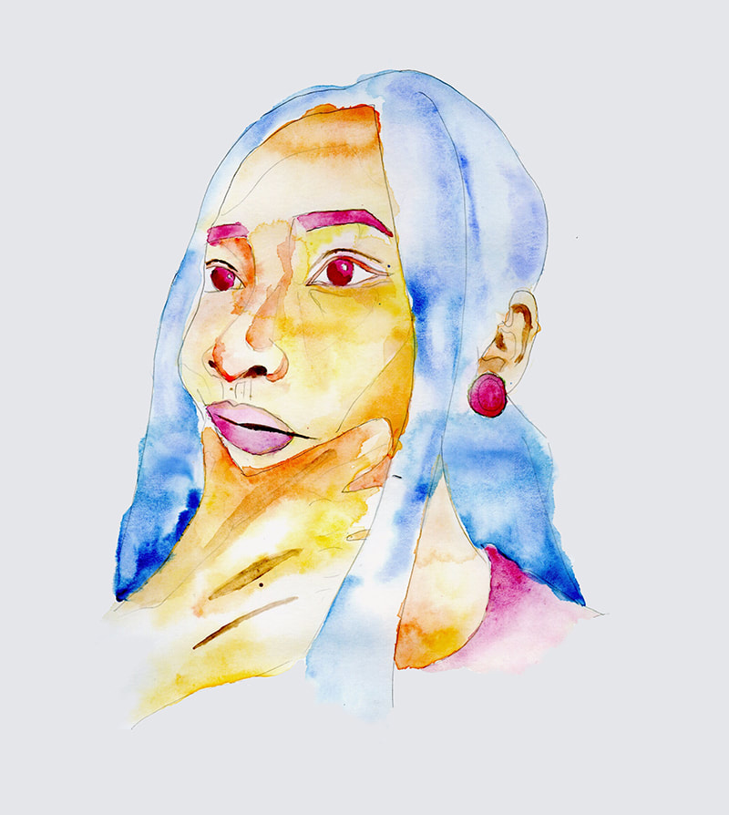
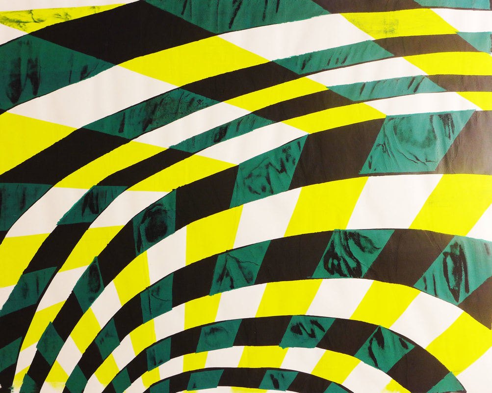
AP Studio Art: 2D Design
2022 PORTFOLIOS
|
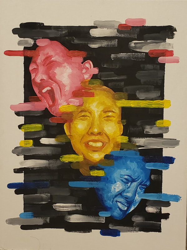
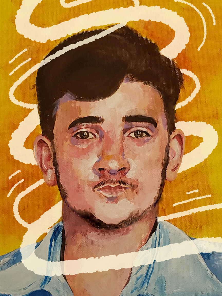
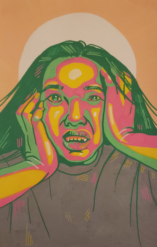
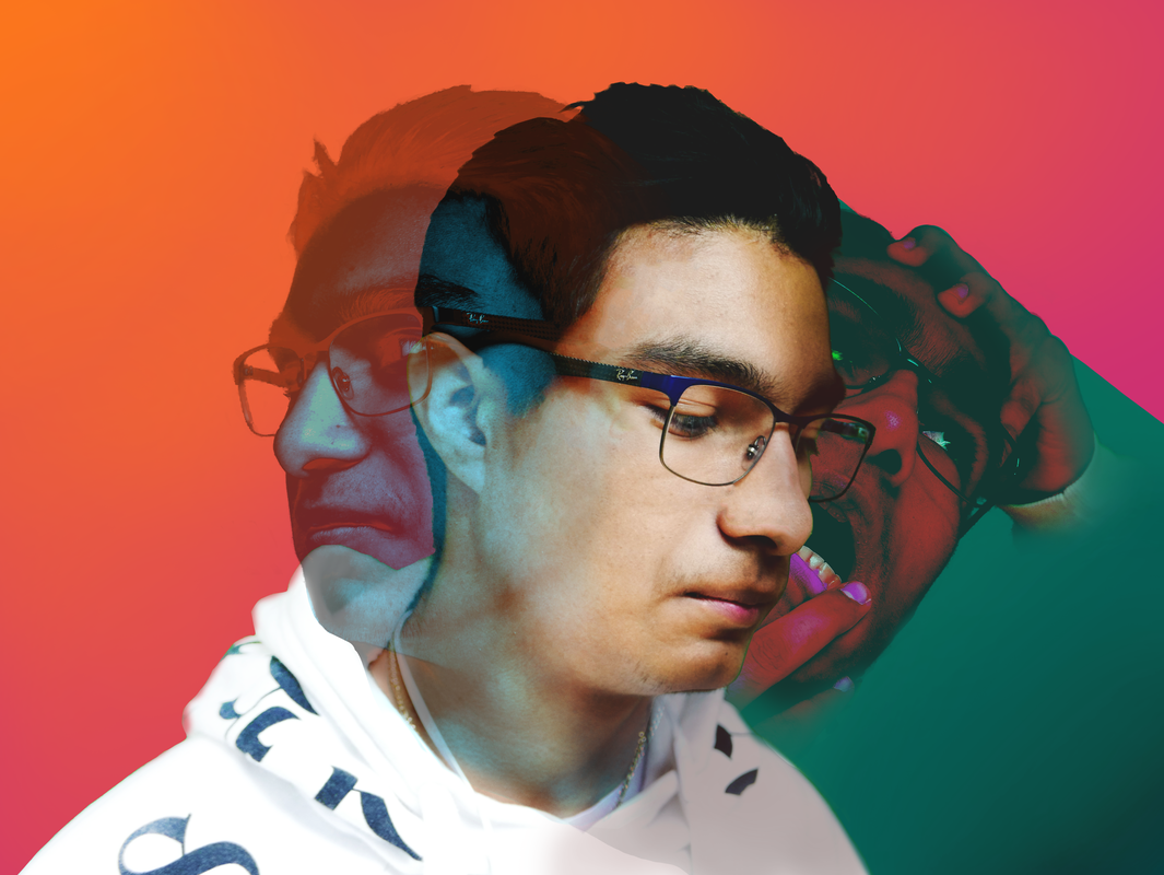
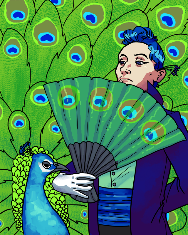
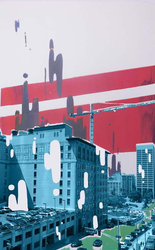
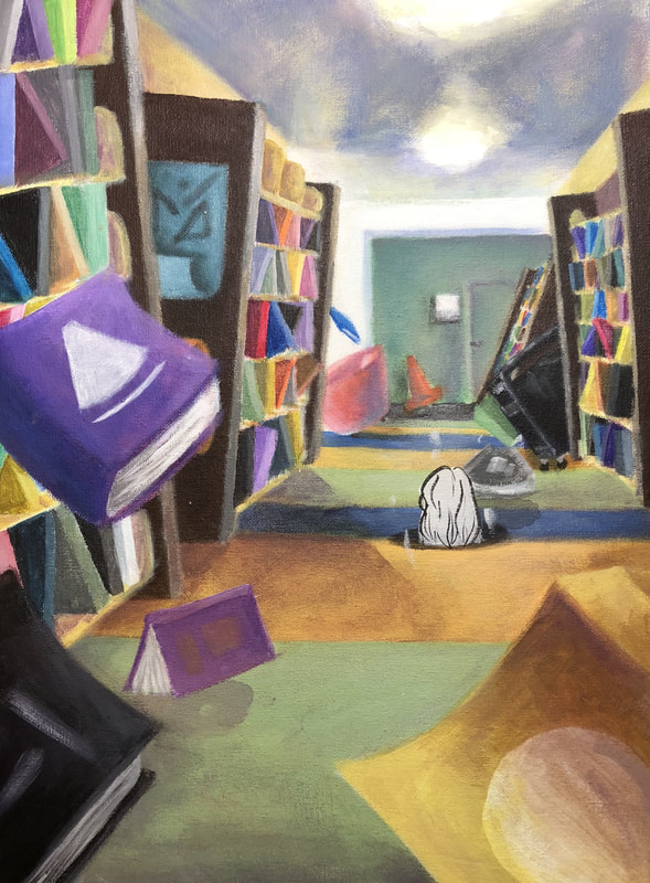
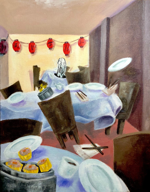
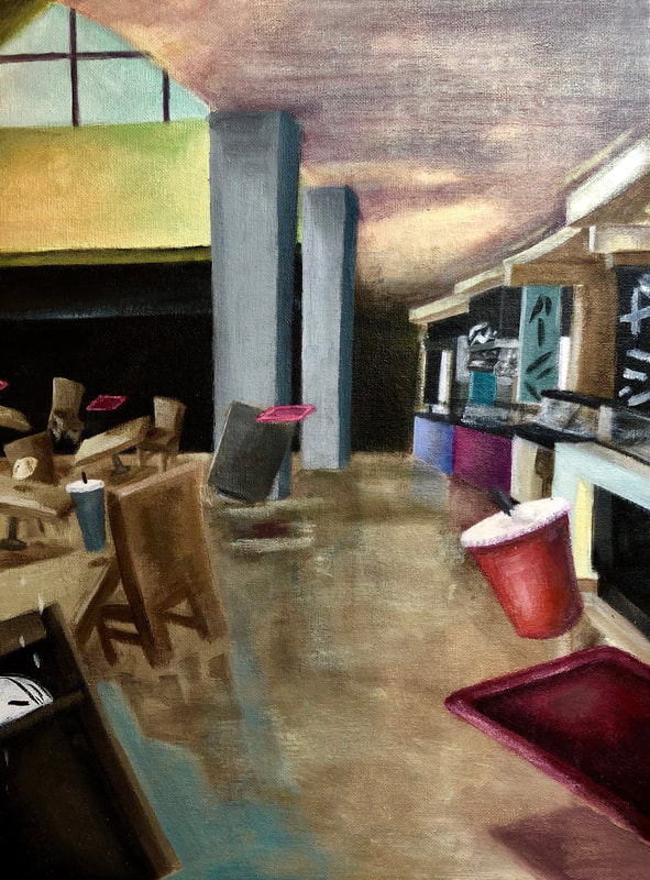
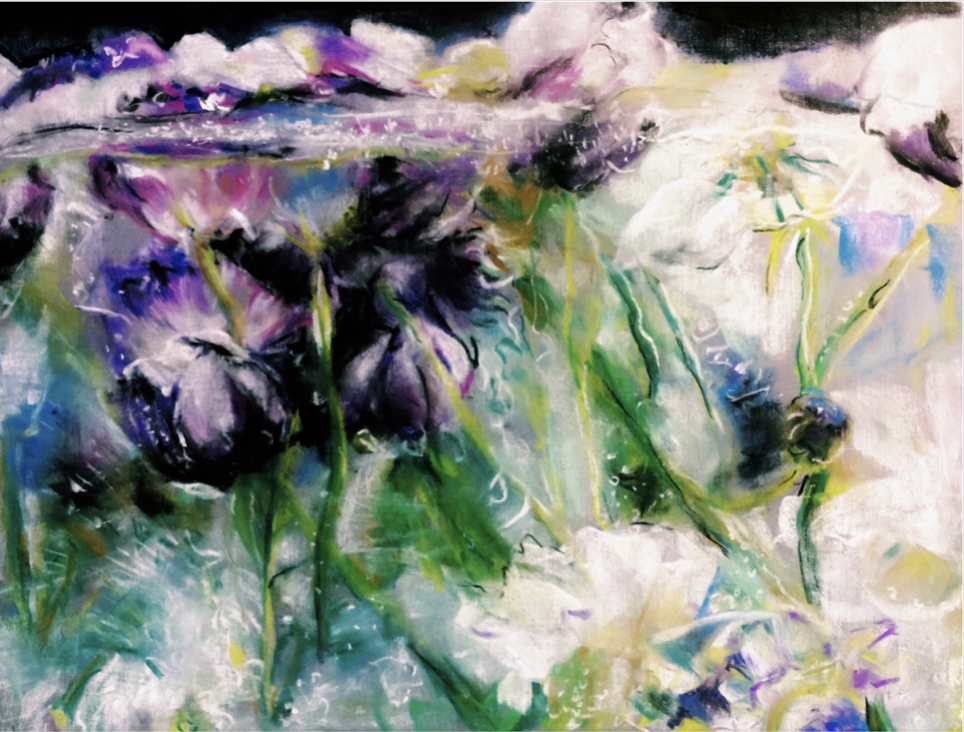
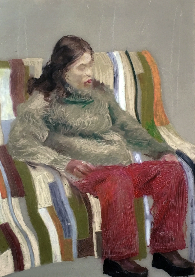
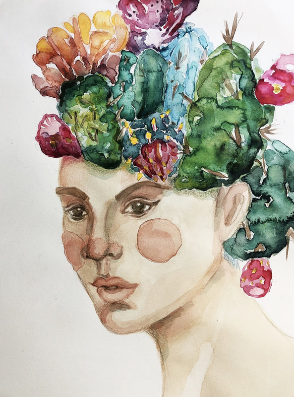
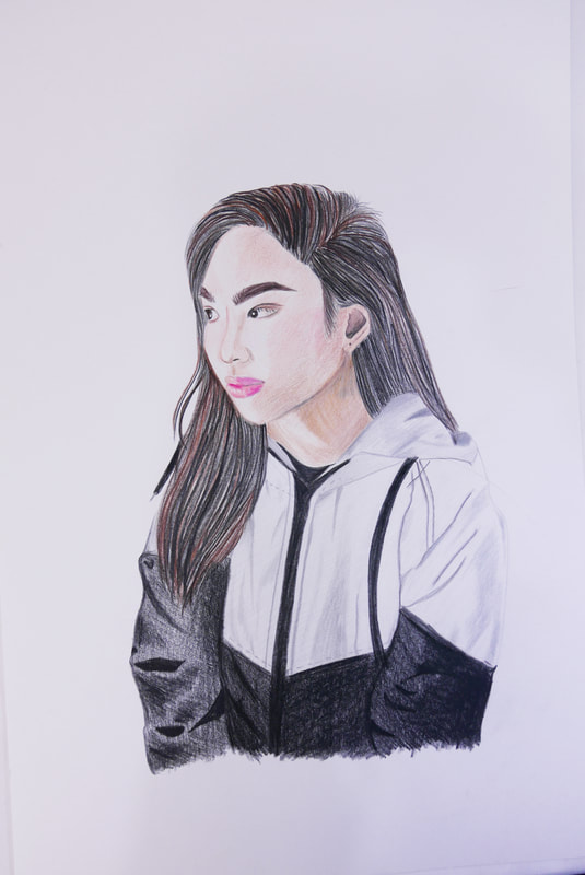
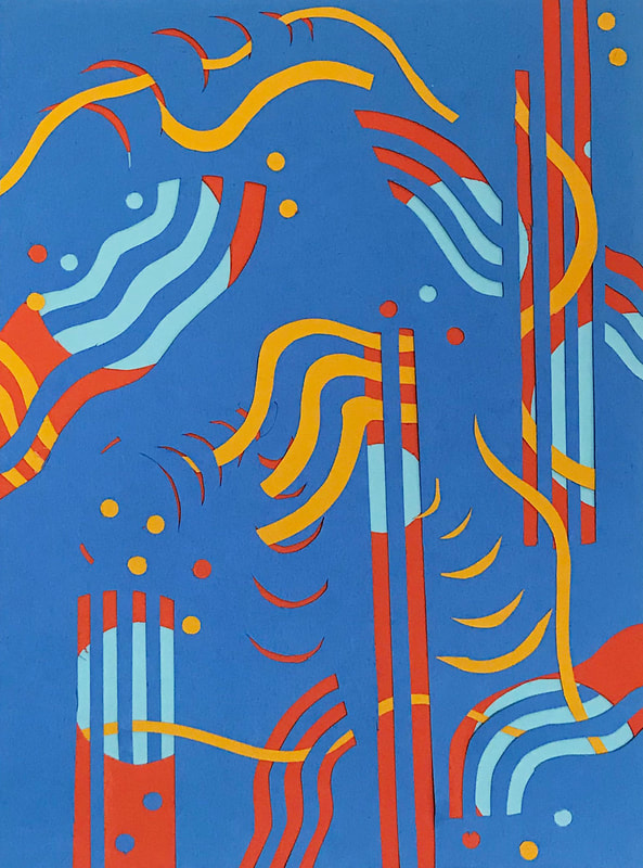
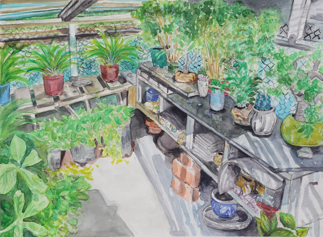
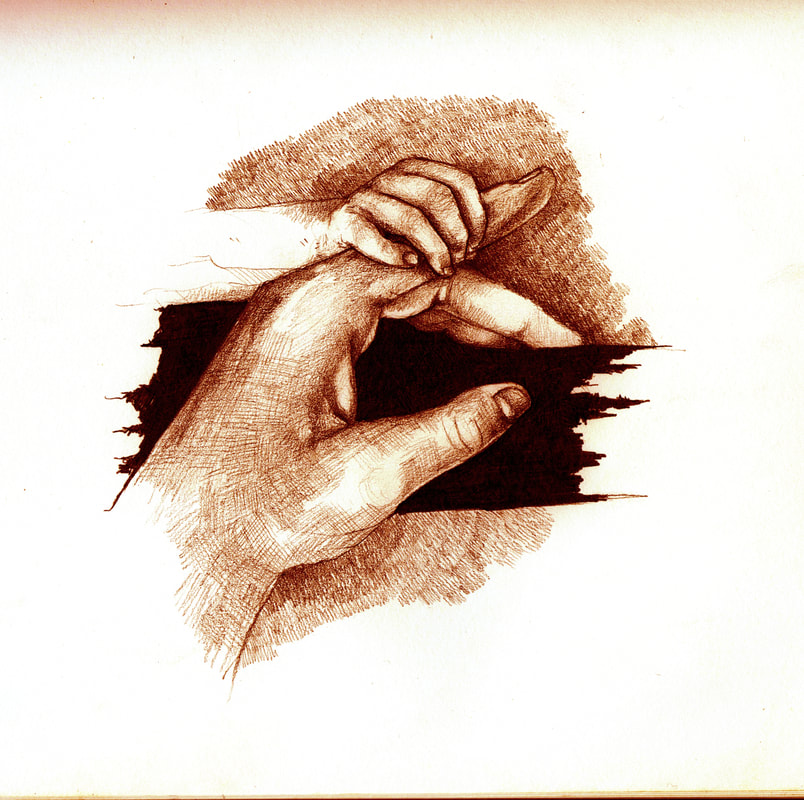
AMBER WANG
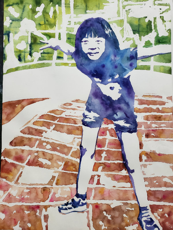
|
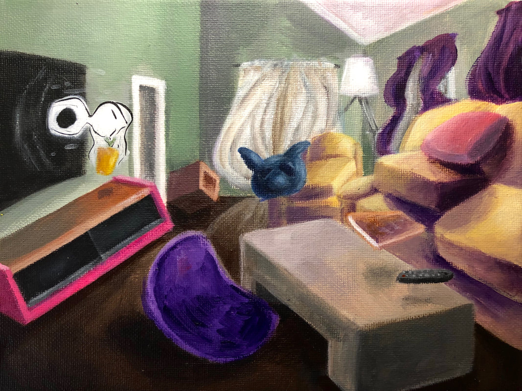
SELECTED WORKS
|


|
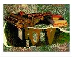
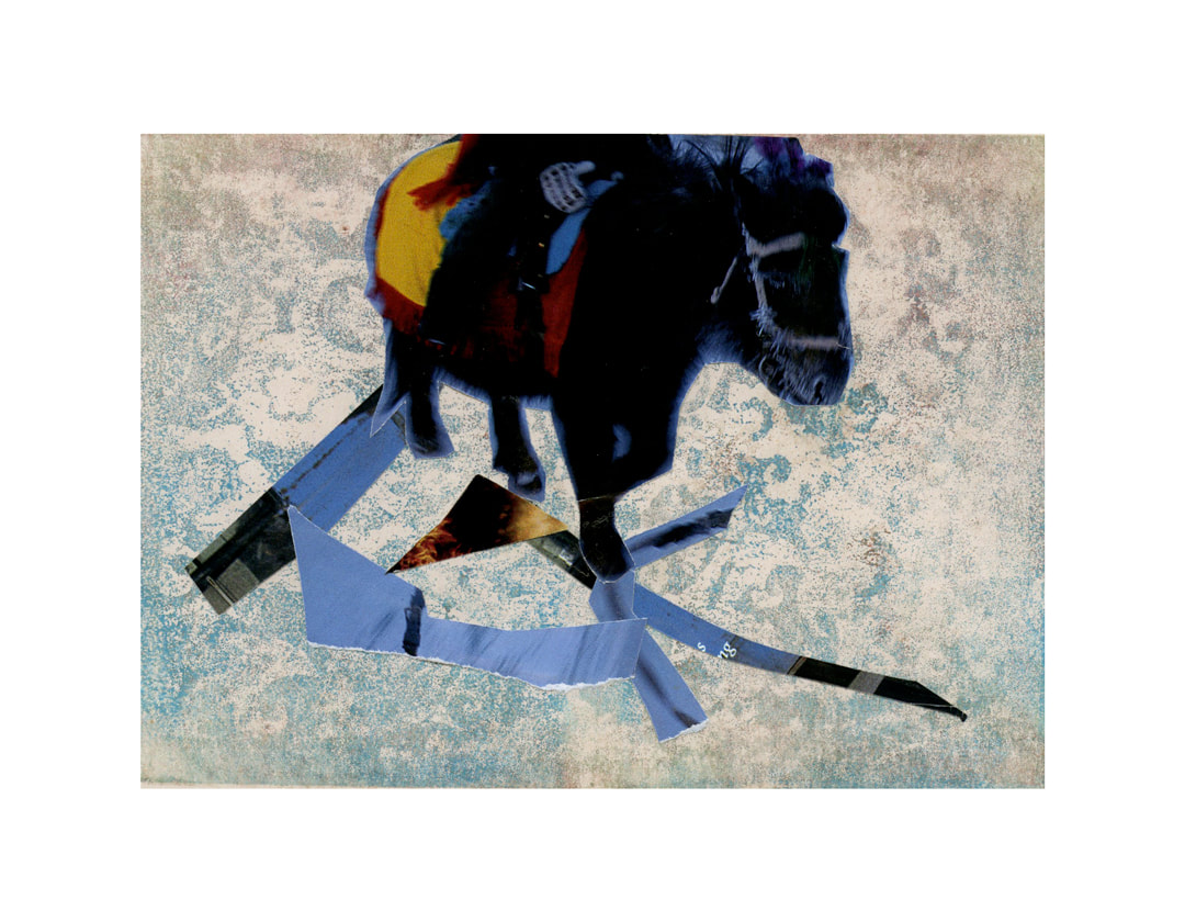
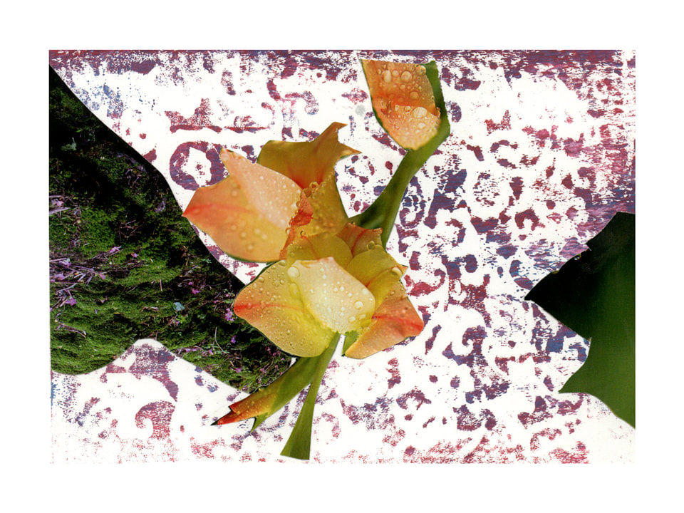
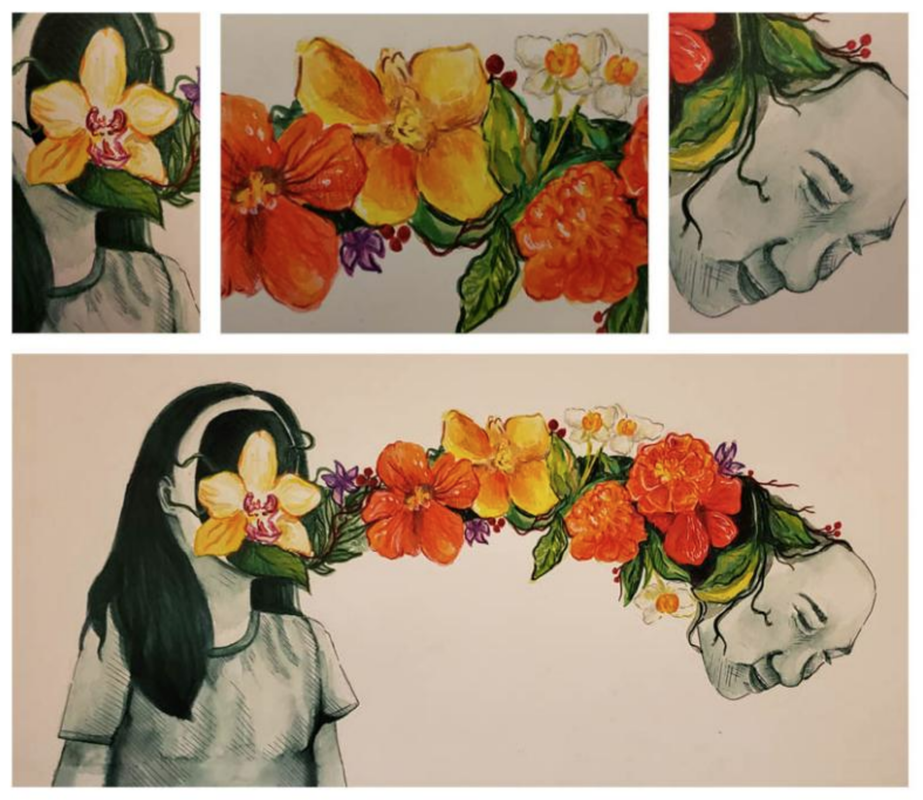
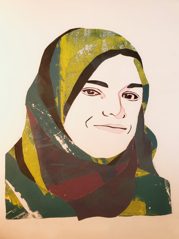
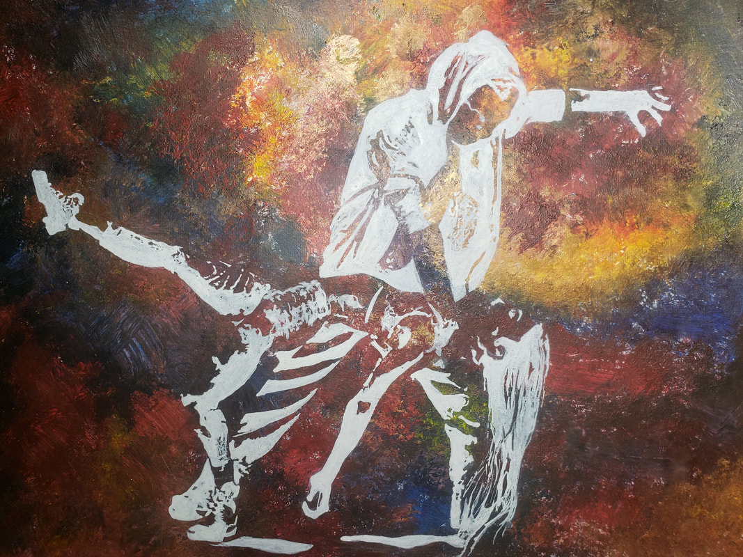
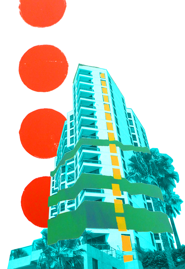
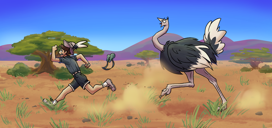
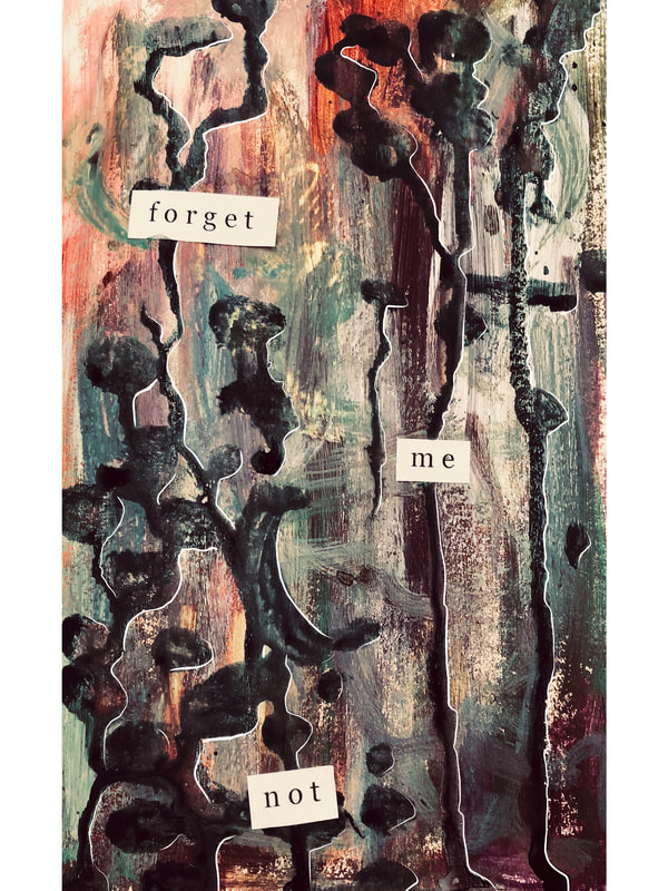
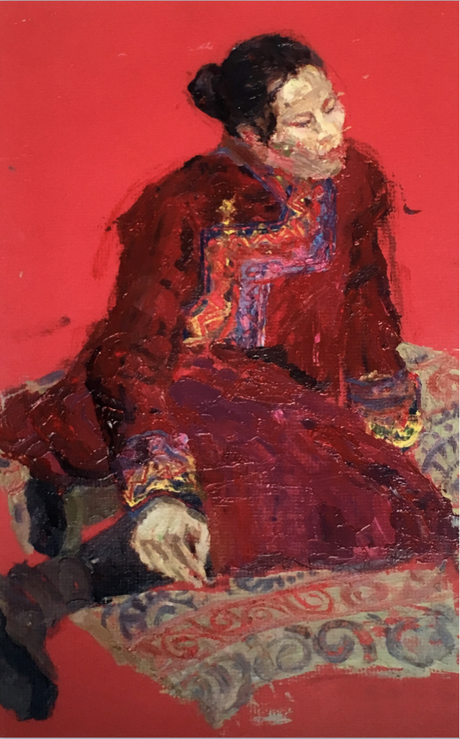
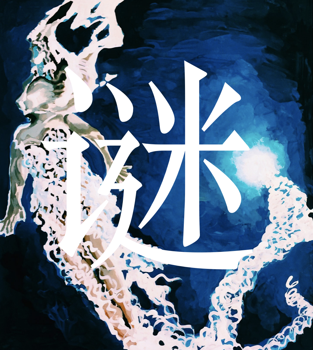
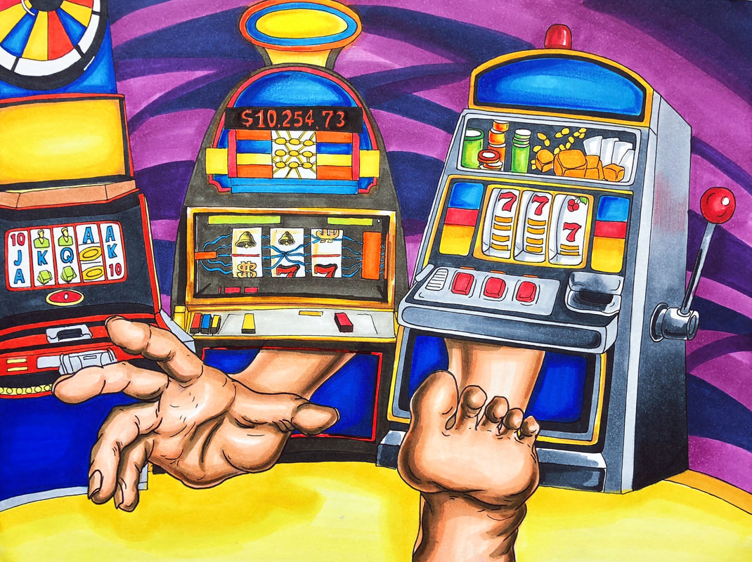
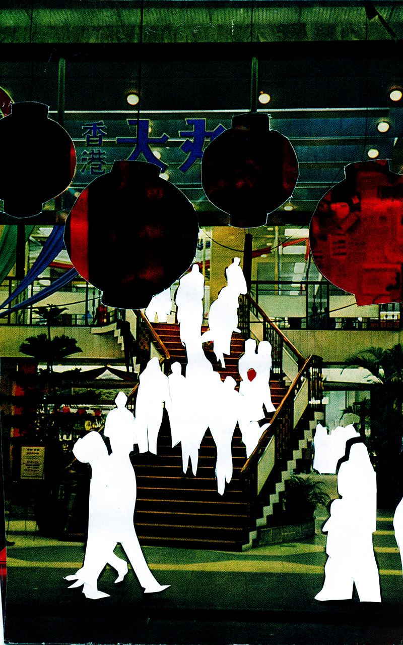
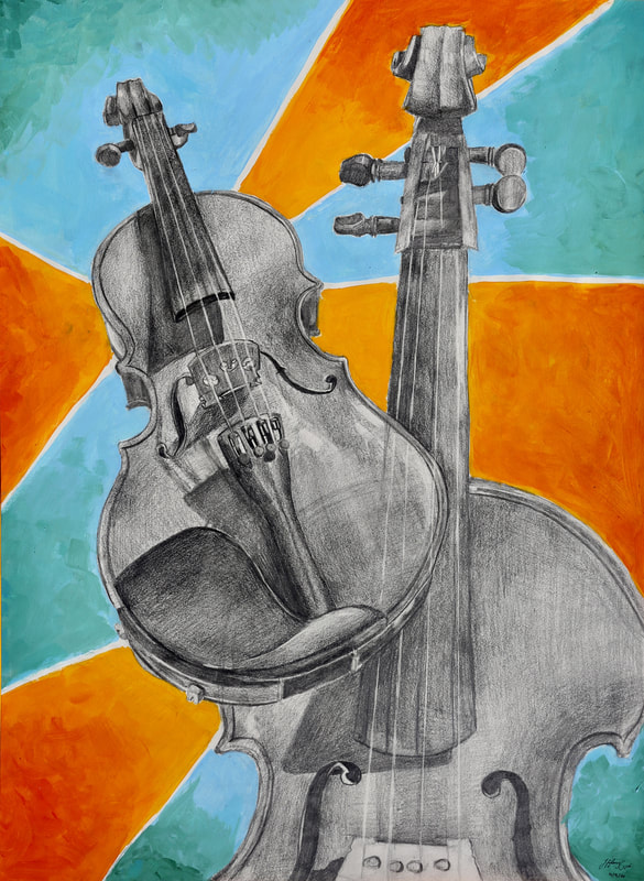
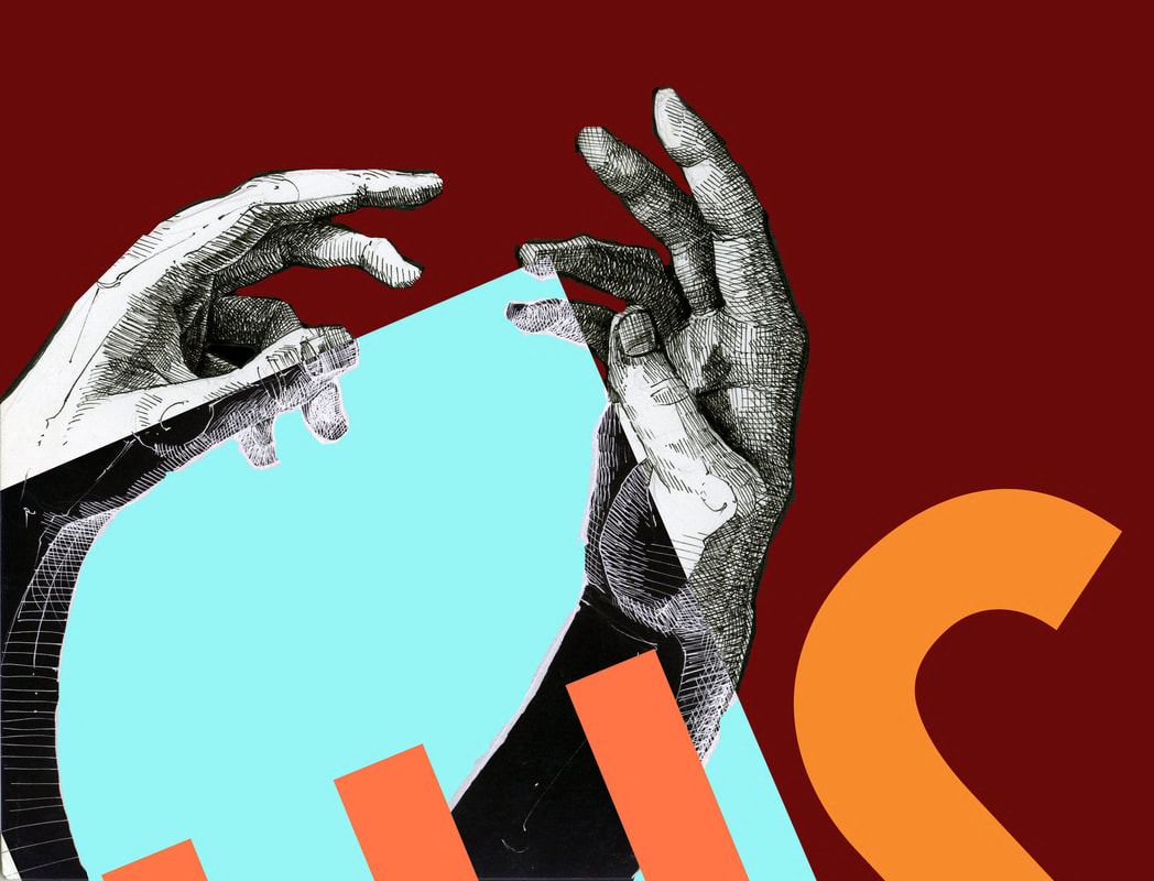
GUAVA RIOS
|
SELECTED WORKS
|


|
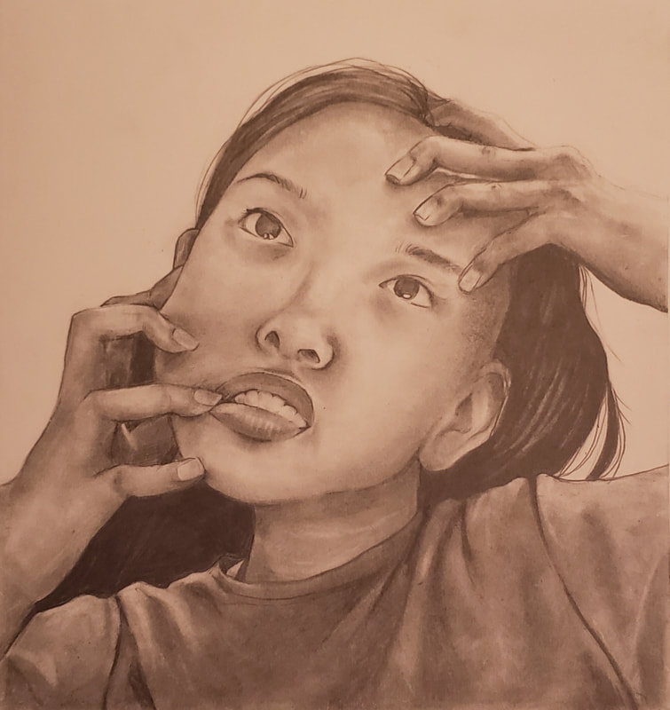
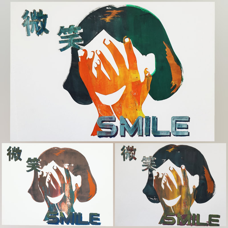
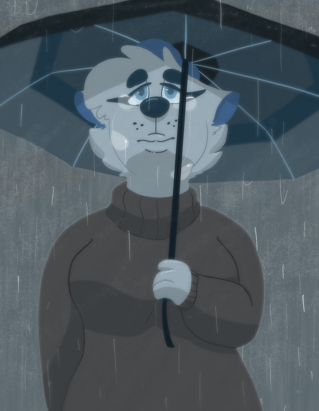
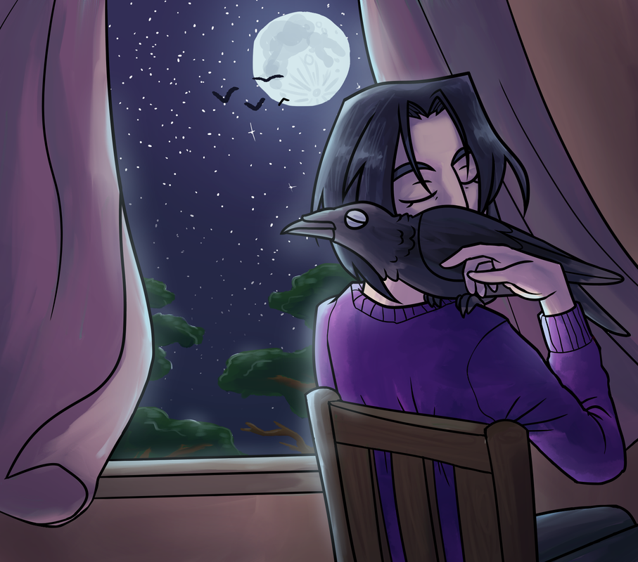
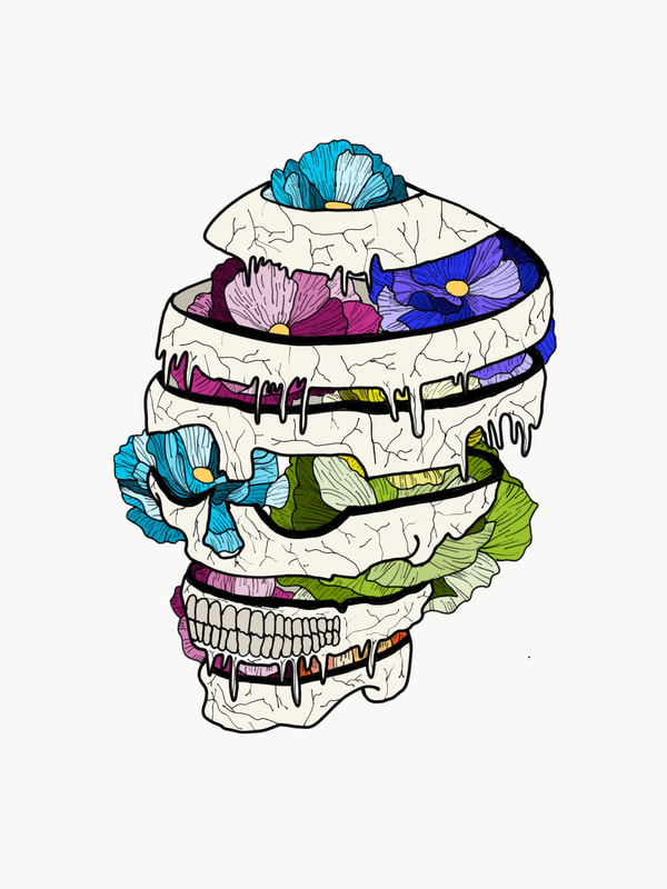
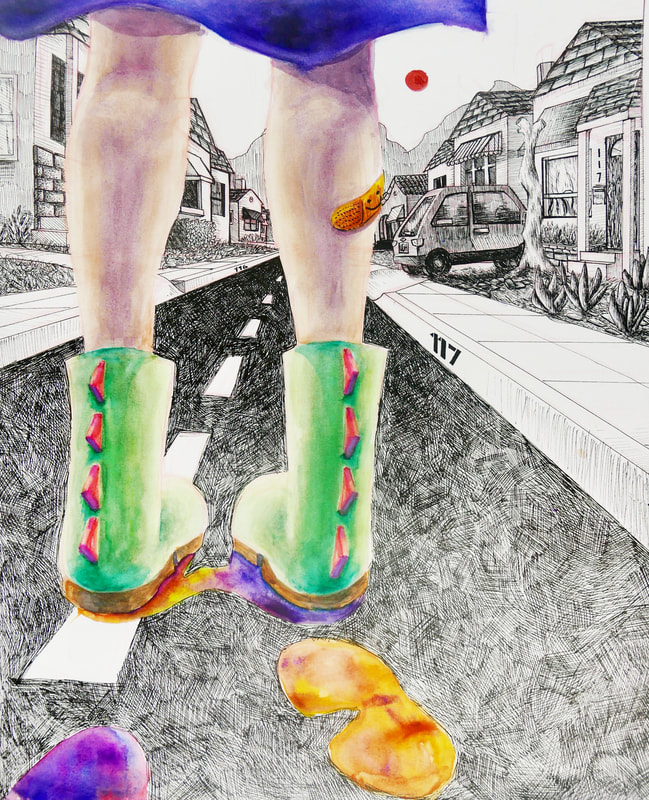
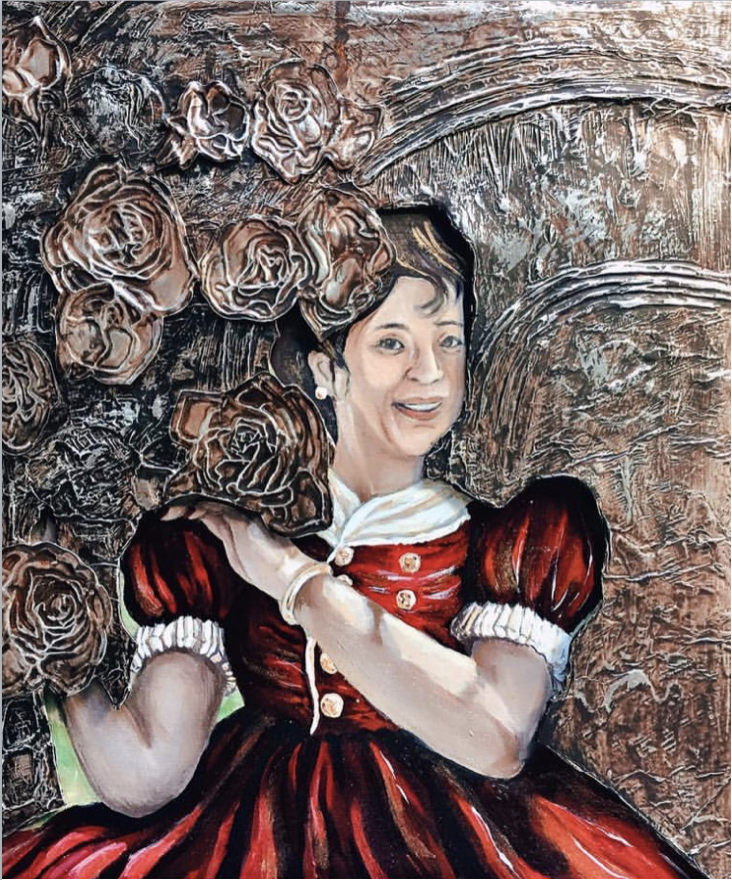
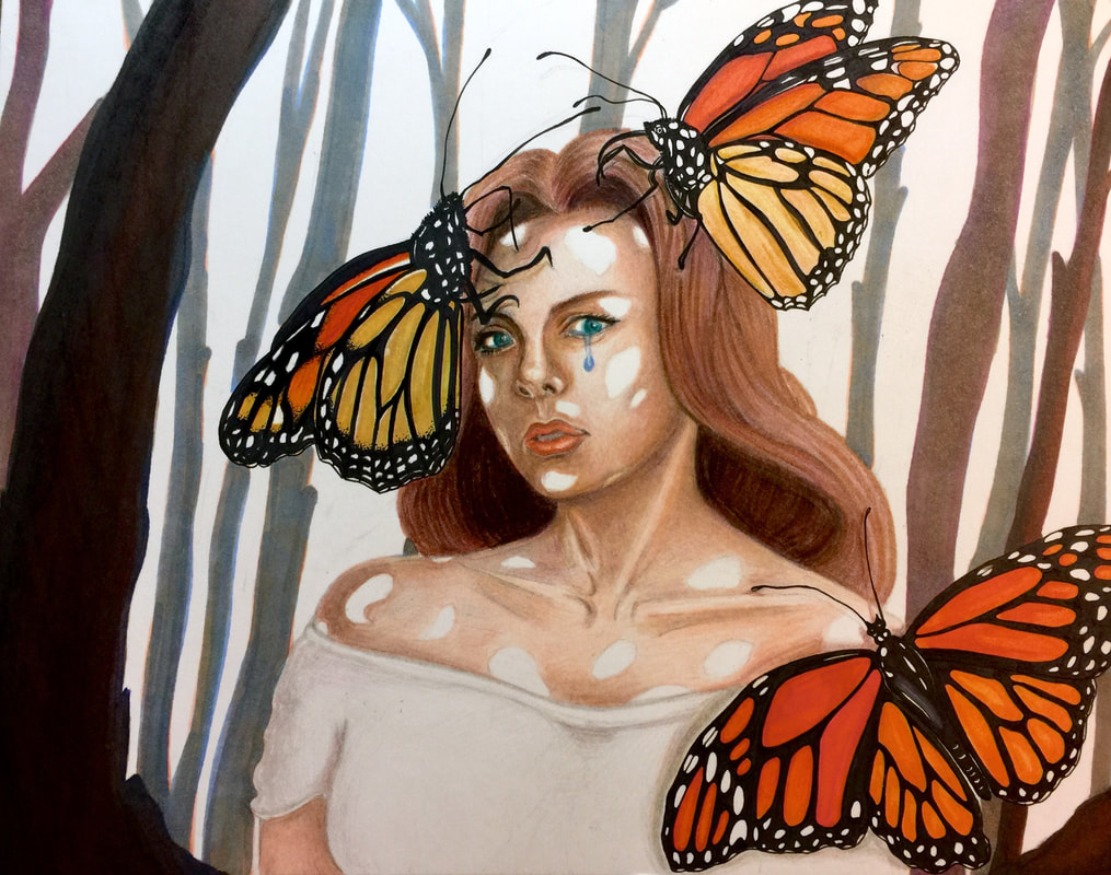
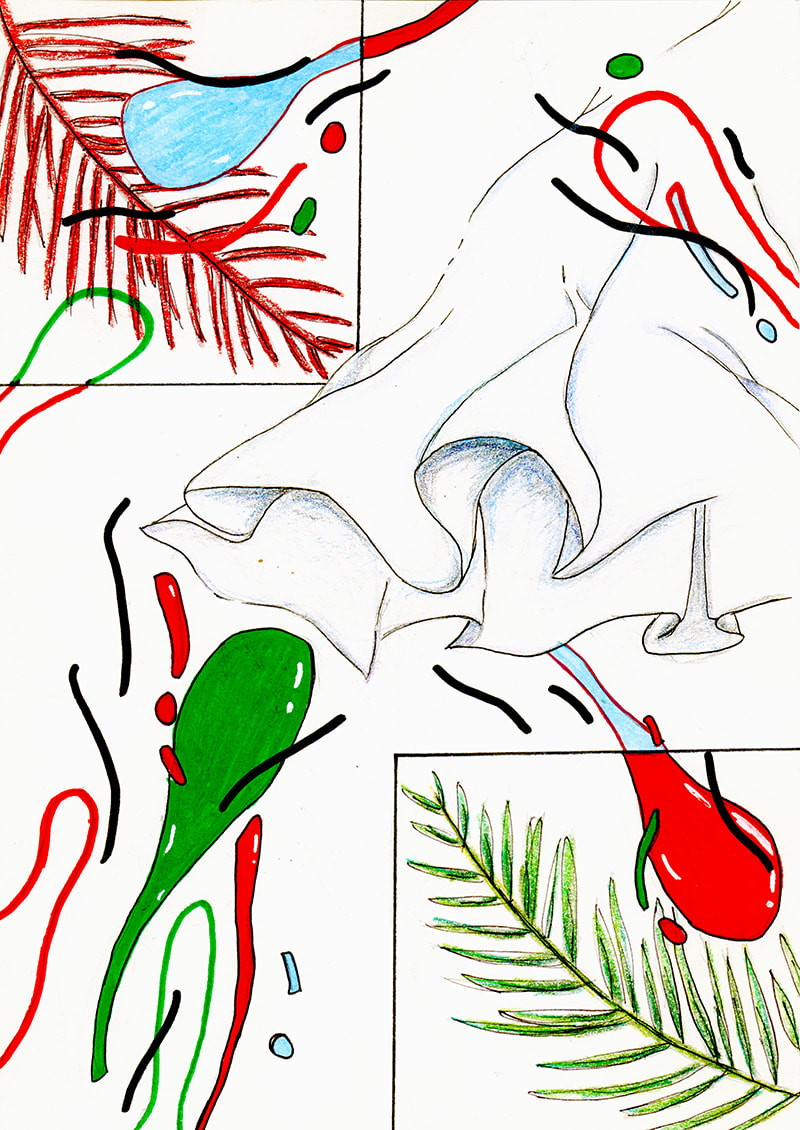
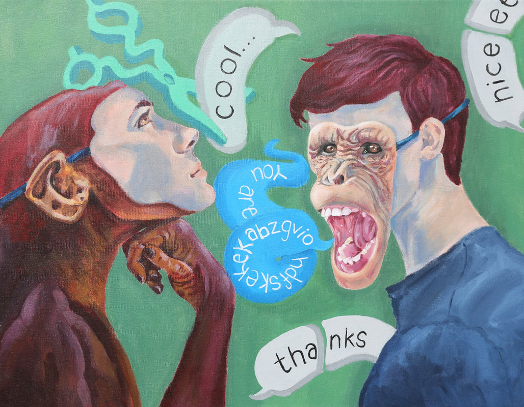
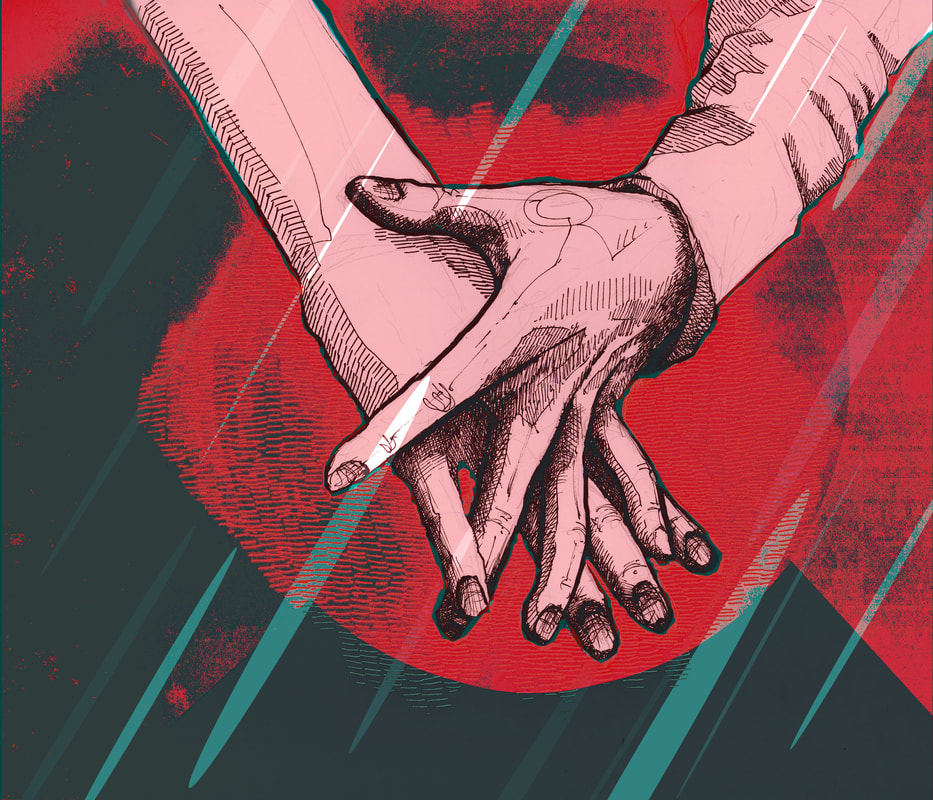
JOANNE LI
|
SELECTED WORKS
|


|
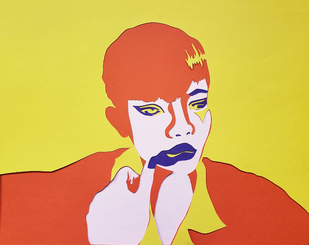
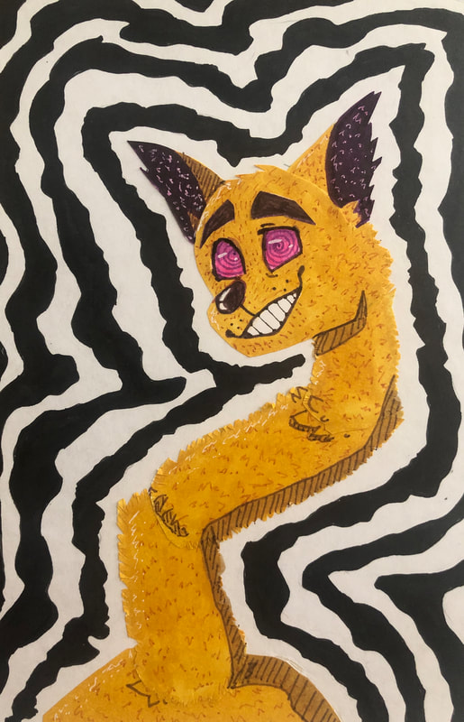
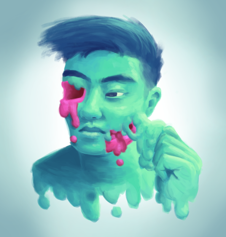
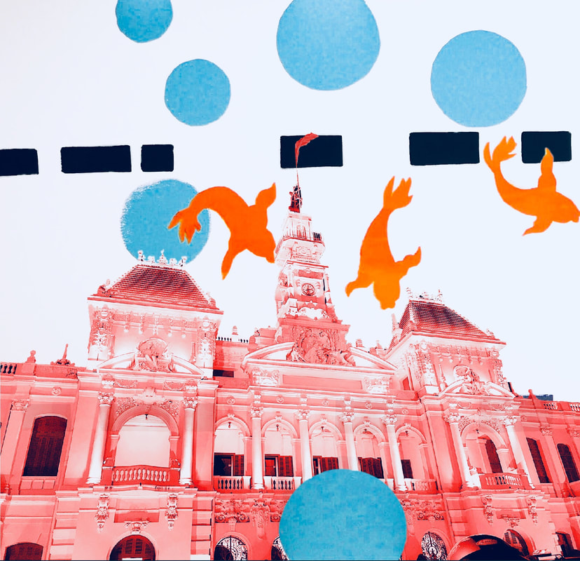
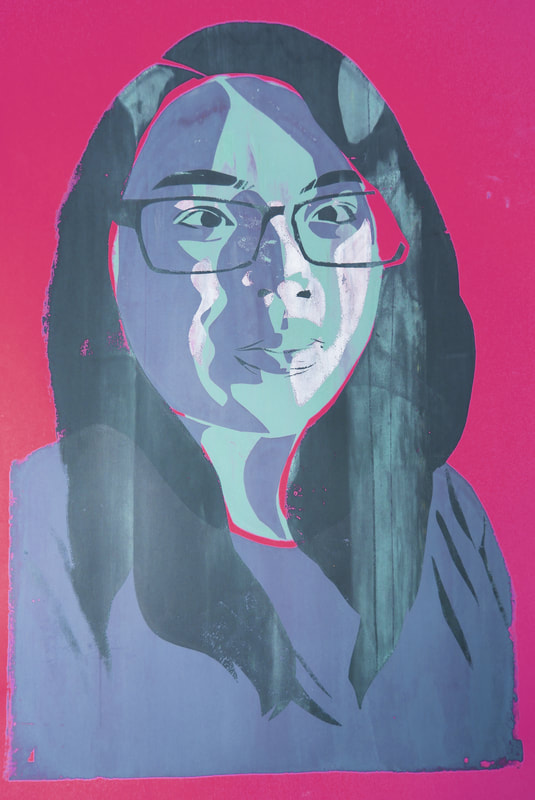
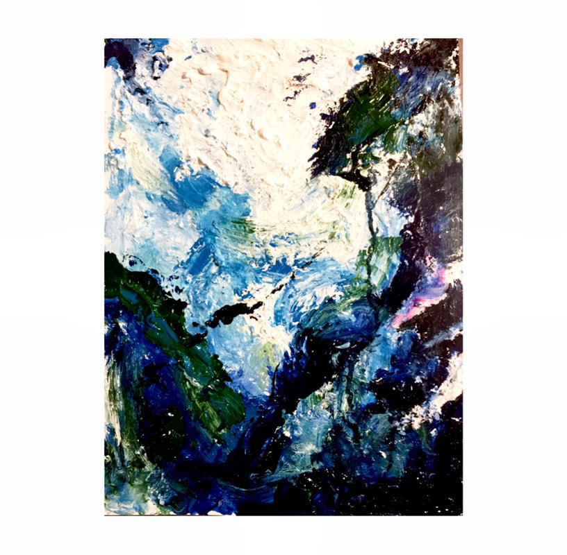
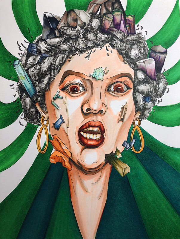
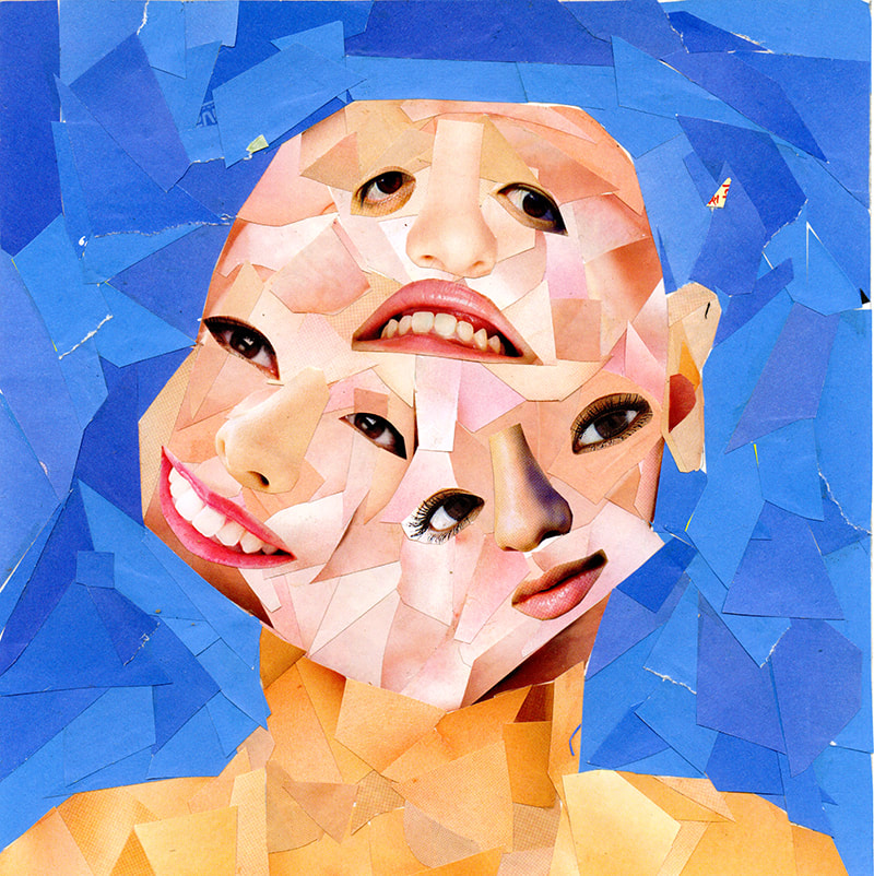
KYLE KOK
|
SELECTED WORKS
|


|
|
|
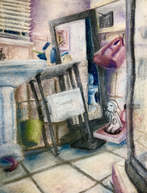
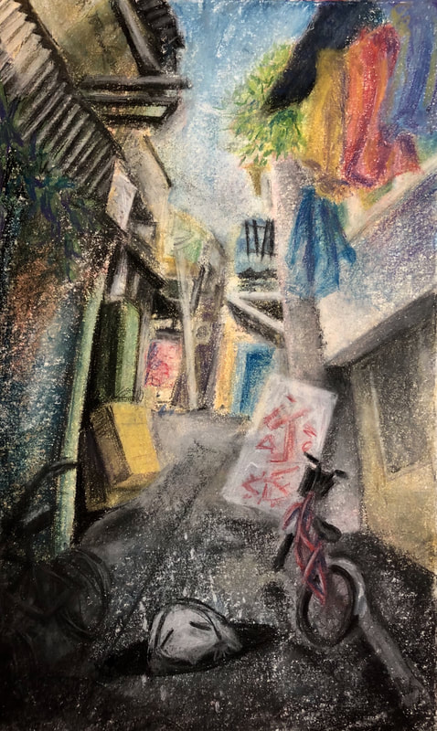
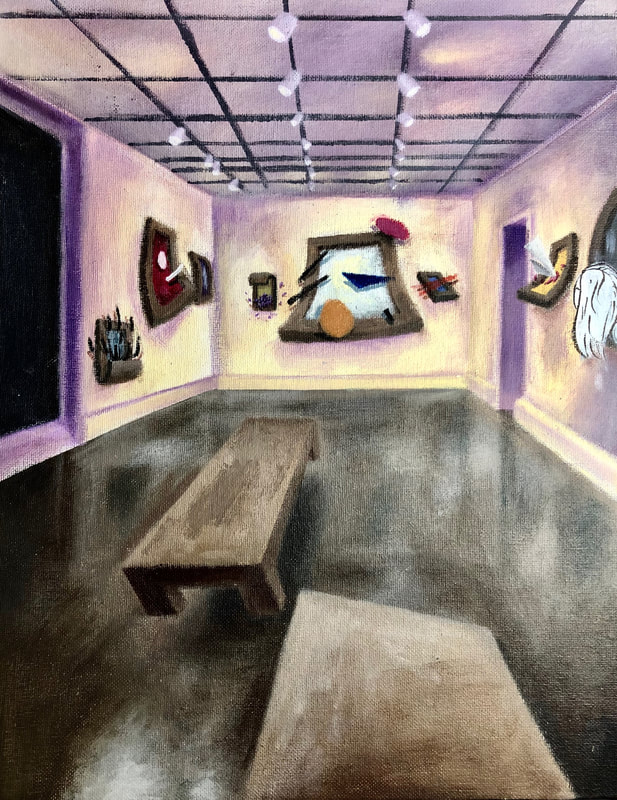
KYLIE WU
|
SELECTED WORKS
|


|
|
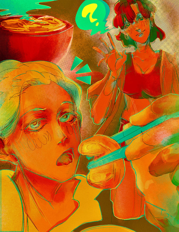
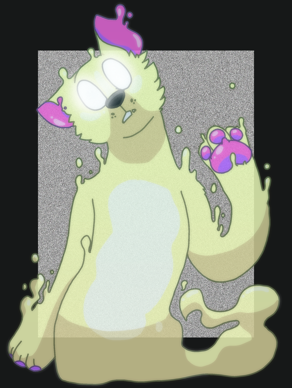
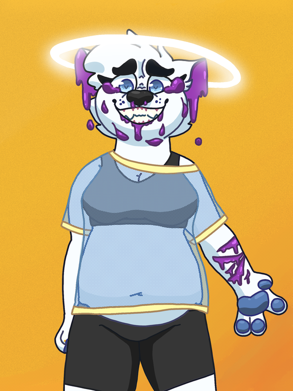
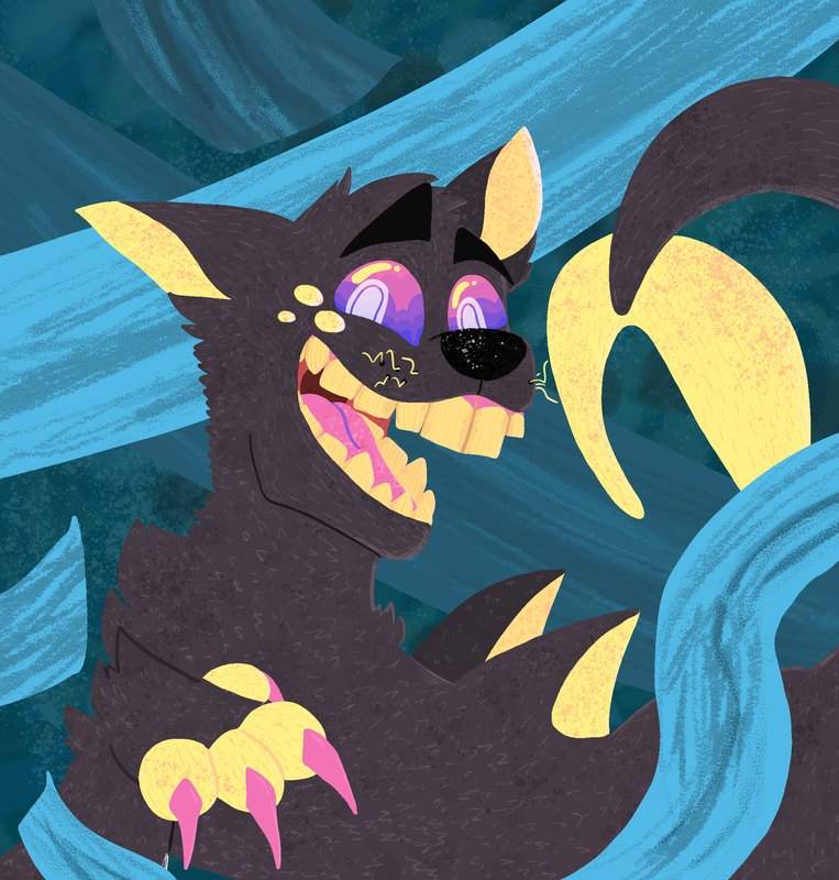
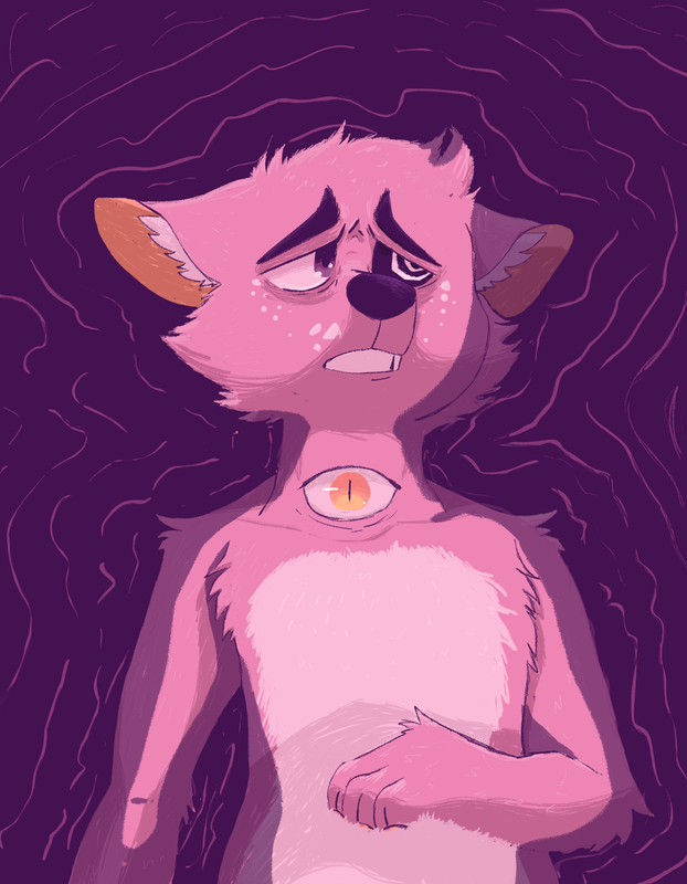
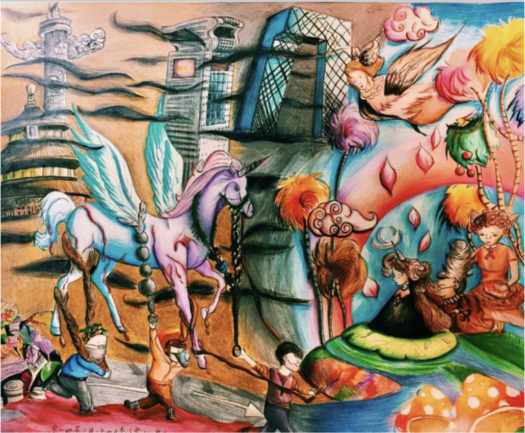
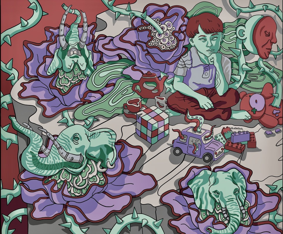
SUSTAINED INVESTIGATION
|
WRITTEN STATEMENT
Identify the question(s) or inquiry that guided your sustained investigation.
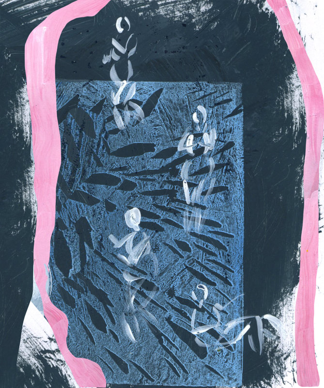
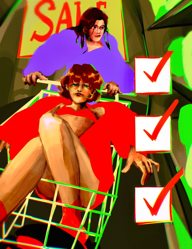
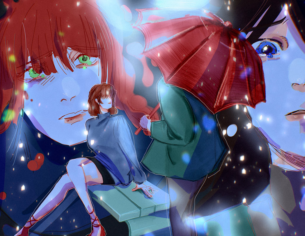
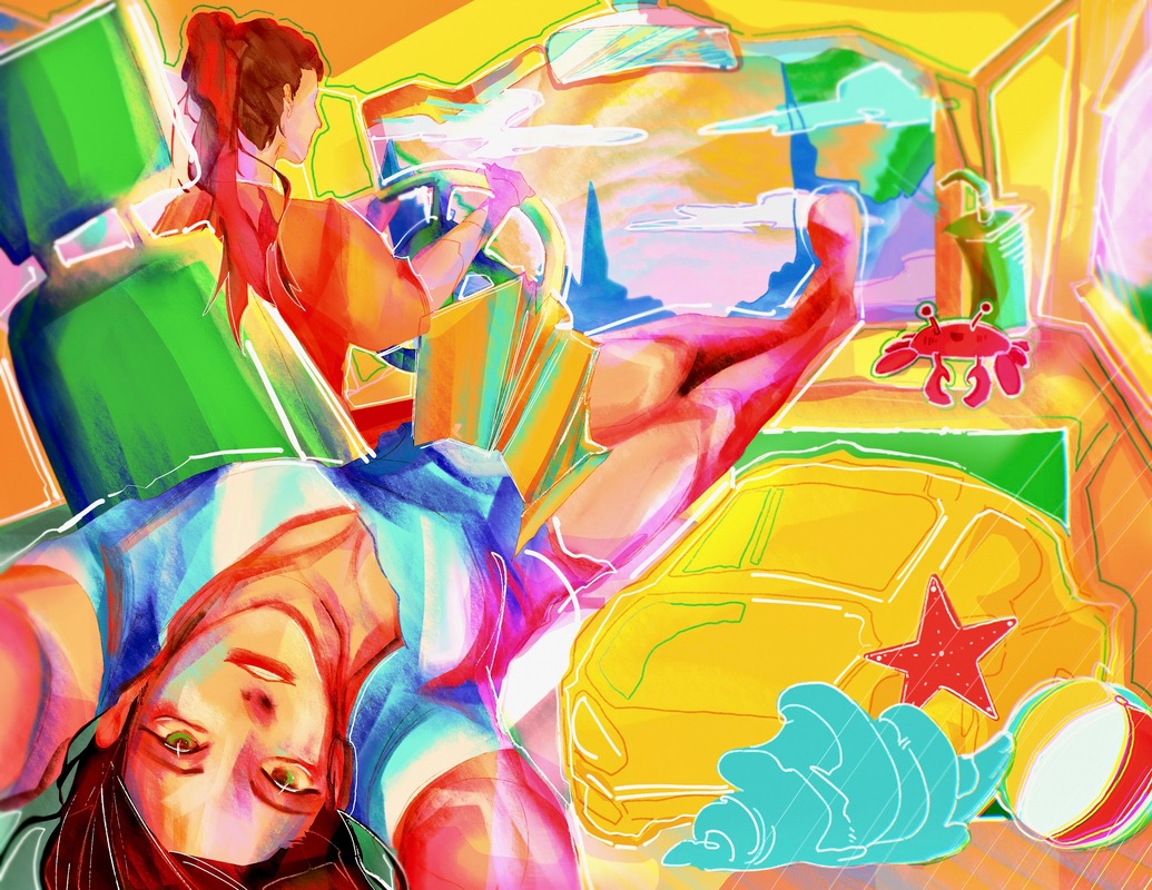
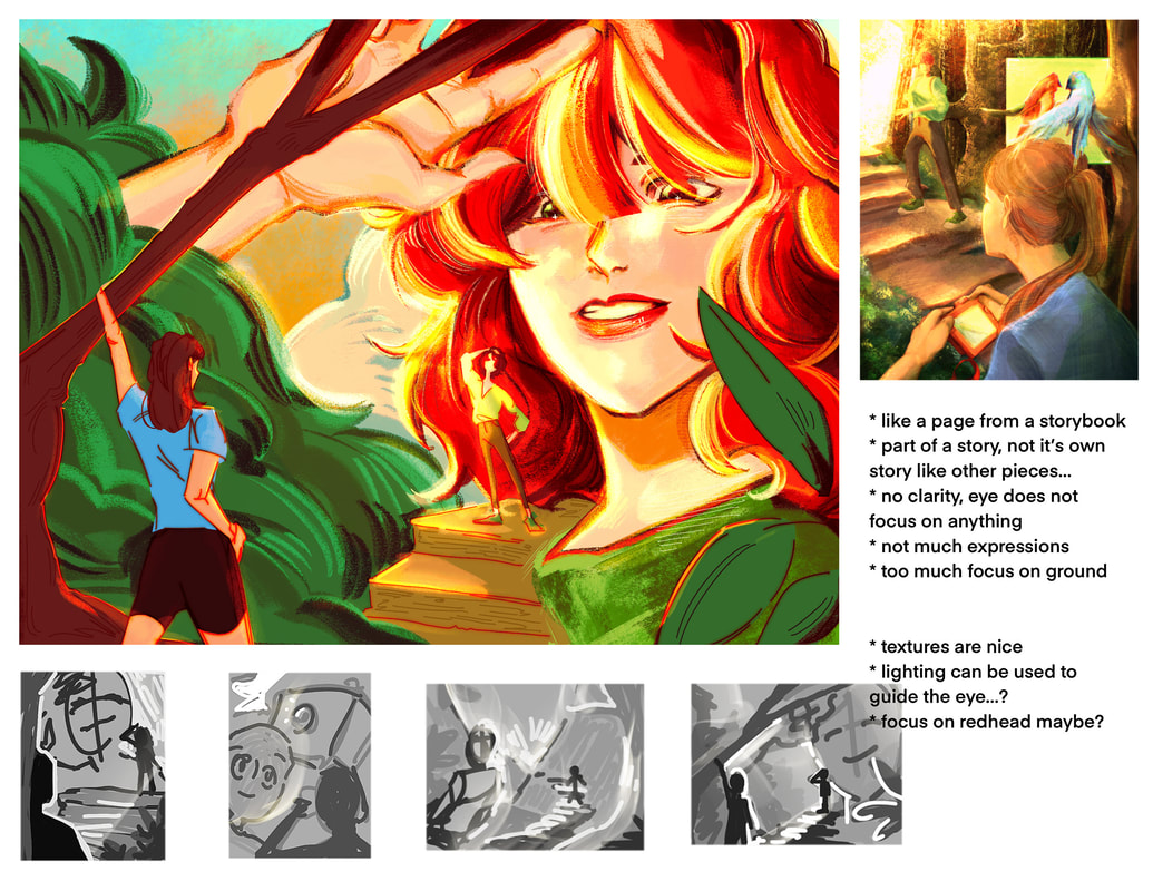
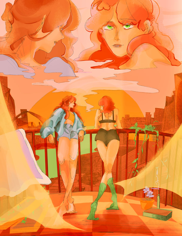
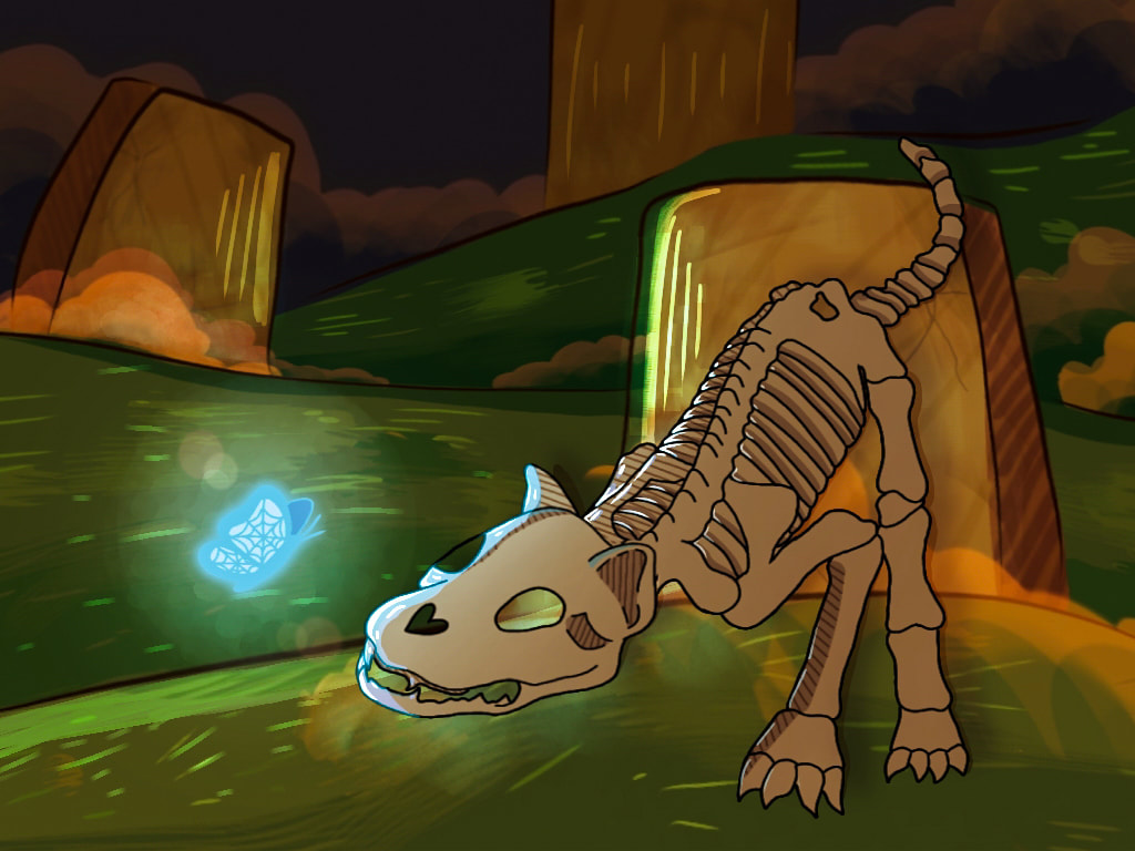
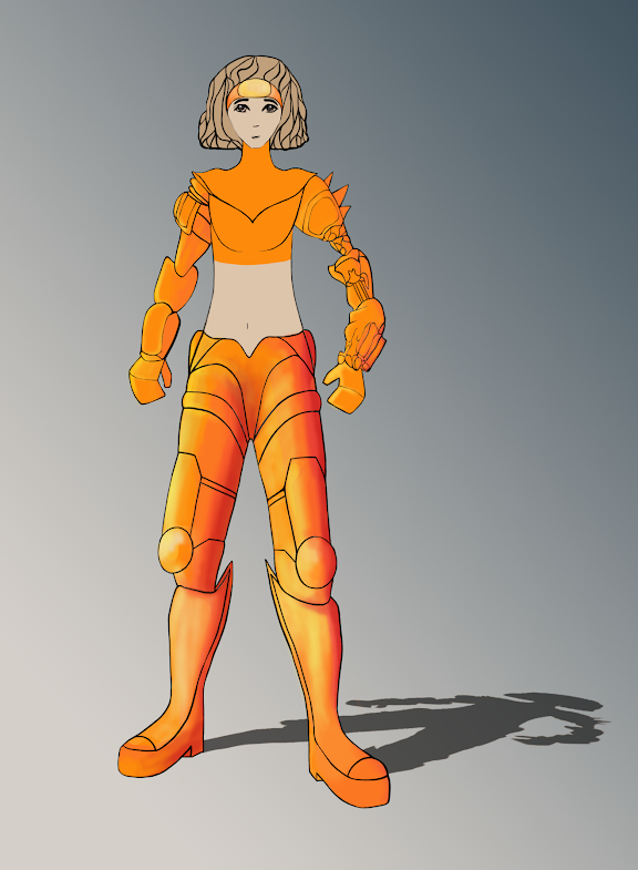
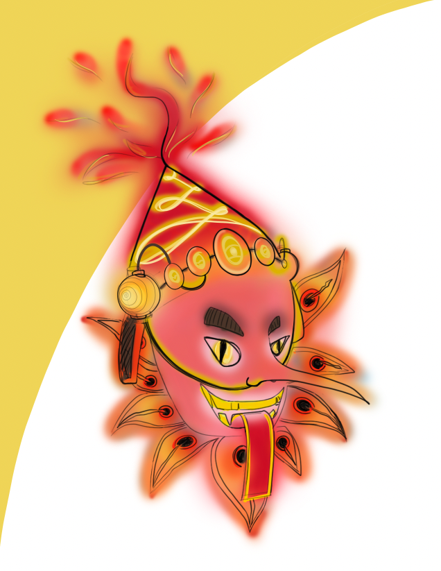
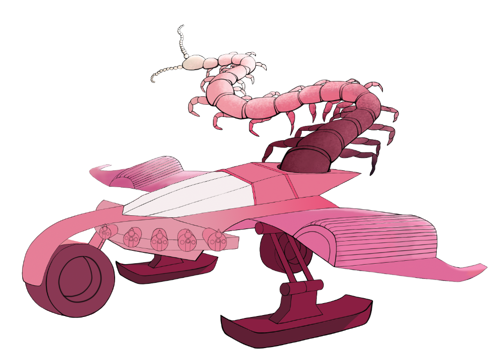
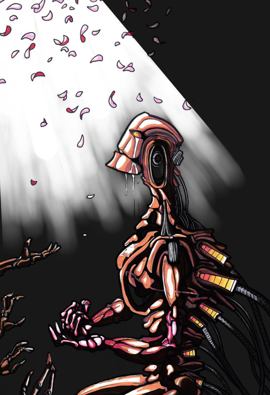
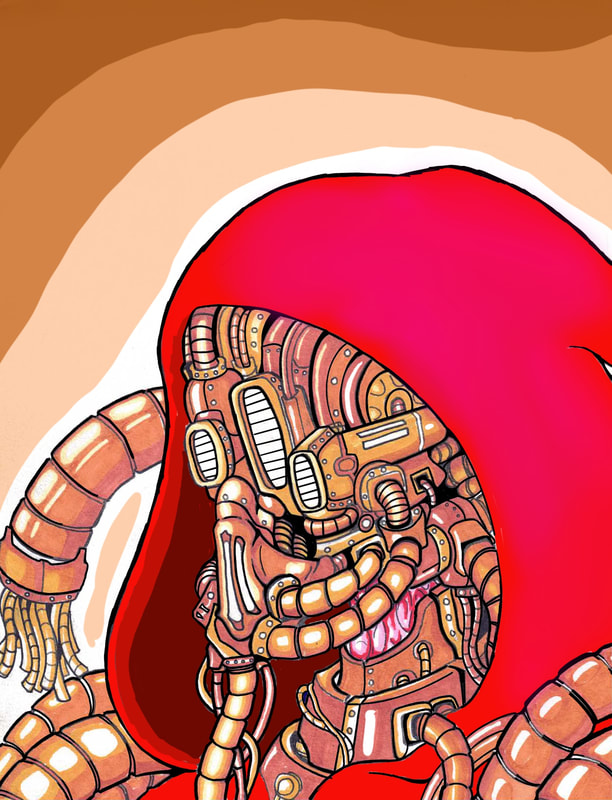
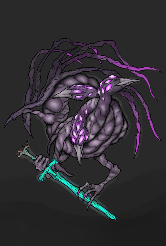
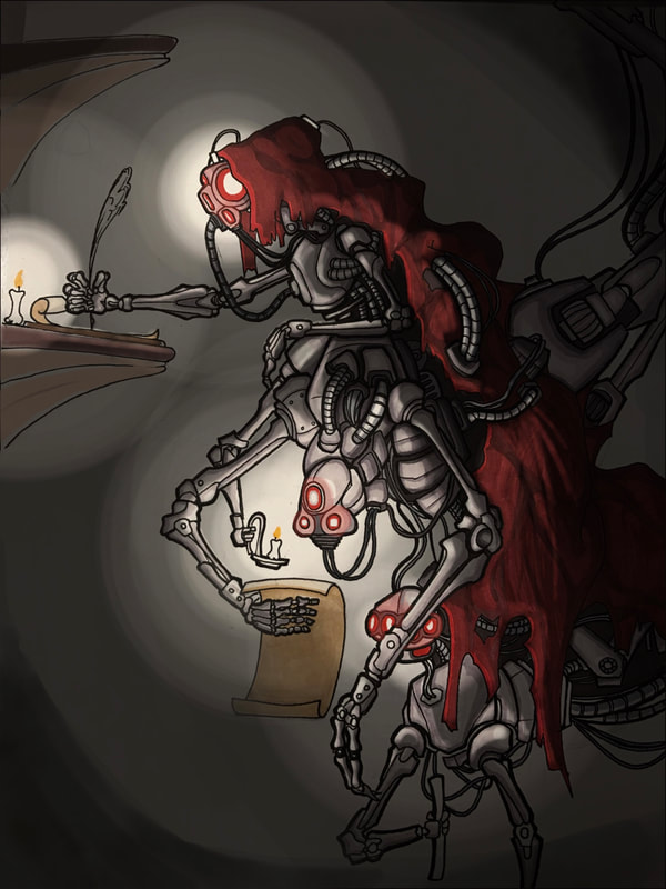
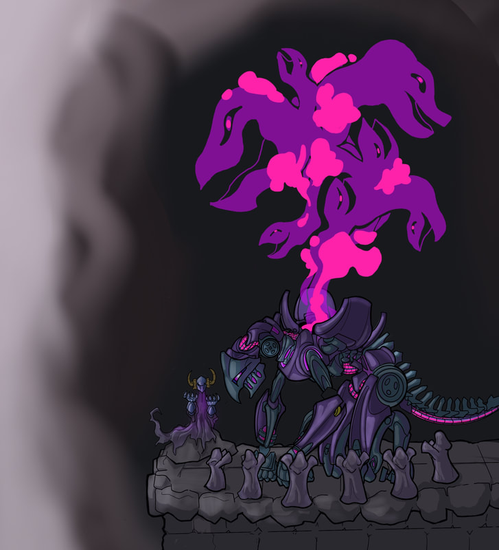
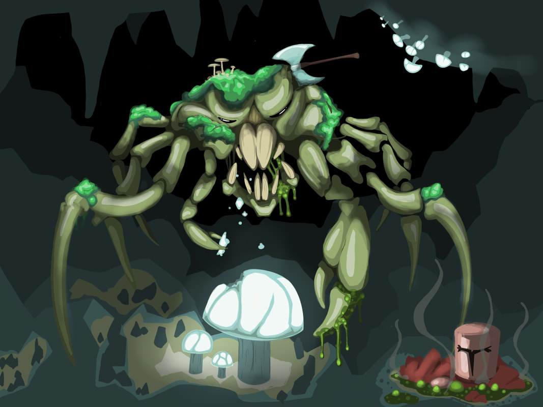
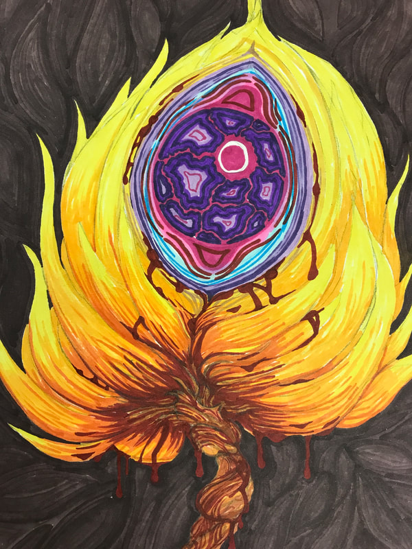
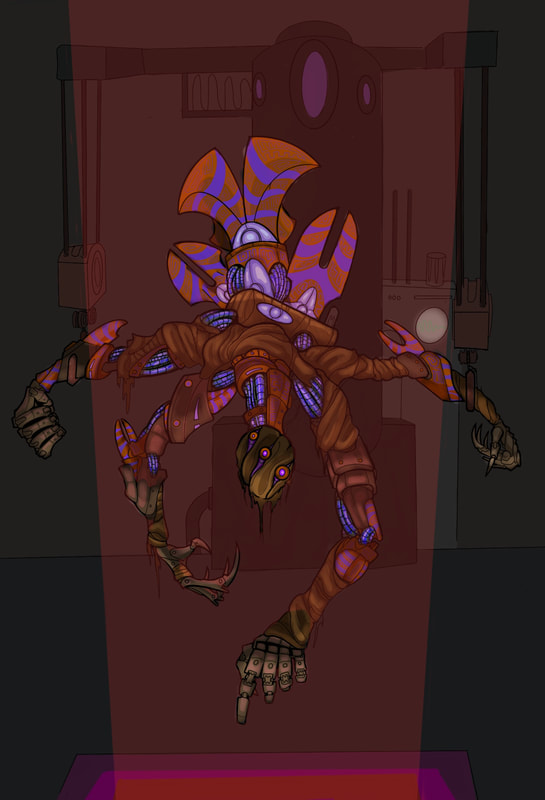
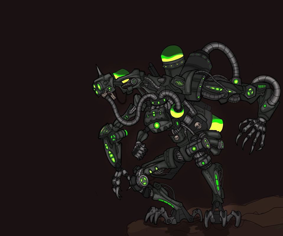
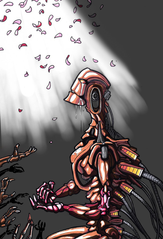
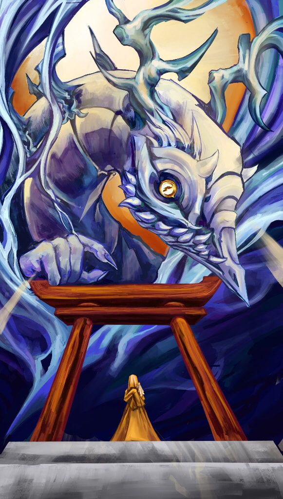
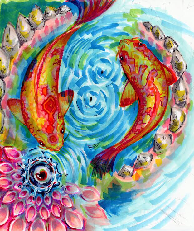
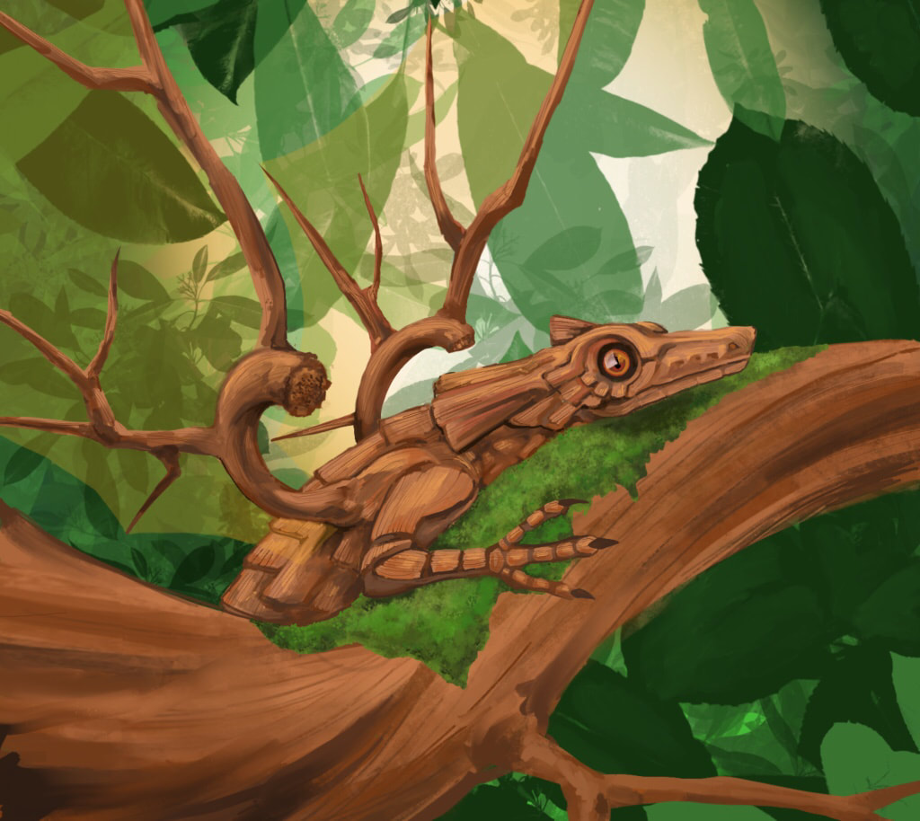
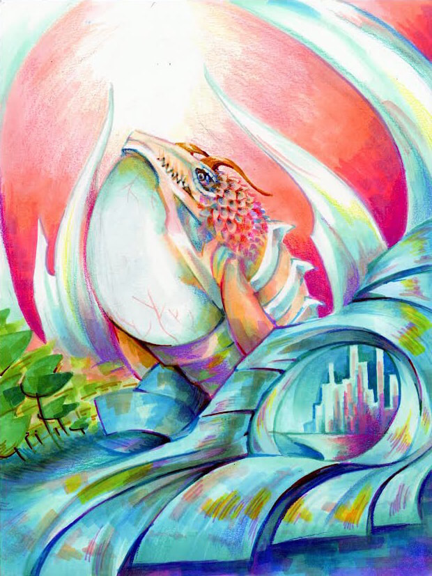
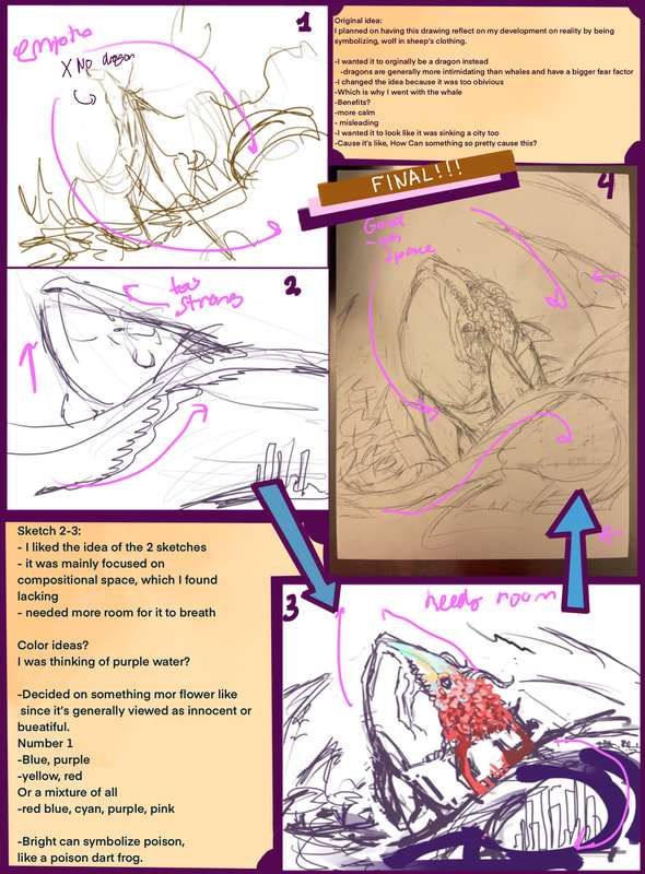
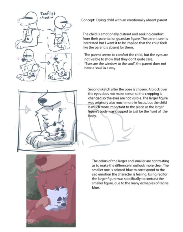
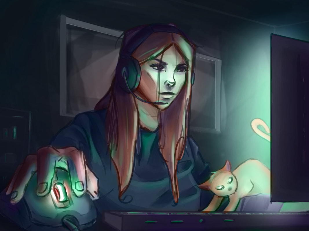
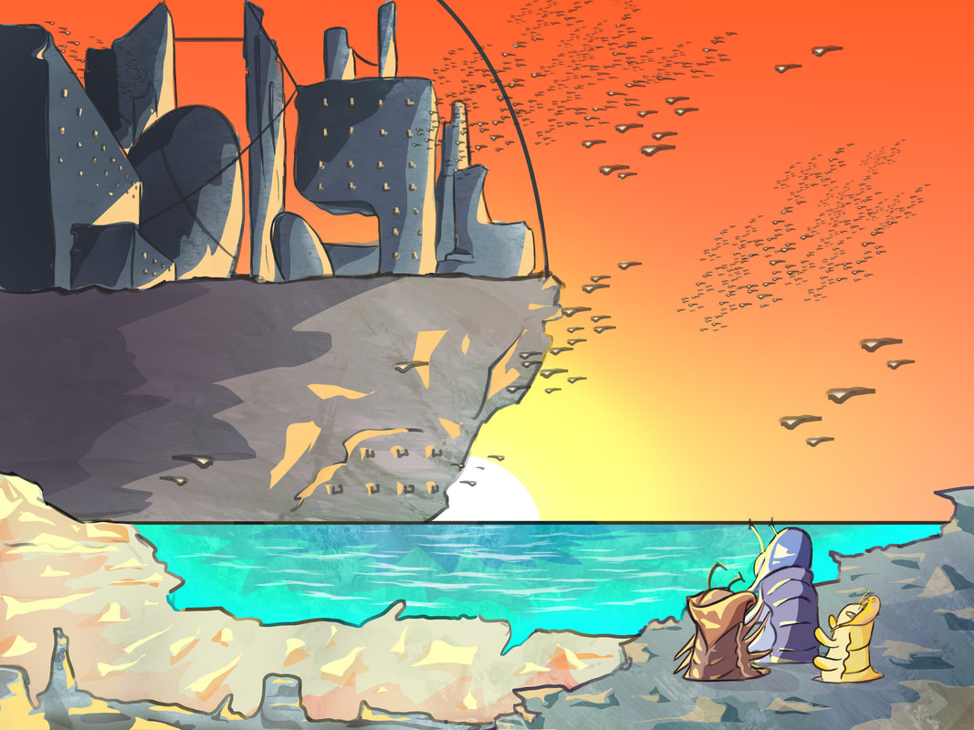
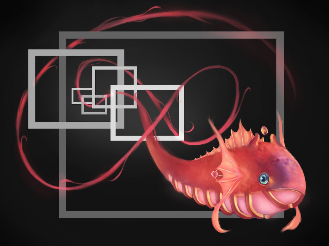
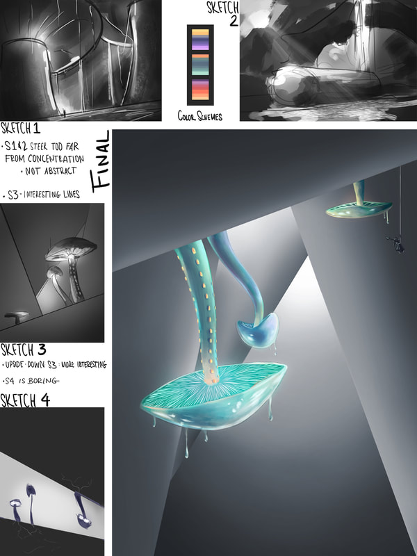
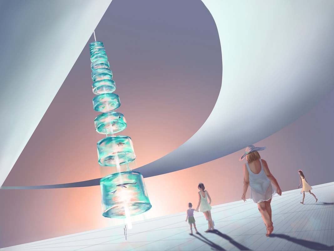
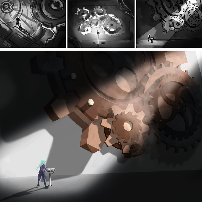
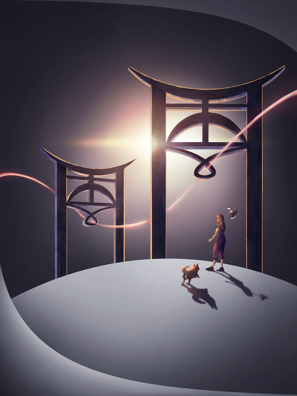
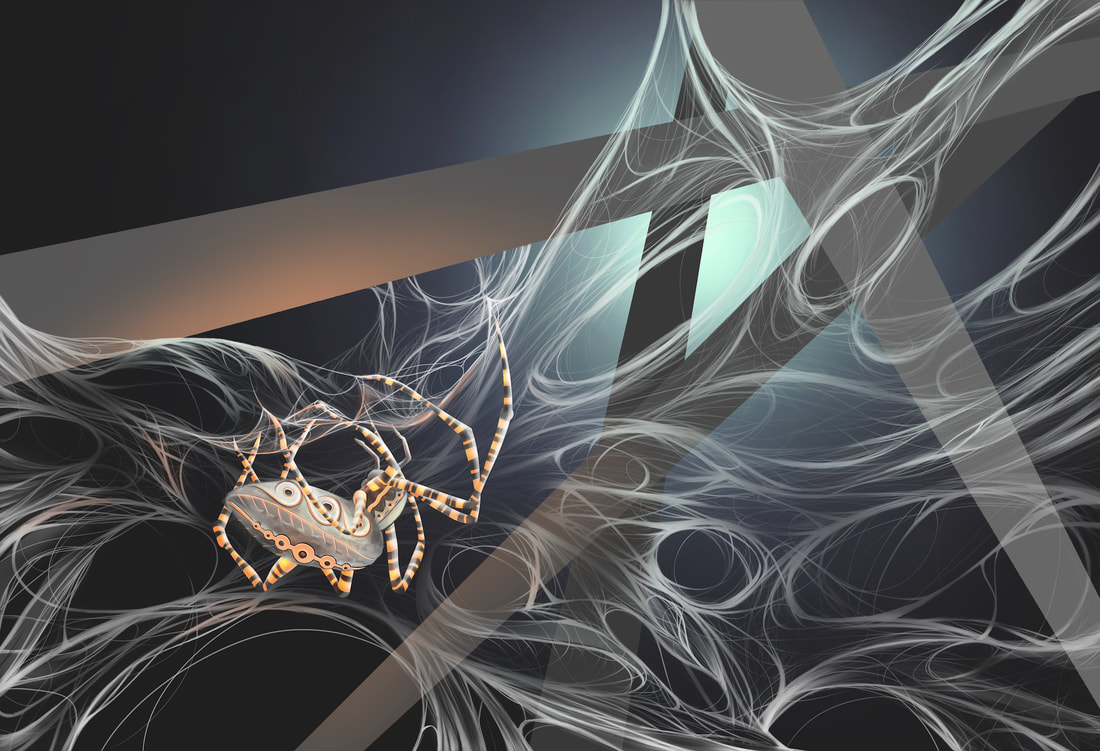
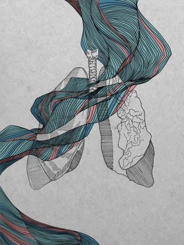
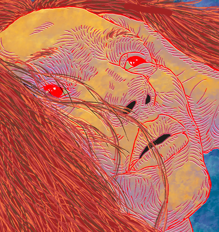
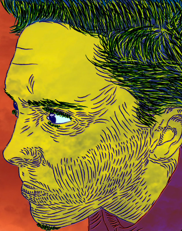
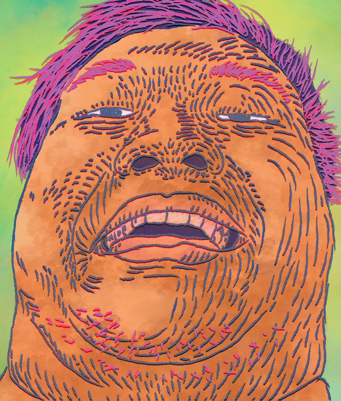
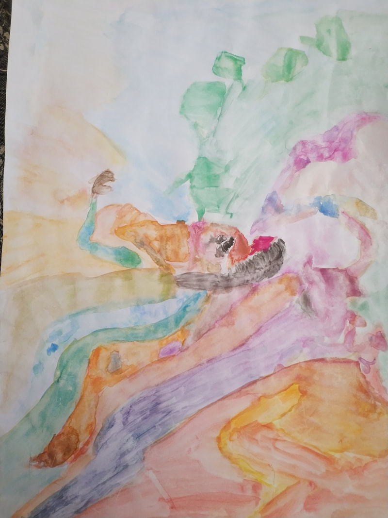
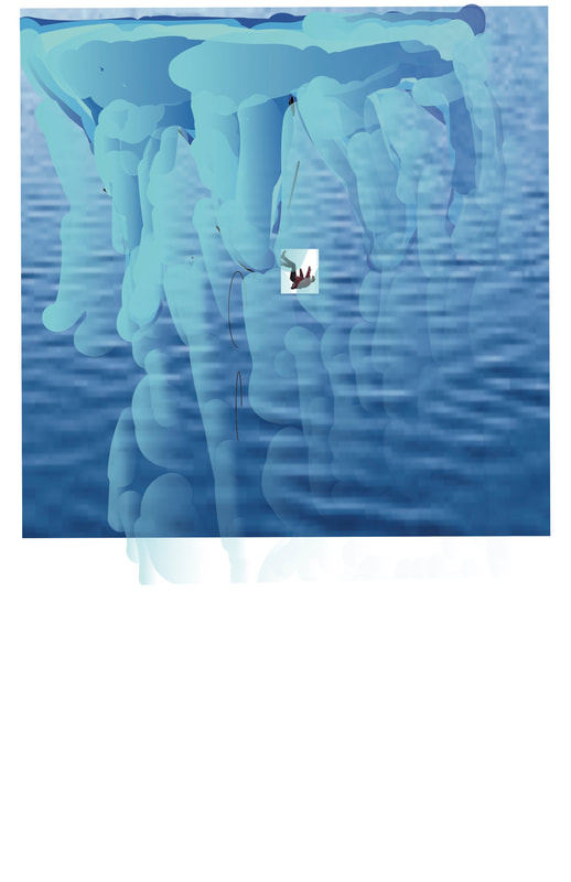
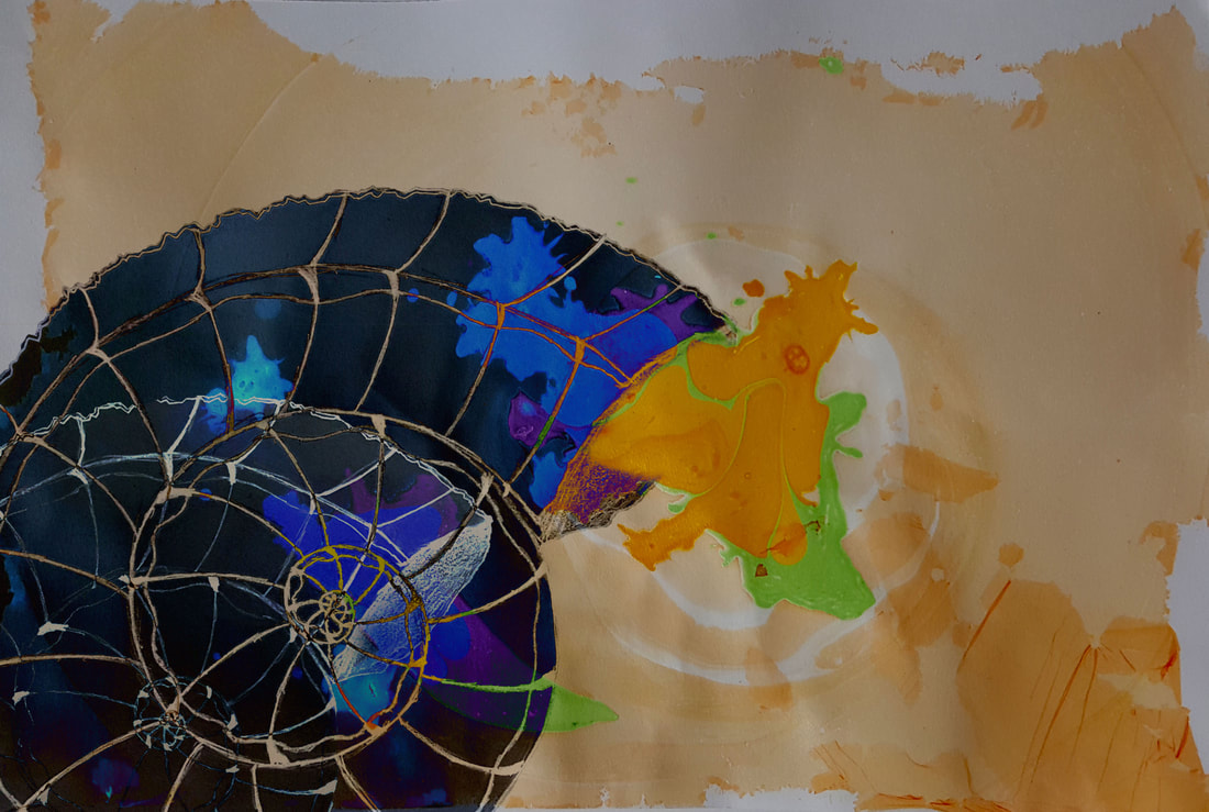
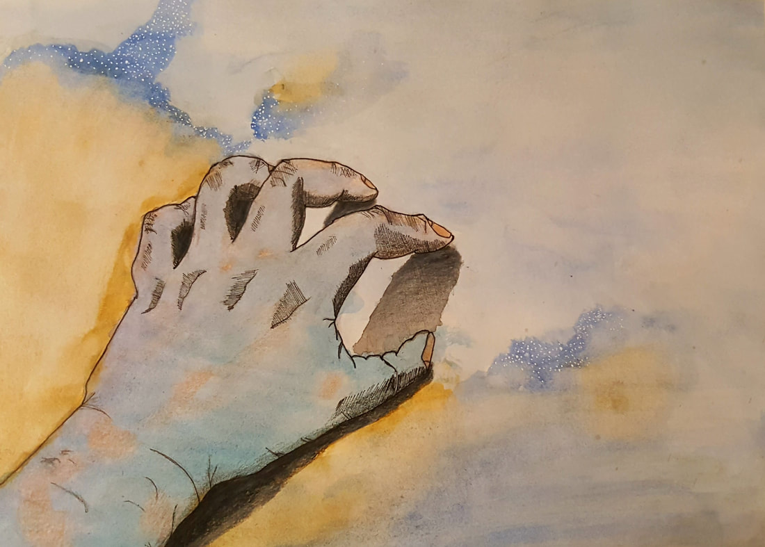
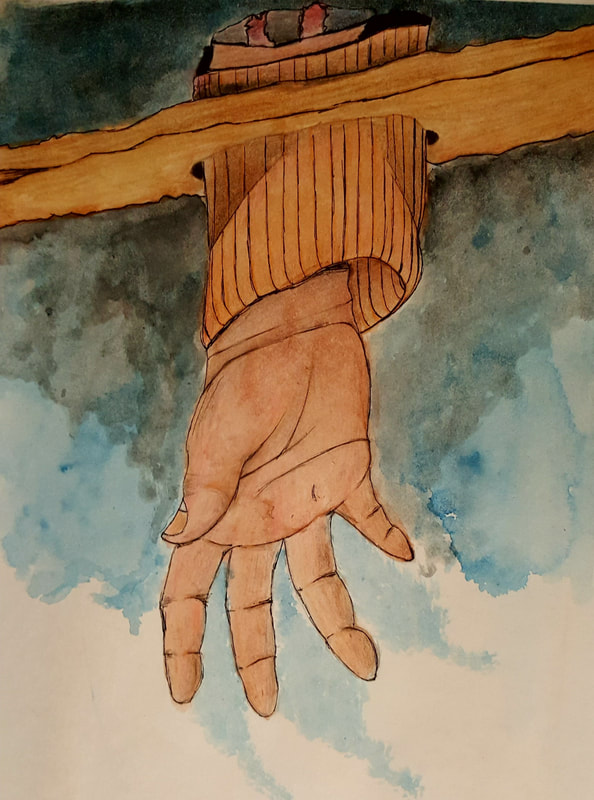
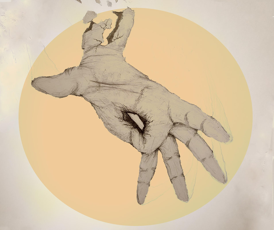
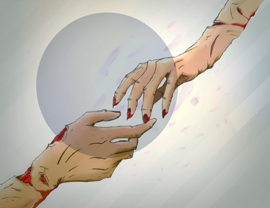
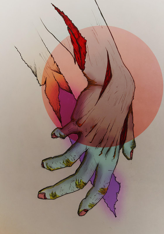
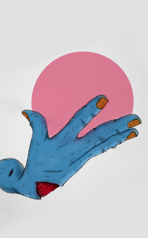
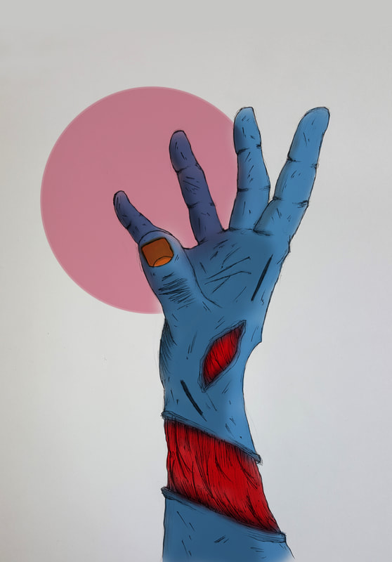
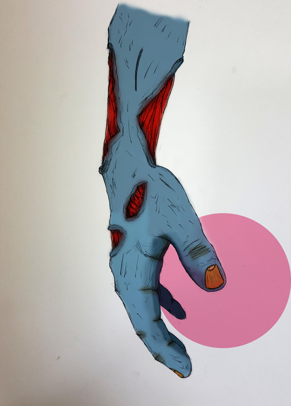
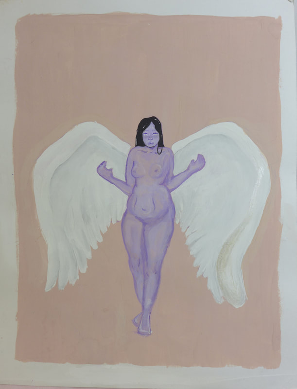
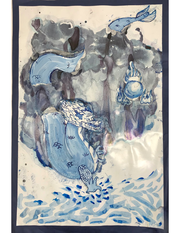
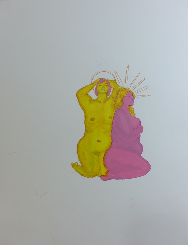
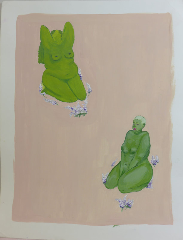
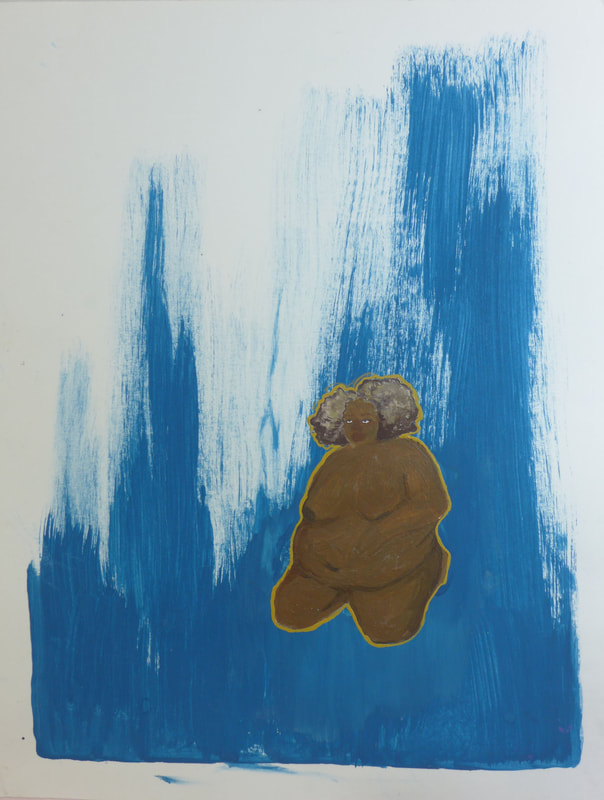
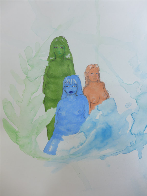
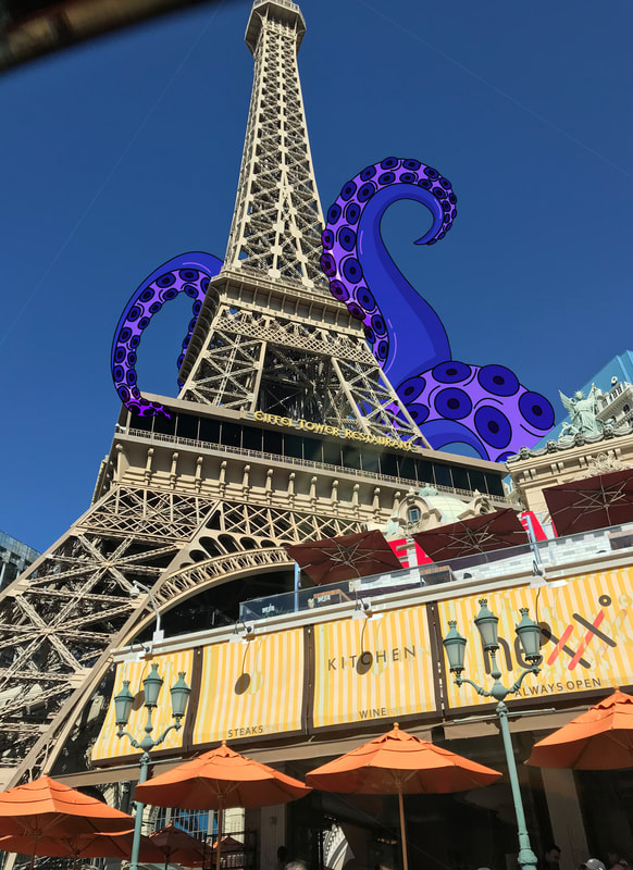
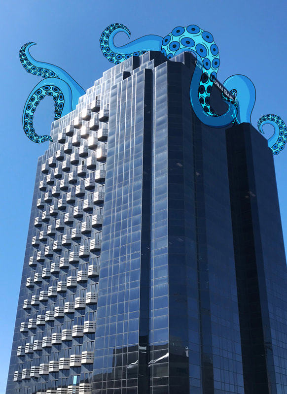
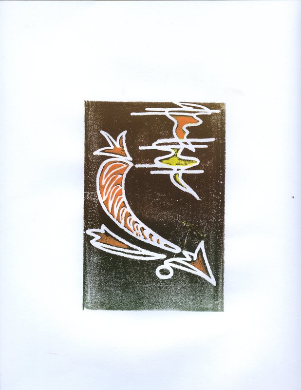
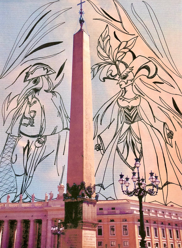
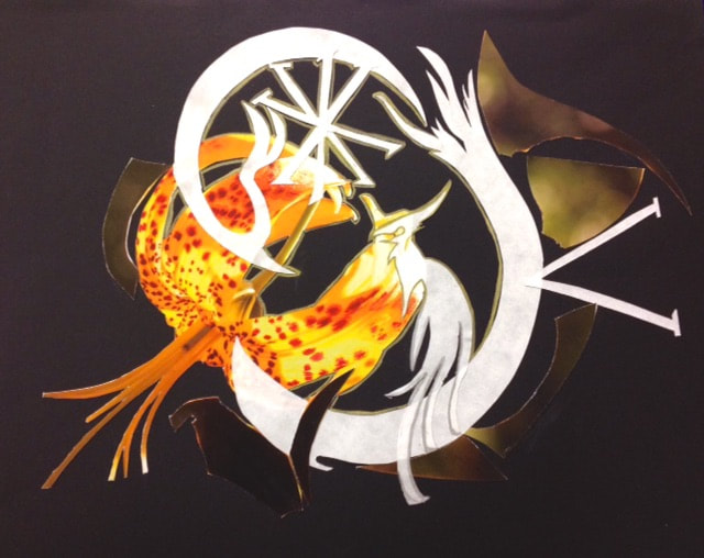
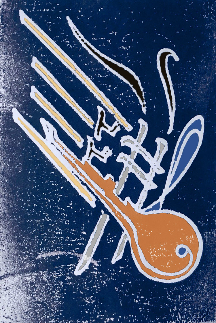
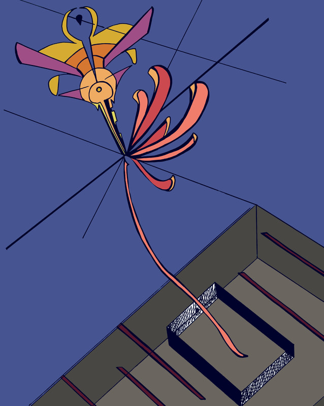
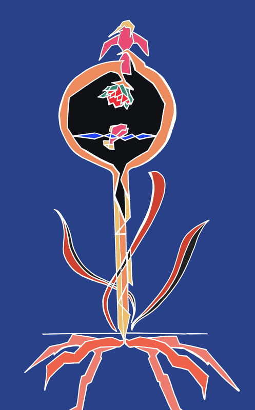
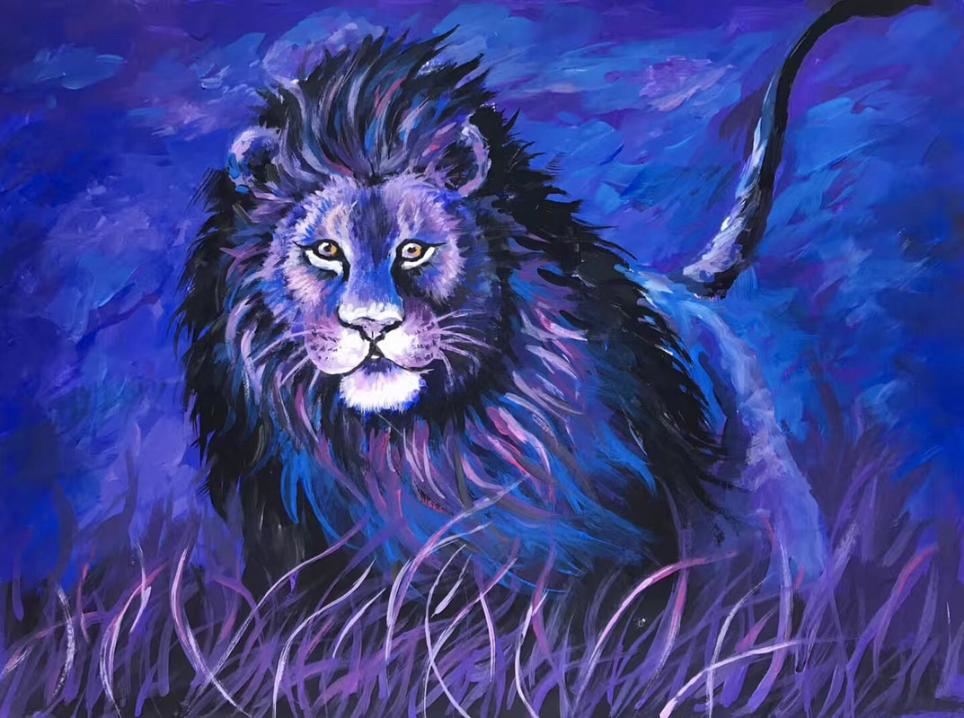
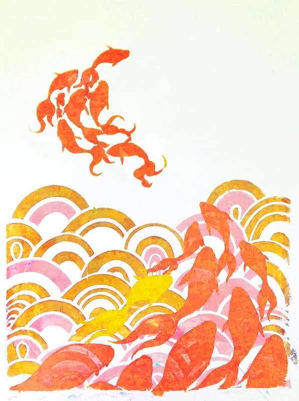
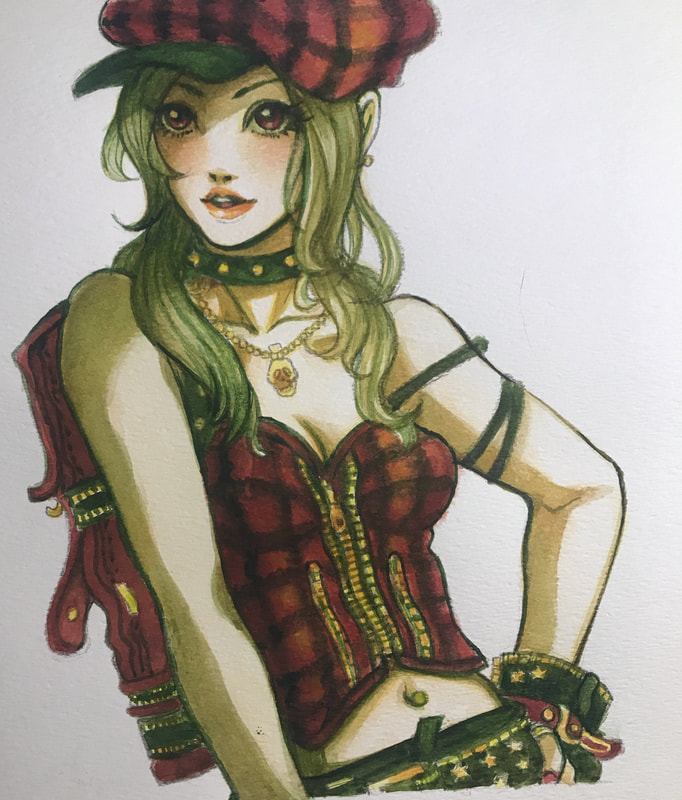
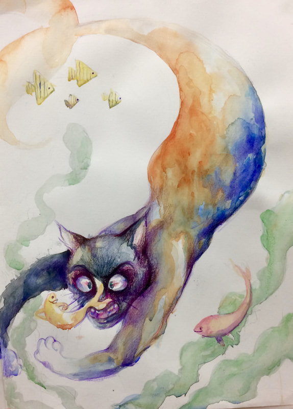
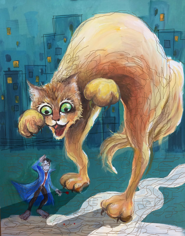
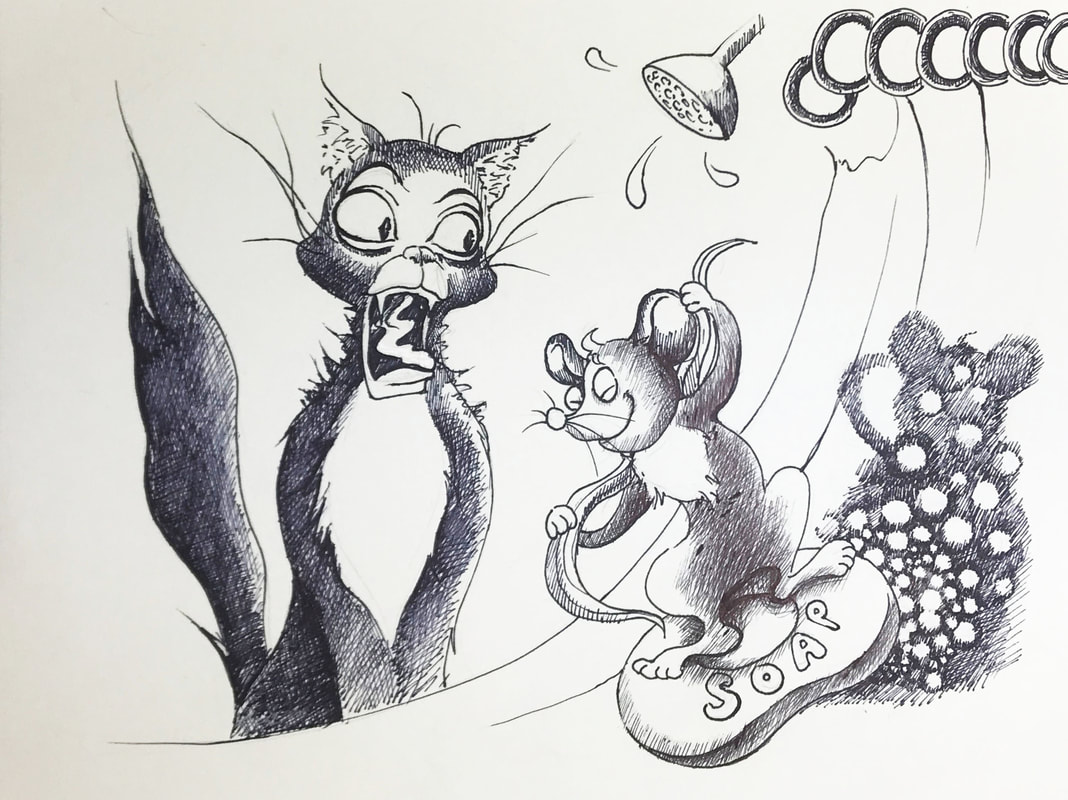
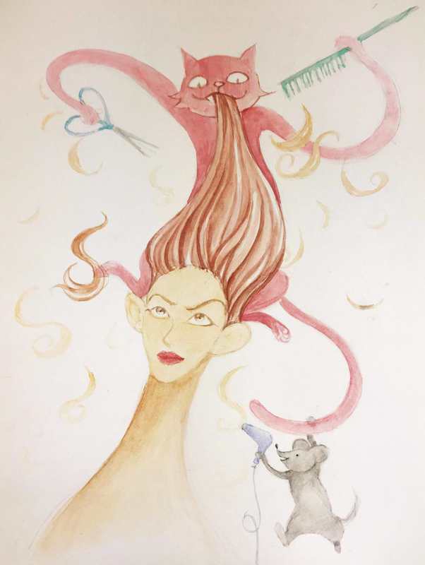
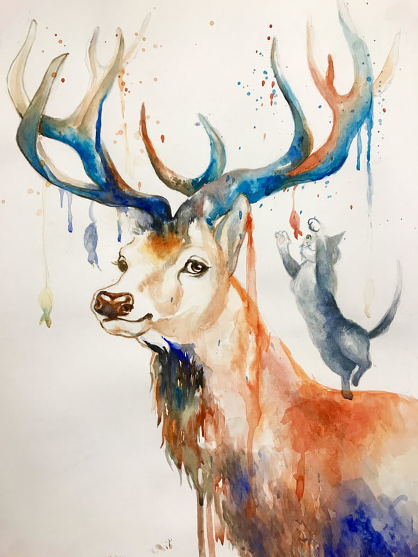
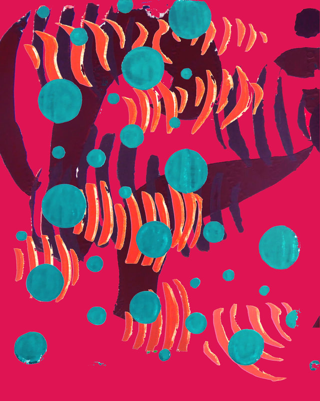
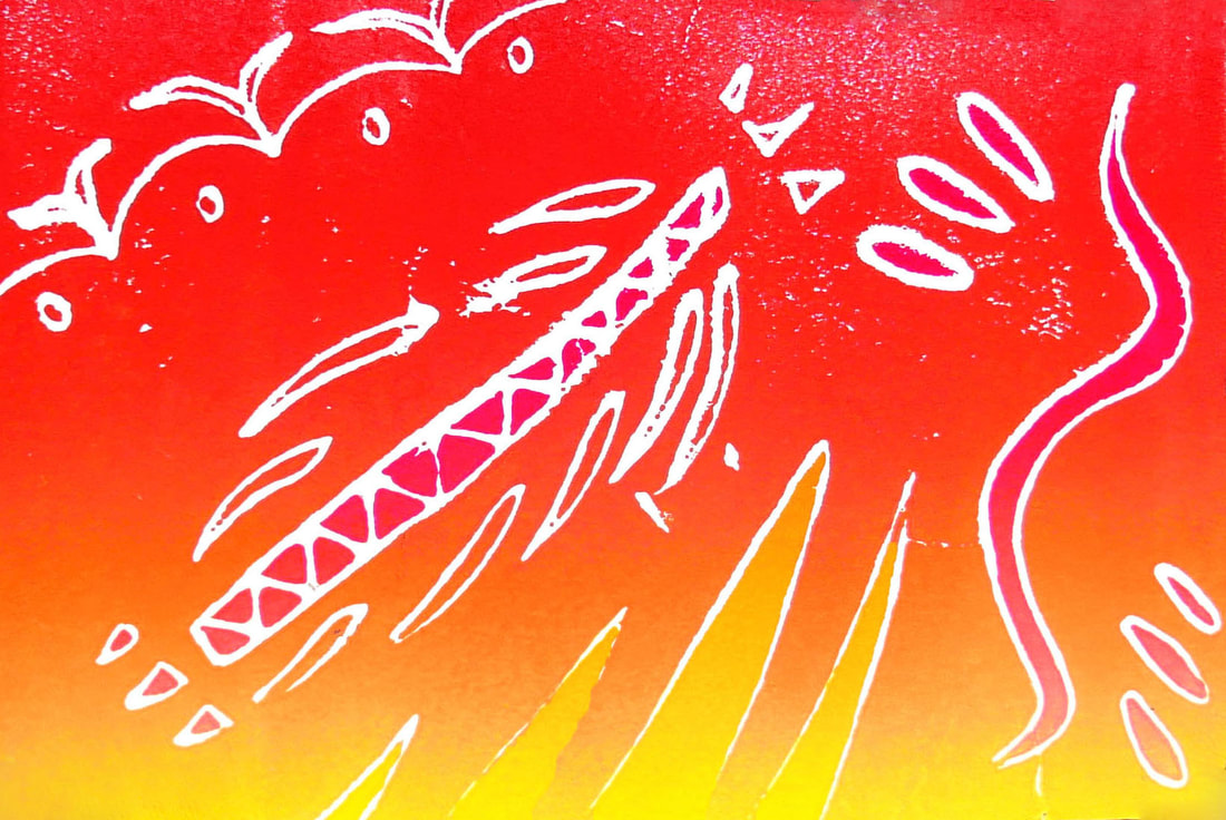
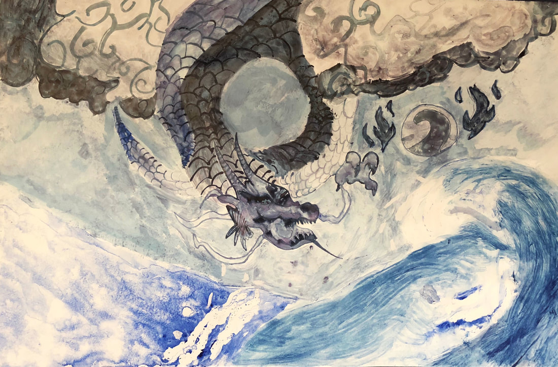
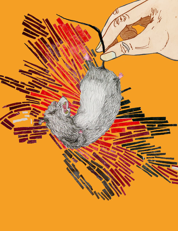
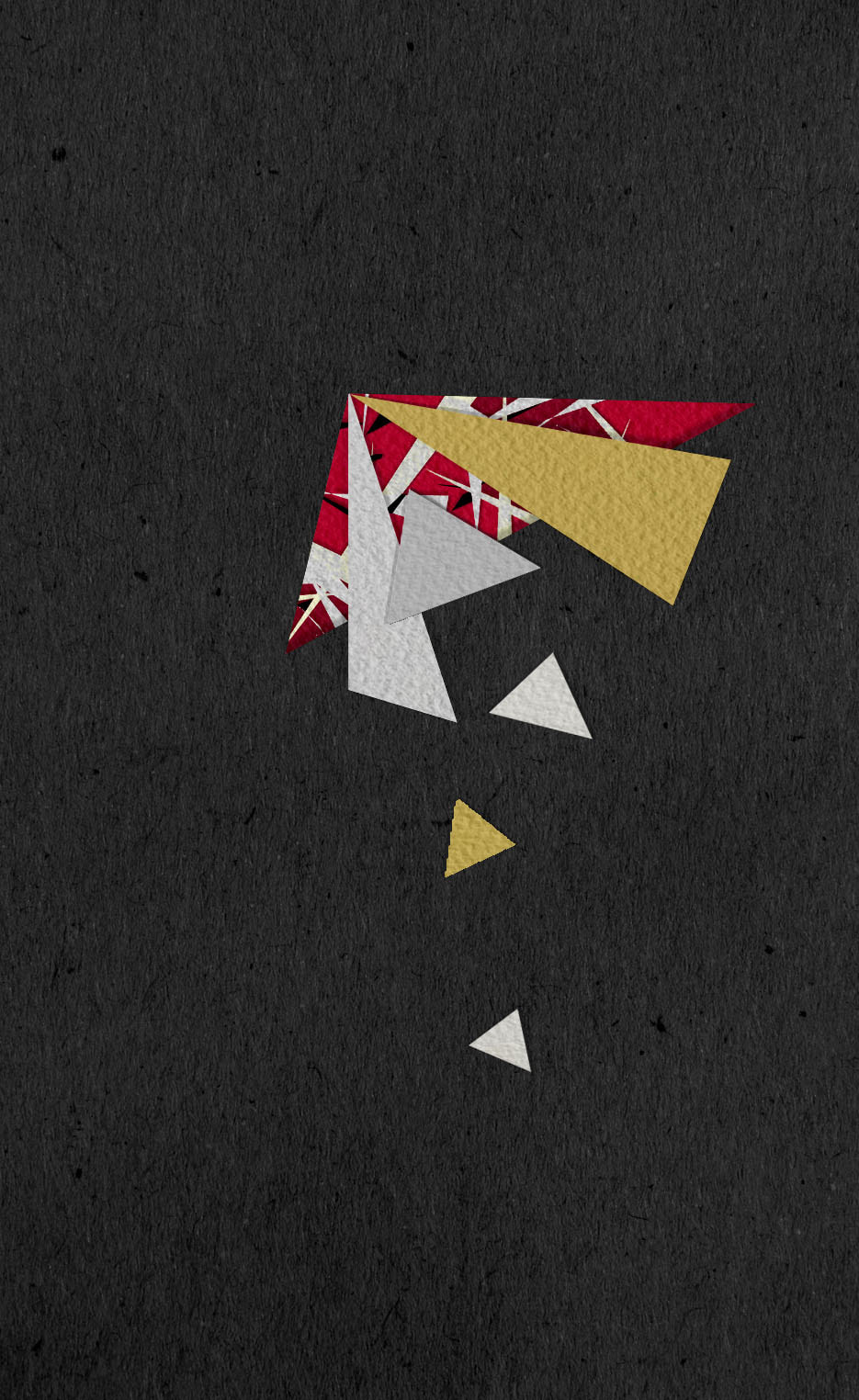
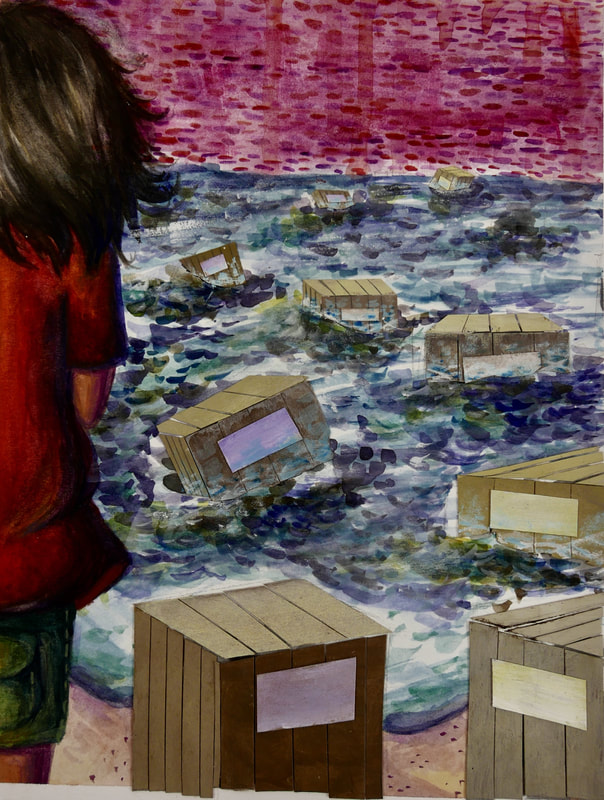
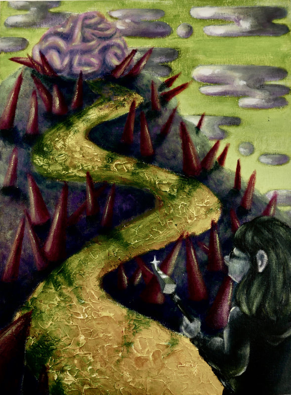
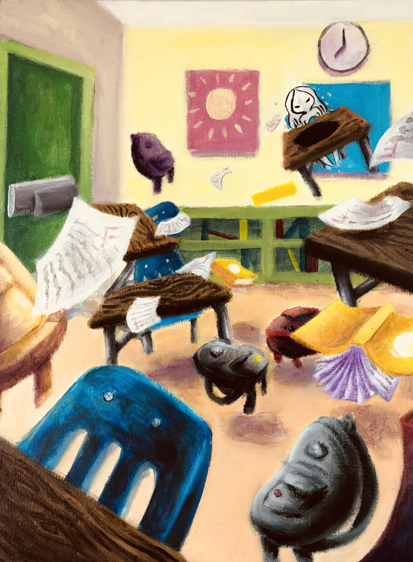
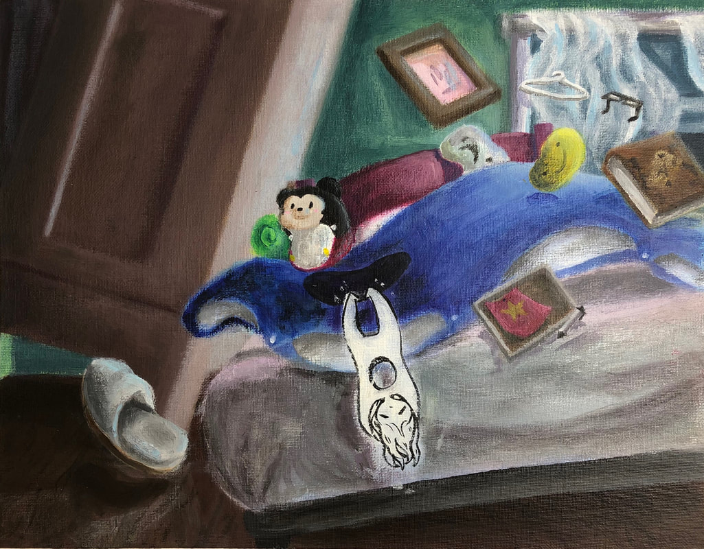
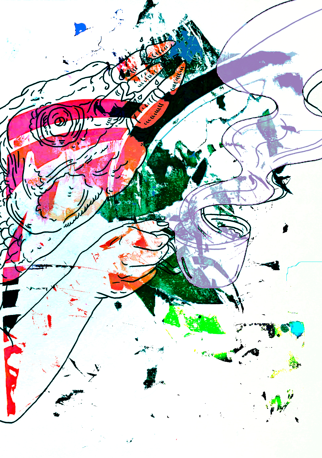
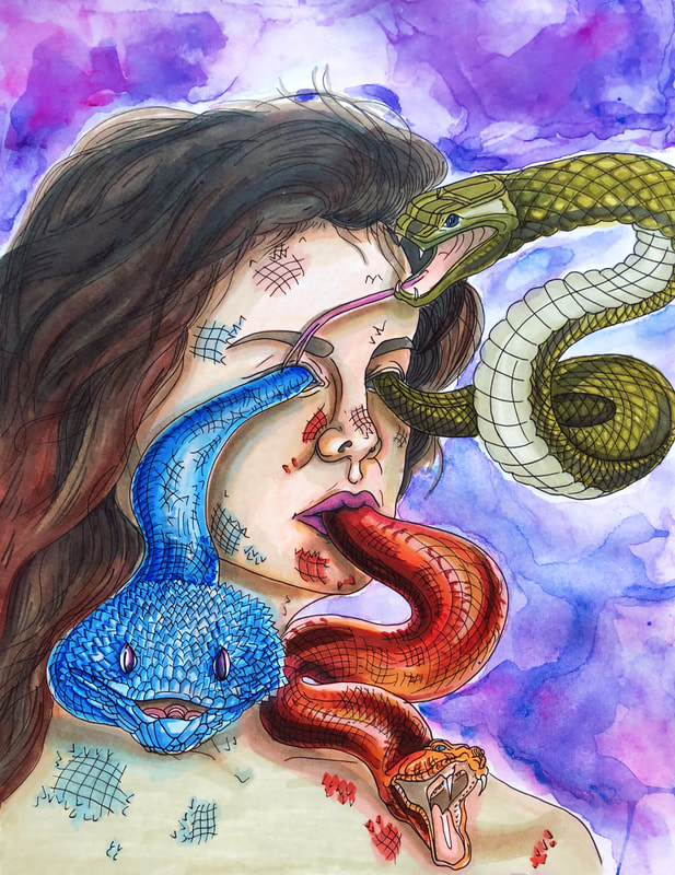
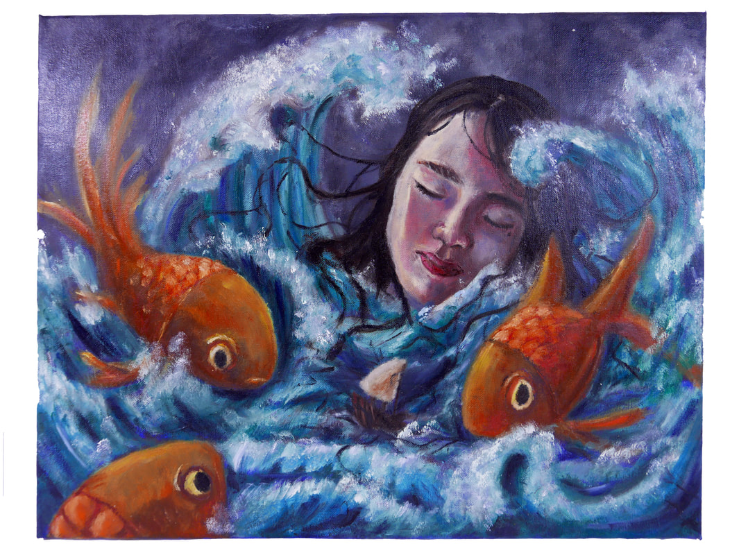
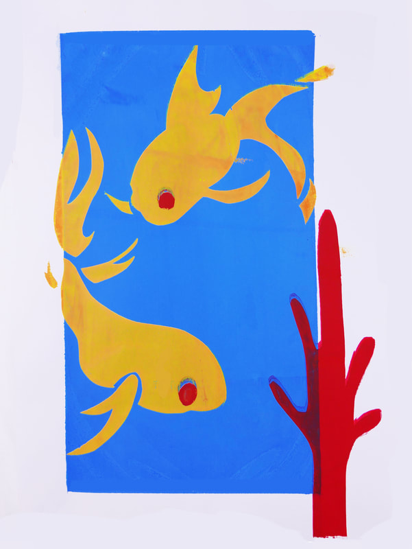
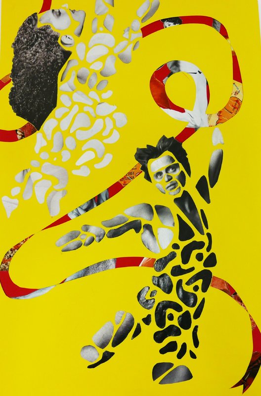
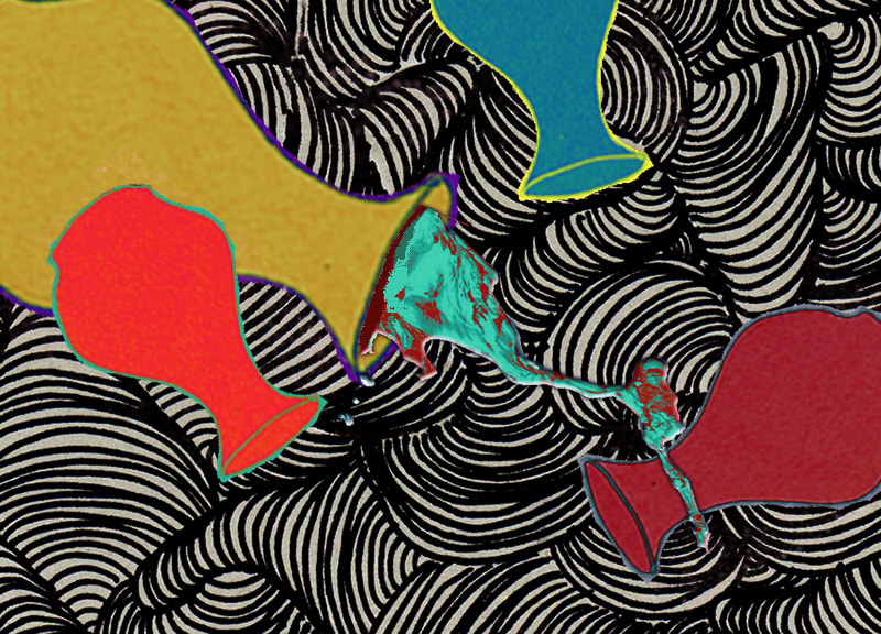
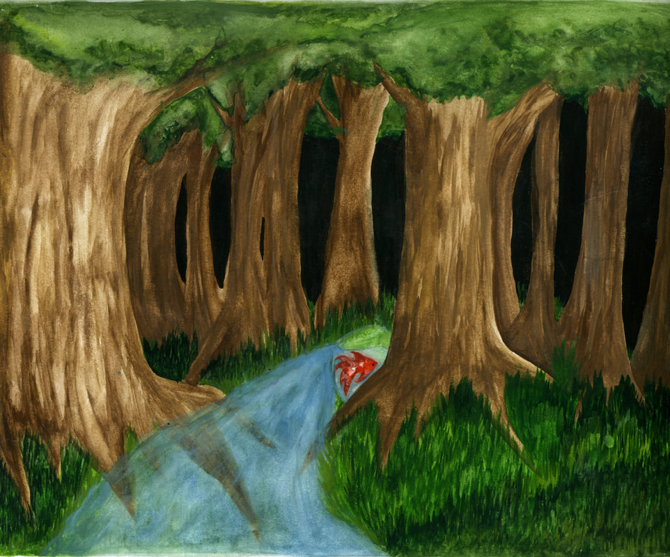
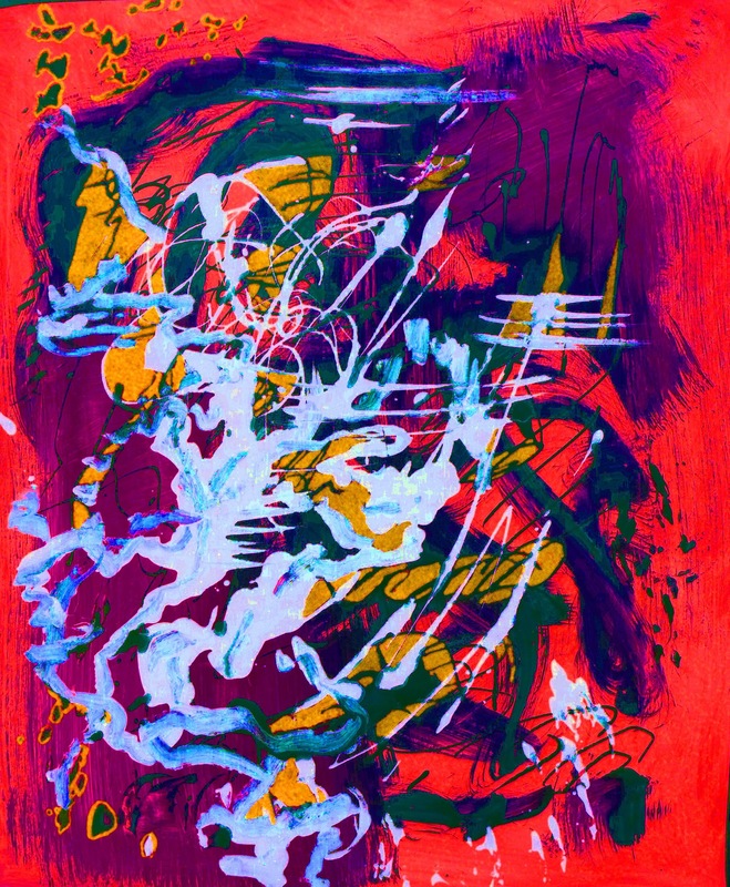
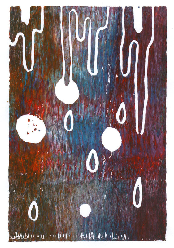
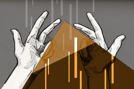
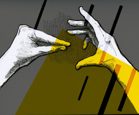
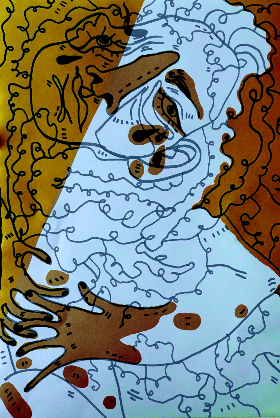
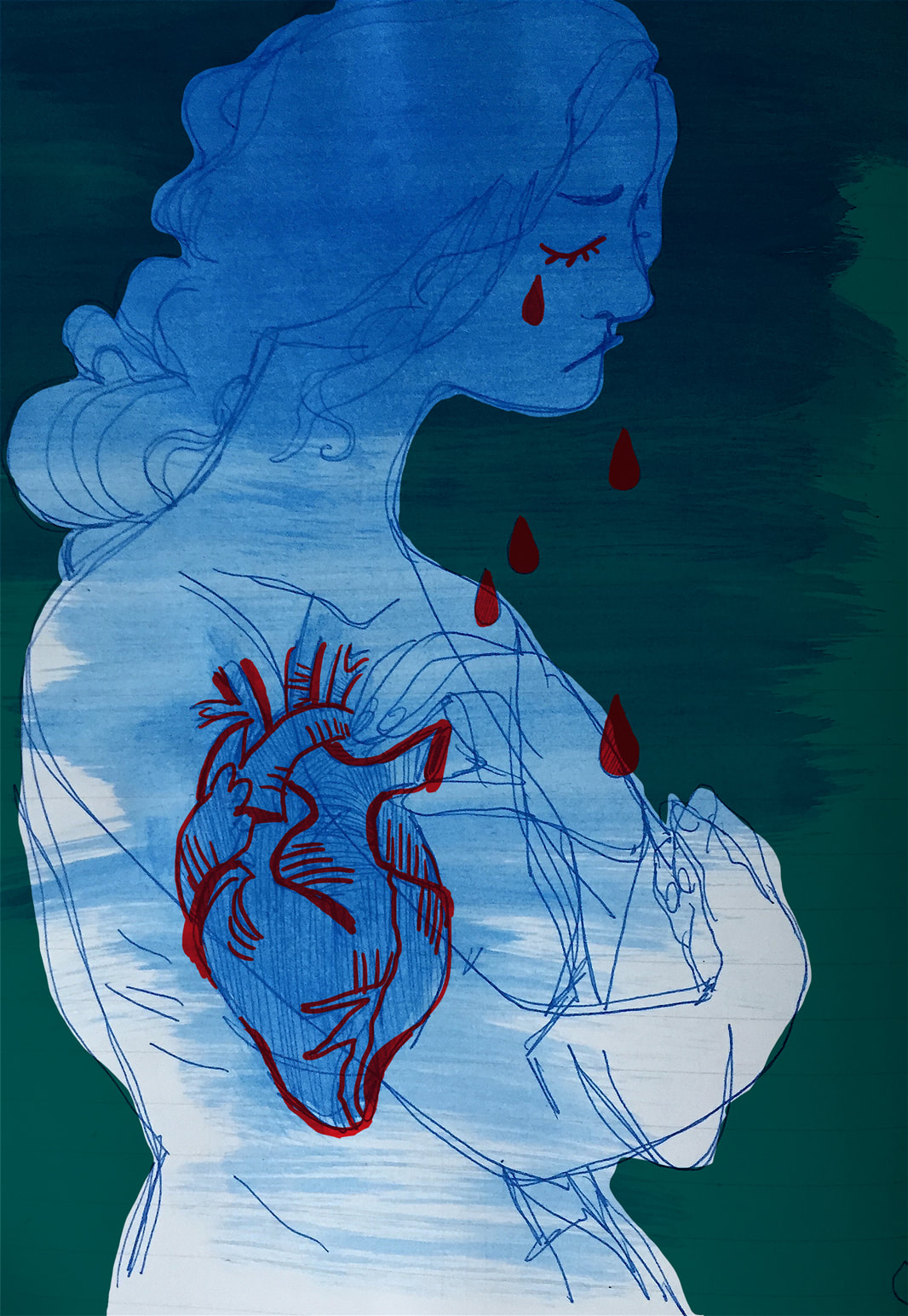
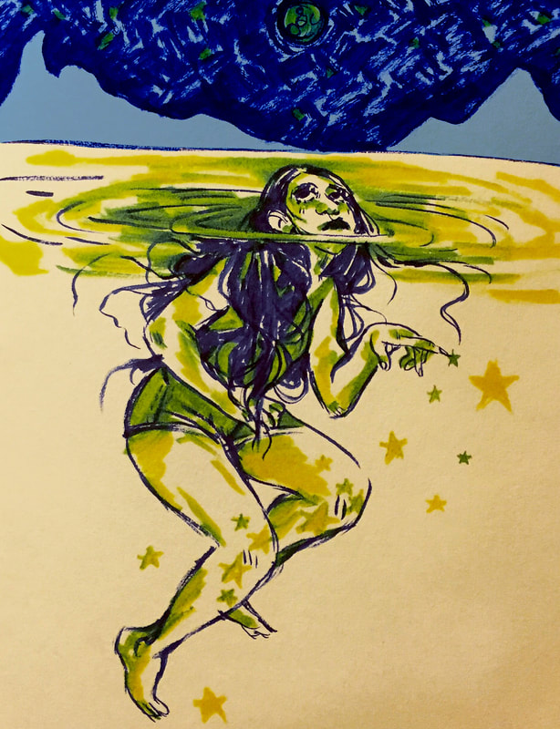
My sustained investigation pairs the majestic nature of a fantasy world with empowered characters and dynamic visual flow. How can I control visual flow to create dynamic compositions with dramatic visual movement? How can contrast, limited color palettes, and lighting emphasize the focal point and unify the composition? How much negative space is needed to emphasize the central gure and allow the composition space to breathe? Describe how your sustained investigation shows evidence of practice, experimentation, and revision guided by your question(s) or inquiry. The earlier drawings (1-4) were simple character portraits, meant to display the species of the world I was creating. To create movement, I started to integrate similar line flow so that there would be rhythm, along with repetition (5-8). In 10, I used theatrical lighting and the curve of the waves to show the power of the sh while darkening the background to create negative space. In (9-15) I experimented with stronger lighting and textures to create a dramatic effect, along with a limited color palette to bring focus the viewer's gaze towards the main subject. |


2021 |
2021 PORTFOLIOS
|
|
MEGAN
CHWA AP SCORE
4 |
SELECTED WORKS
|


|
|
SELECTED WORKS
|
|
SUBRINA
KUO AP SCORE
4 |
|


|
ADRIAN
PAXSON AP SCORE
3 |
SELECTED WORKS
|


2020 |
2020 PORTFOLIOS
|
|
MOYA
HOARD AP SCORE
5 |
QUALITY PORTFOLIO
|


2019 |
2019 PORTFOLIOS
|
|
AMANDA
CHUM AP SCORE
5 |
QUALITY PORTFOLIO
|


|
ELIAS
CAMPOS AP SCORE
5 |
QUALITY PORTFOLIO
|


|
APRIL
LI AP SCORE
3 |
QUALITY PORTFOLIO
|


|
TIMOTIUS
MAYONTO AP SCORE
3 |
QUALITY PORTFOLIO
|


|
ISABELLA
NAVA-HOLSTEIN AP SCORE
3 |
QUALITY PORTFOLIO
|


|
VALENCIA
MINGKID AP SCORE
5 |
QUALITY PORTFOLIO
|


|
KACIE
NGUYEN AP SCORE
4 |
QUALITY PORTFOLIO
|


|
ANDREW
PEREZ-MICHEL AP SCORE
5 |
QUALITY PORTFOLIO
|


2018 |
2018 PORTFOLIOS
|
QUALITY PORTFOLIO
|
|


|
CAITLIN
SANTOS AP SCORE
3 |
BREADTH PORTFOLIO
CONCENTRATION PORTFOLIO
|
CONCENTRATION STATEMENT
Q1:
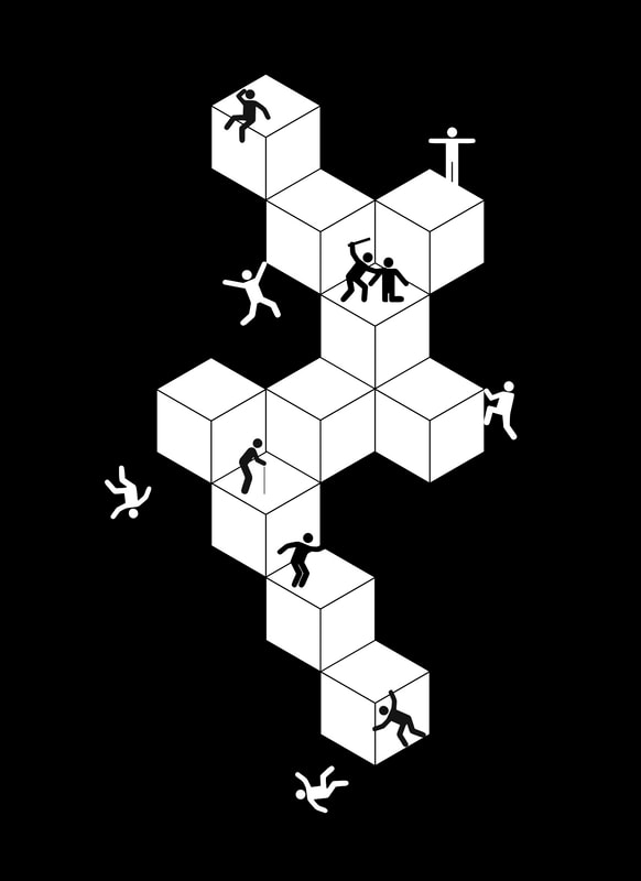
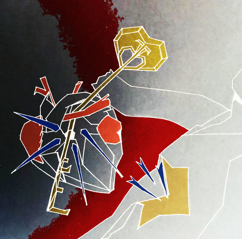
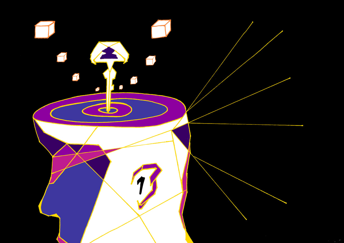
Through the subject of keys, my concentration focuses on the symbolism of keys conjured by humanity with the intention of portraying either direct or indirect symbolism associated with my subject. Keys are not only referred to as objects that open and close things, but throughout the ages, keys can also relate to ideas such as possibilities, freedom, or even death. Given that my concentration is intended to invoke symbolism, I chose to unify them with a combination of abstraction and cubism. Q2:
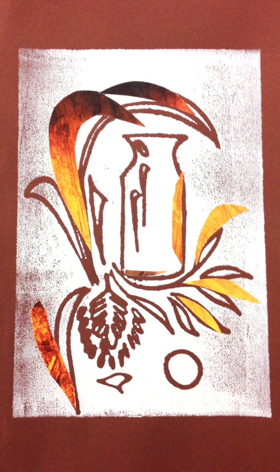
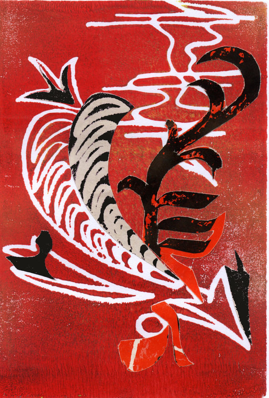
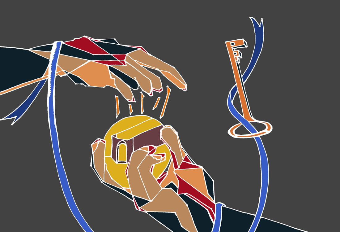
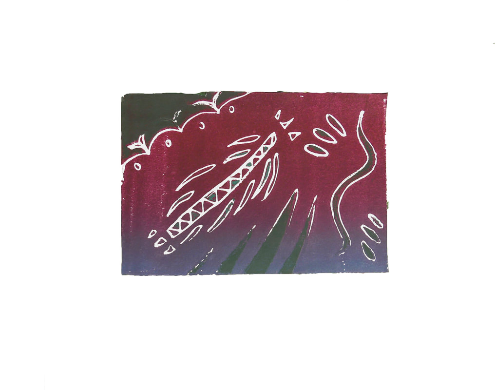
Some of my works demonstrate how I position my subject—keys—within the negative space I’ve crafted and that allows me to relate to some of the themes I’ve chosen for each respective piece. In composition #4, it depicts a key that’s designed to look like a flying insect that incorporates movement as it leaves a trail of color that leads down to a gray-toned cage. Aside from playing around with my negative space, I’ve also incorporated deep hues to unify the compositions. Over the course of my time in constructing each piece, I’ve decided to refine my linework and color them as mainly white or yellow and this serves to craft a sense of sophistication that may not be seen in some pieces because those pieces were a few of the first ones that I made. I believe the last few compositions were more dynamic in color and somewhat more complicated in symbolism because I wanted to experiment with how well I could convey the rest of my themes if I made them more contrasting or variable with added variety. |


|
CHRISTINE
YUAN AP SCORE
5 |
QUALITY PORTFOLIO
|


|
EMILY
HUYNH AP SCORE
3 |
QUALITY PORTFOLIO
|


|
KELLY
WONG |
QUALITY PORTFOLIO
|


|
LESLIE
KWAN AP SCORE
5 |
QUALITY
|


|
LINA
LI AP SCORE
5 |
QUALITY PORTFOLIO
|


|
QUALITY
|


|
LINDA
THAI AP SCORE
5 |
BREADTH
CONCENTRATION
|
CONCENTRATION STATEMENT
Q1:
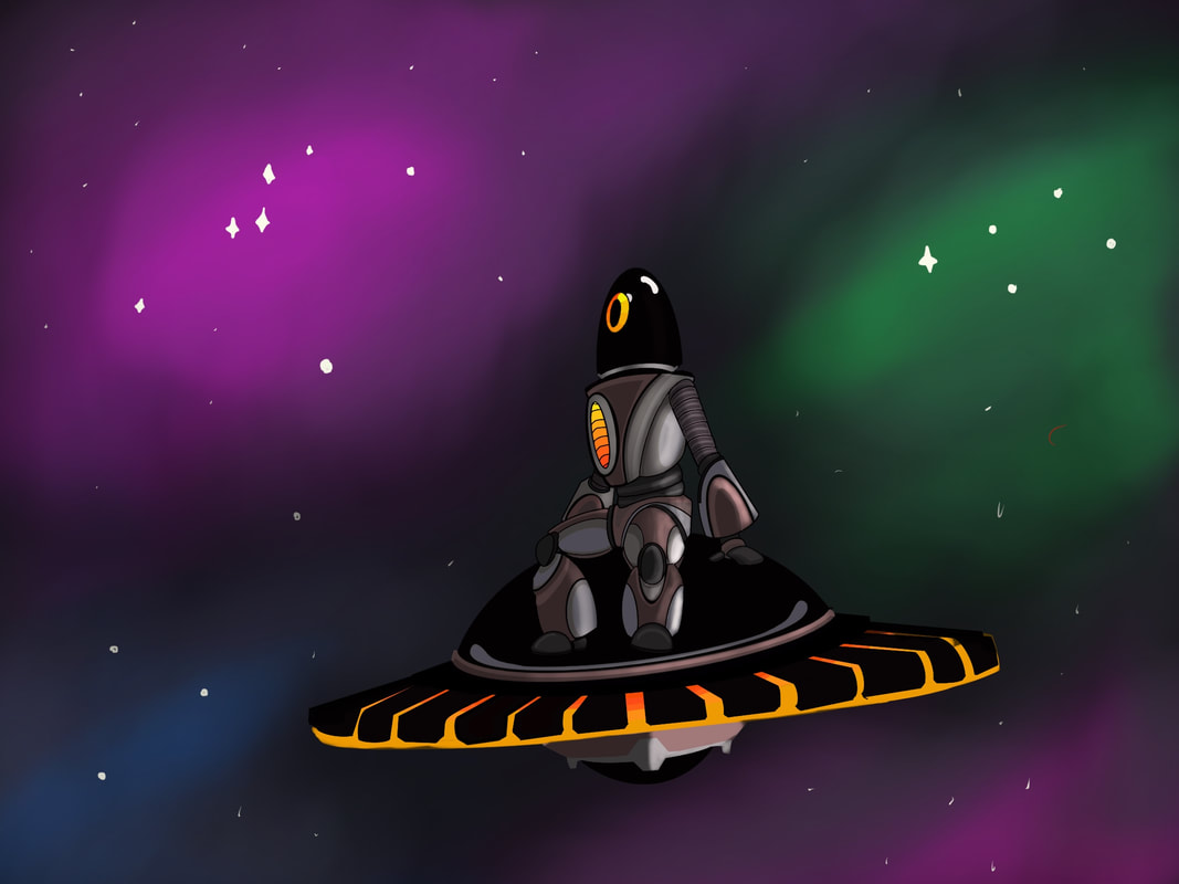
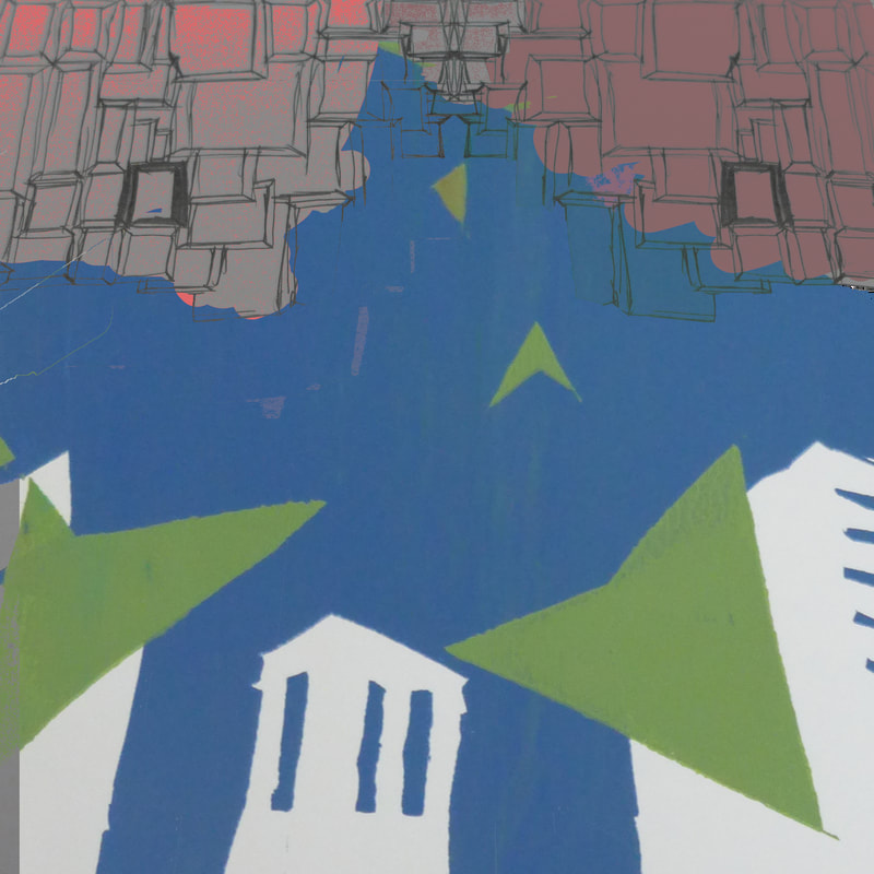
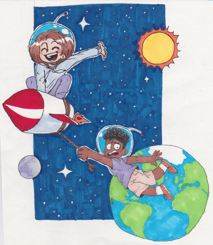
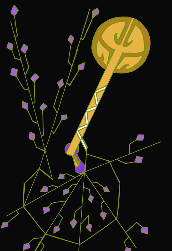
The central idea of my concentration stems from the aesthetic and innovation of retrofuturism. To me, retrofuture represents a dream of the future from the perspective of the past. With this idea in mind, I want to convey the modernist’s imaginative depiction of the future by blending the feelings of nostalgia and retro-style with futuristic technology and science fiction. Q2:
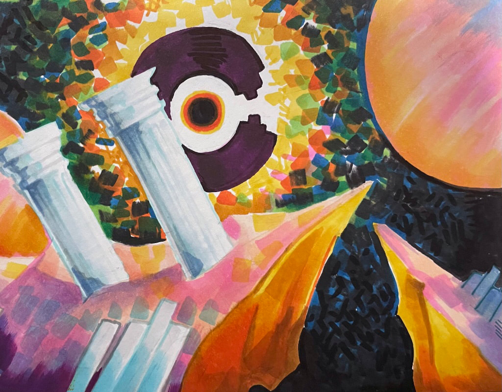
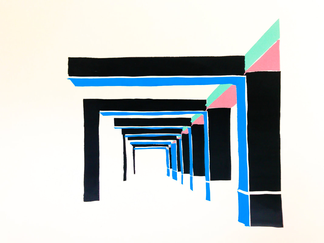
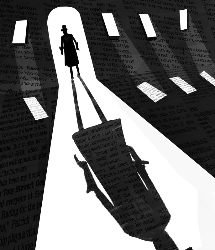
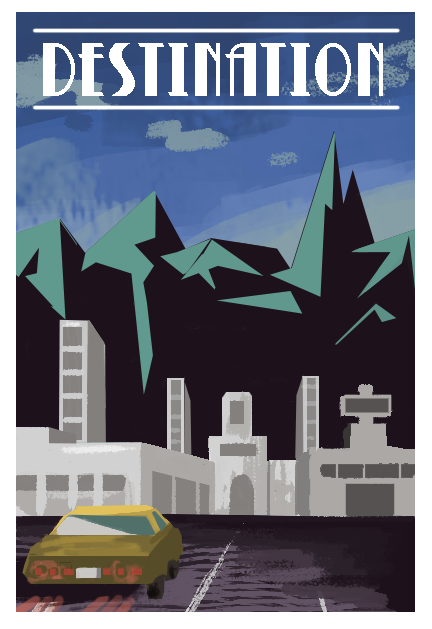
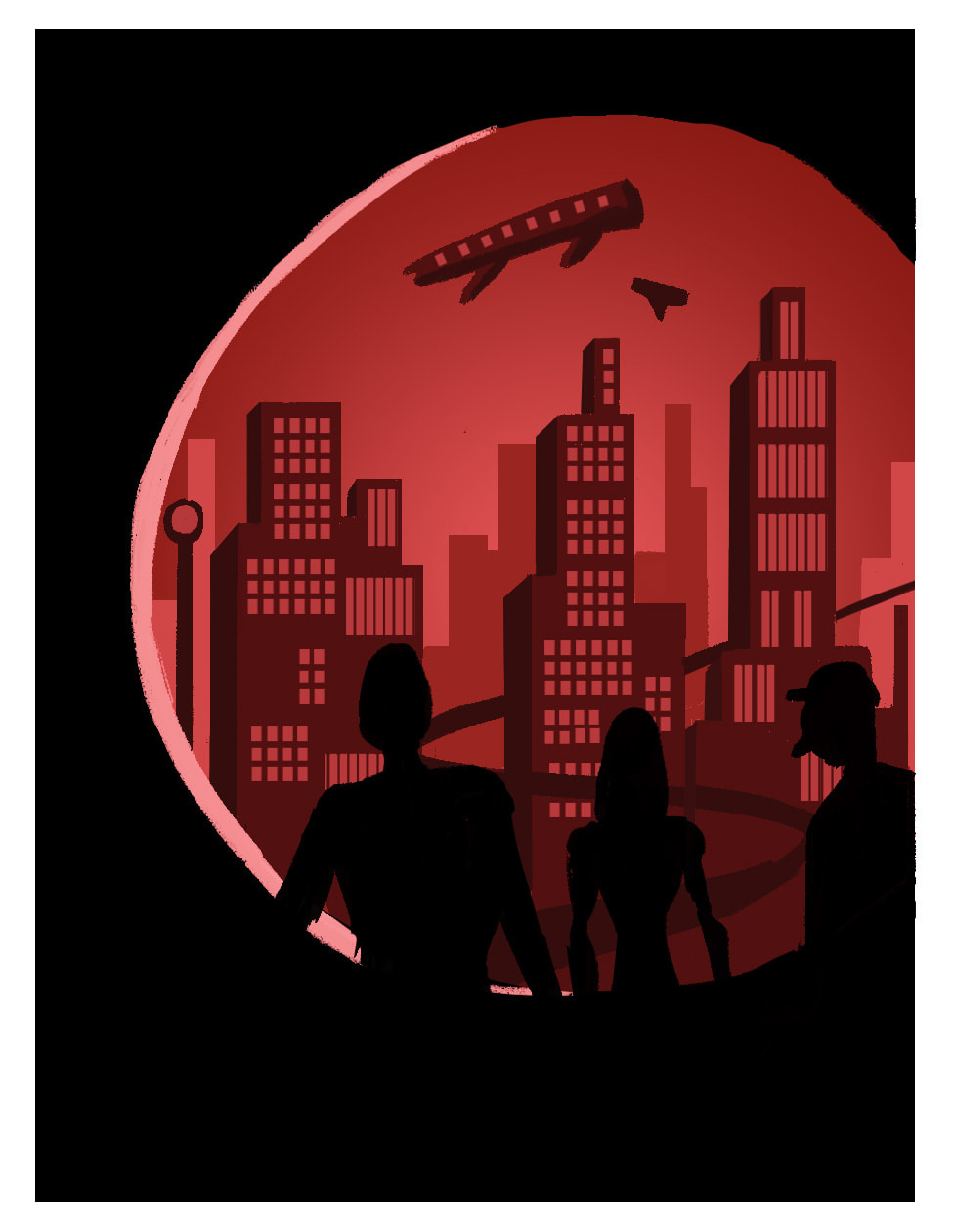
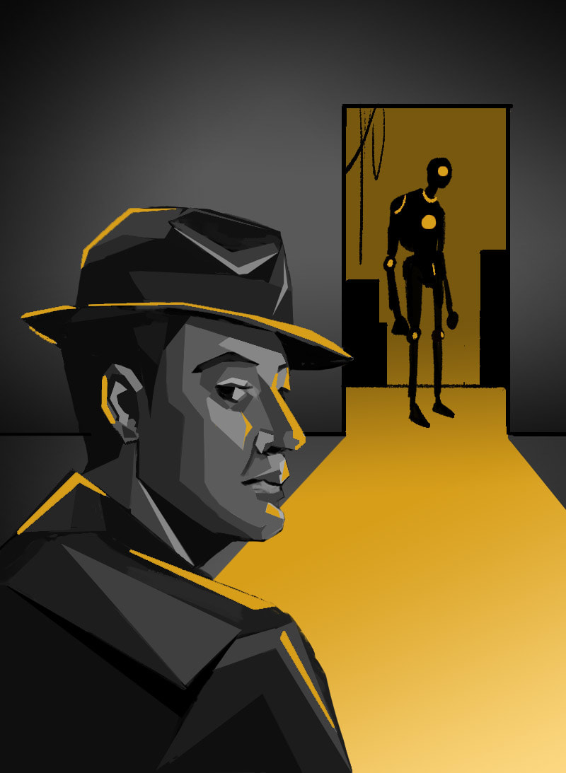
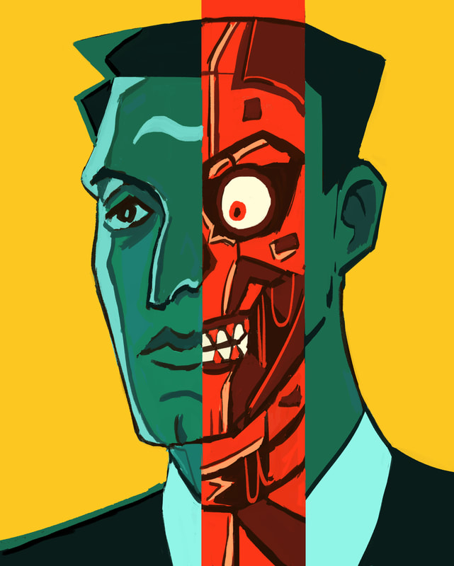
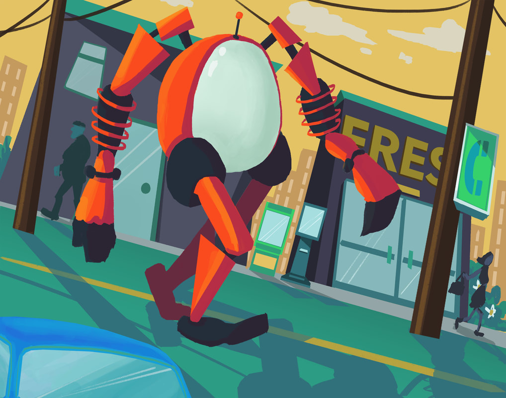
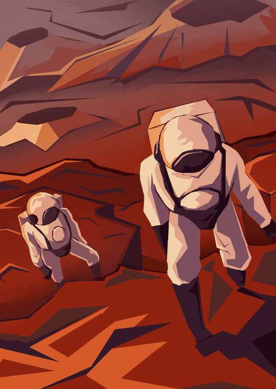
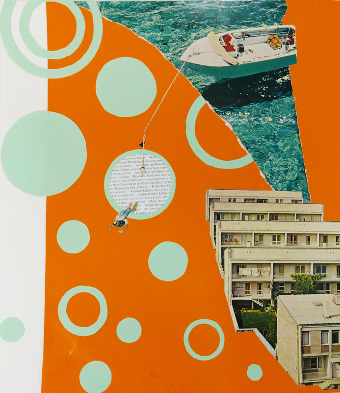
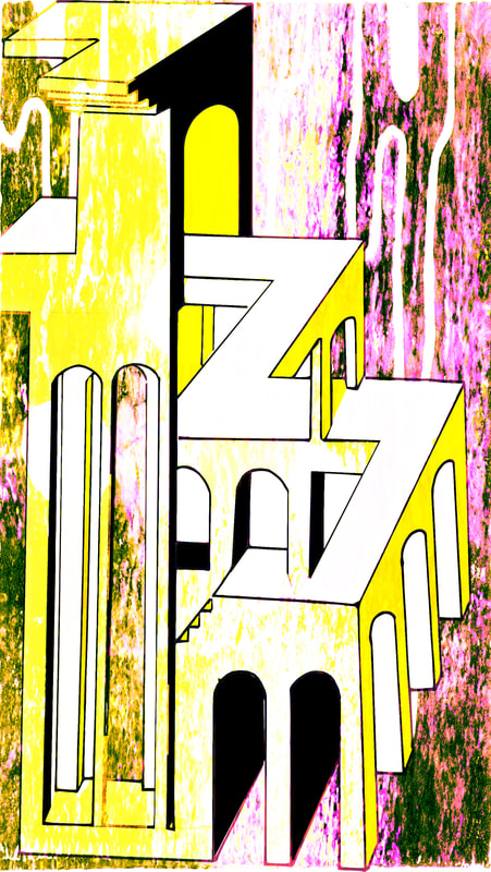
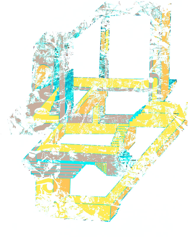
Throughout my process, I aim to have my pieces follow a style that mimicked art-deco inspired principles such as geometric shapes, sharp and flat colors with minimum shading, intricate facets, airbrush effects and graphic features. I incorporate dated and contemporary elements focusing on limited color palettes and negative space in order to create unity and balance in my artwork. By using negative space, I isolate the main subject of my composition by controlling the viewer’s eyes and creating a vantage point that emphasizes heroic exploration (image 10, 11, and 12) and extreme perspective (image 9). When I began my concentration, I wanted to depict an accurate impression of retrofuturism in the mid 1900s by referencing historical popular culture and events such as film noir (image 1, 3 and 4) and the Space Age (image 10, 11 and 12). Overtime, I saw growth in my artistic endeavors and expertise evident by the contrast between the first few pieces (image 1 and 2) and the last few pieces (image 11 and 12). The beginning ones were more one-dimensional with substandard shading, mudane composition, and low-risk taking. But with more practice and research, I developed my own style by constructing facets that created the illusion of depth and form and complementing it with more dynamic compositions and sophisticated color choices. |


|
NATALIE
THI AP SCORE
3 |
QUALITY
|


|
RICA
WONG AP SCORE
4 |
QUALITY PORTFOLIO
|


|
SAMANTHA
YOUNG AP SCORE
4 |
QUALITY PORTFOLIO
|


|
TIFFANY
WEI AP SCORE
5 |
QUALITY PORTFOLIO
|


|
WES
PHILLIPS |
QUALITY PORTFOLIO
|


2017 |
BREADTH PORTFOLIOS
|
CONCENTRATION PORTFOLIOS
|
|
JACOB
VAN OOSTEN AP SCORE
5 |
|
|


|
TAYLOR
PANNELL AP SCORE
3 |
|
|

|
NISA
ALAM AP SCORE
3 |
|
|