|
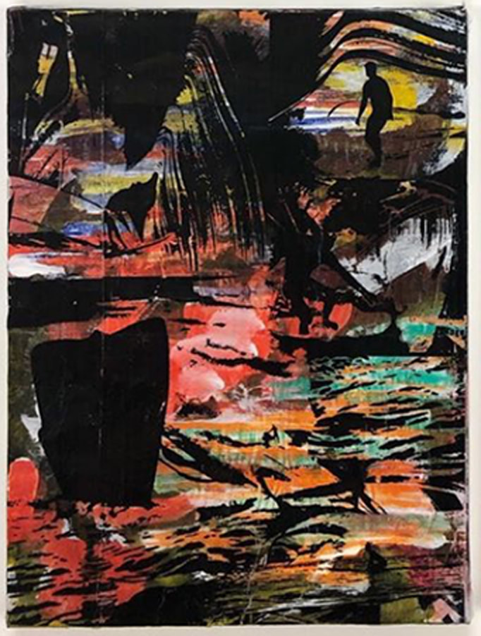
Kris Chatterson
|
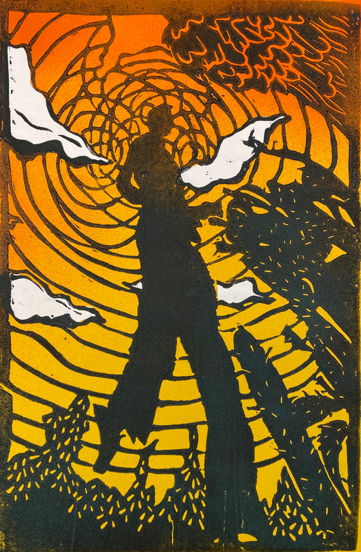
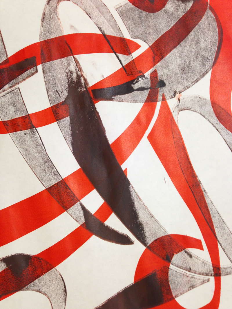
Block Printing On Top
|
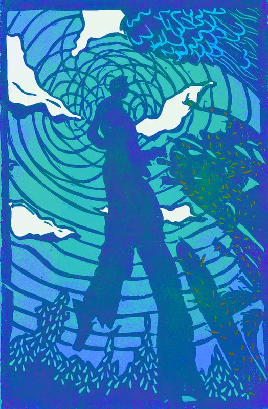
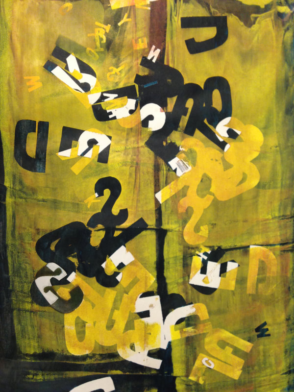
Use a Linoleum Block to Carve a Single Color Print
Design, carve, and print one test print of your linoleum block.
Carve one Linoleum Block
|
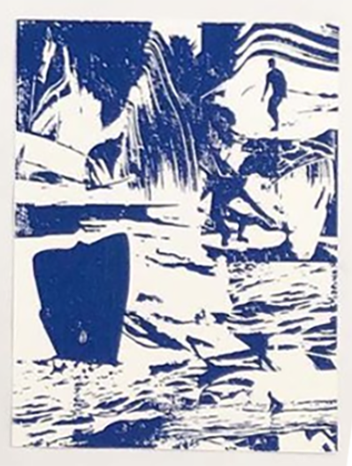
Your block print should use up half of the space
|
YOUR BLOCK PRINT SHOULD:
|
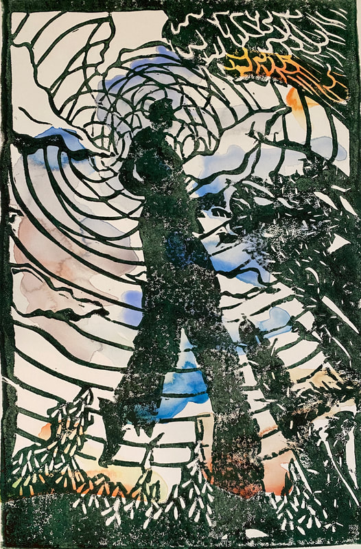
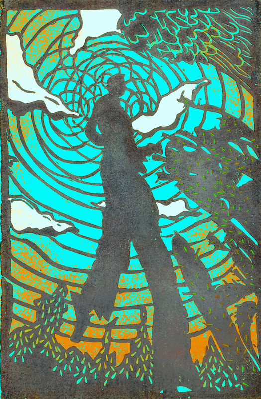
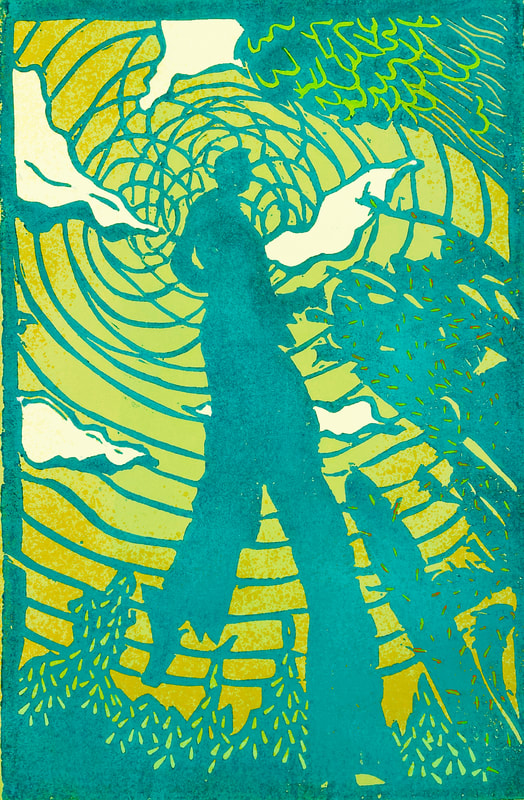
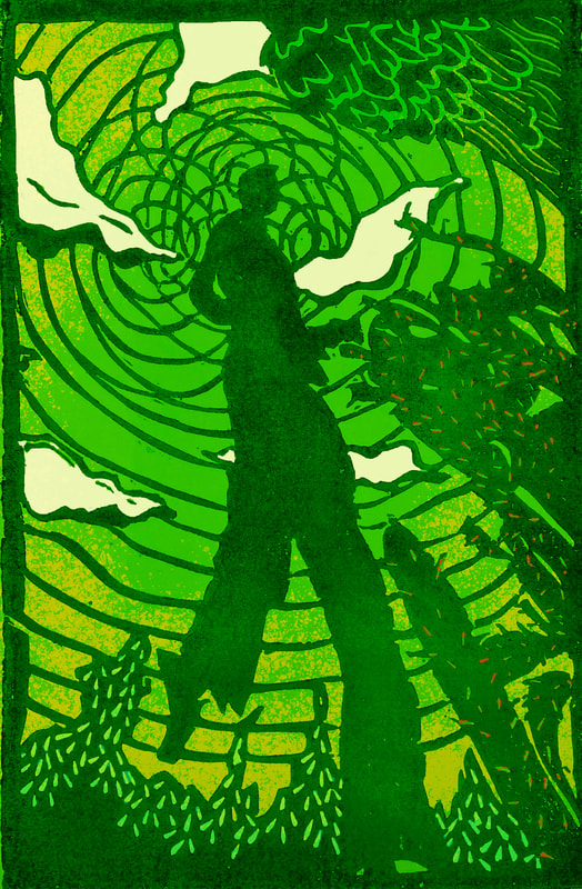
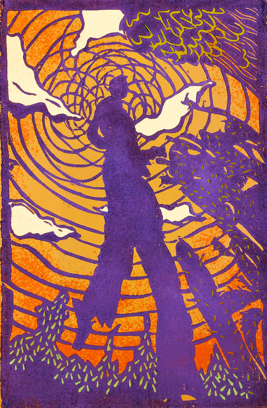
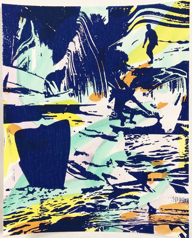
Watercolor Underprints
|
CREATE 4+ WATERCOLOR BACKGROUNDS FOR YOUR BLOCK PRINT
|
THE WATERCOLOR LAYER SHOULD:
|
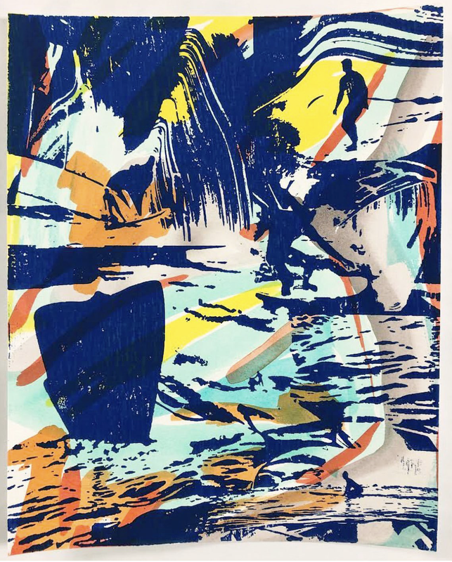
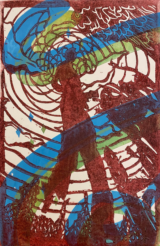
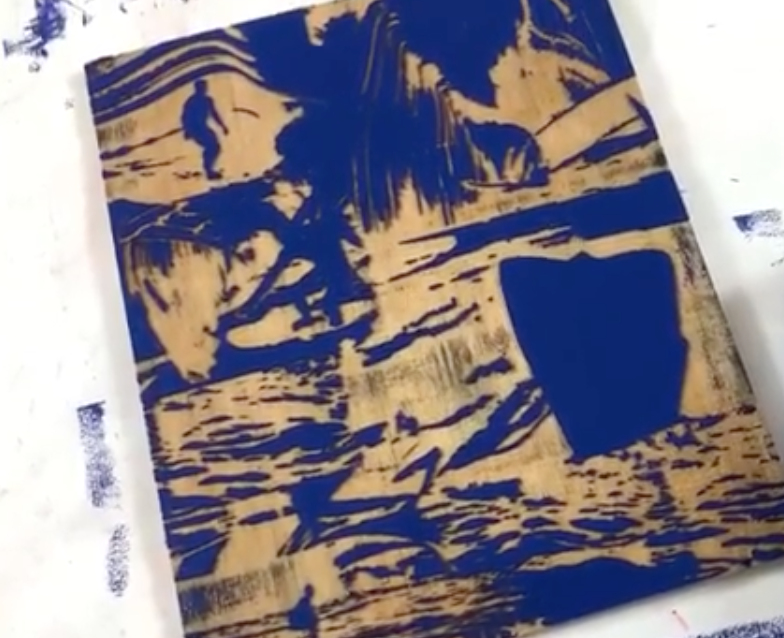
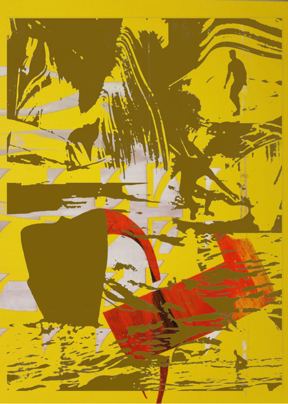
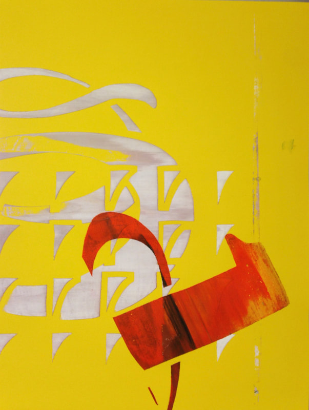
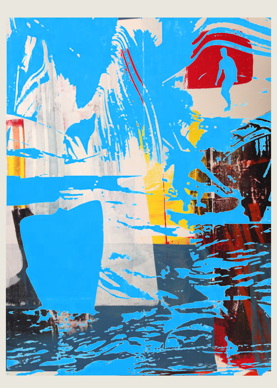
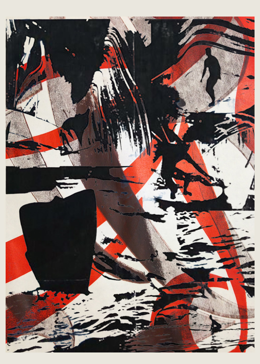
Screenprinting Underlayer
|
|
|

|
Use the screen as a monoprint surface and create 4+ backgrounds for your block print. You can create a stencil or apply ink sparingly in different areas of the screen to control color, flow, direction, etc.
THE SCREENPRINT LAYER SHOULD:
|
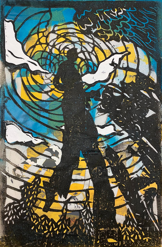
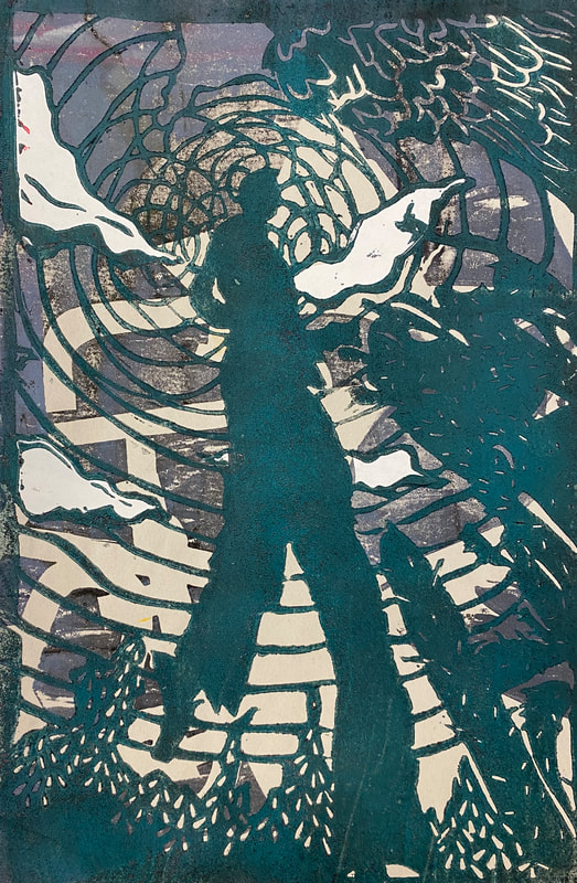
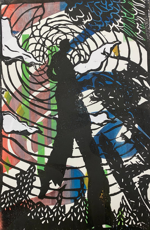
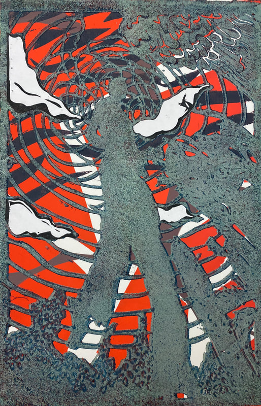
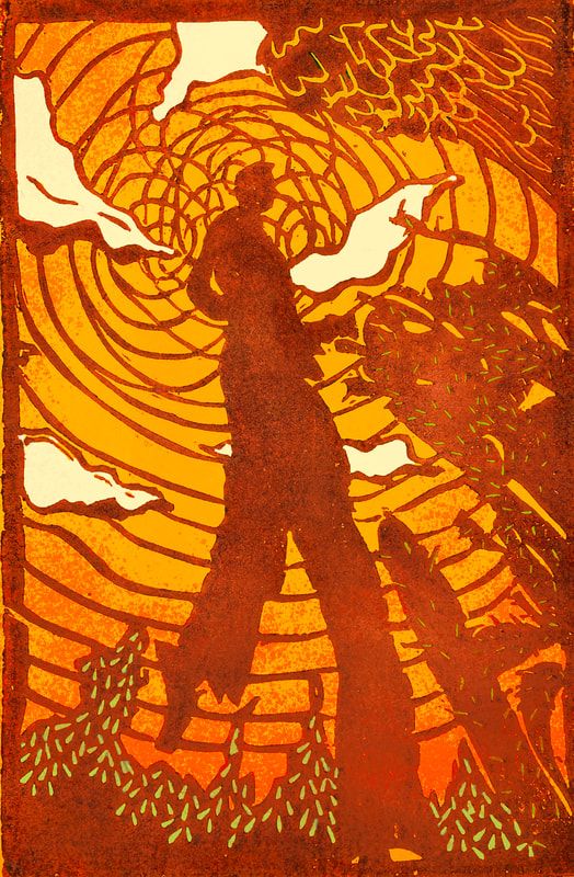
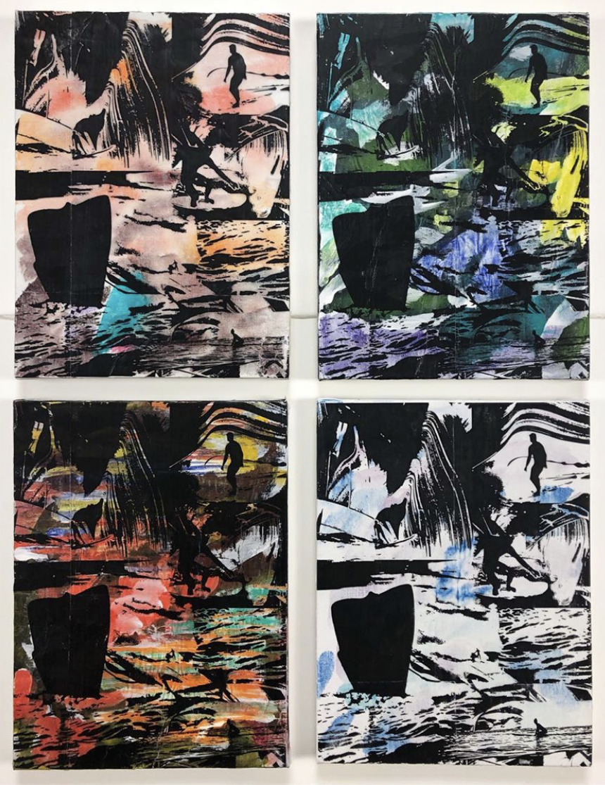
8+ Final Prints : 2 Types of Backgrounds, 1 Block Print on Top
Minimum Requirement: 4 Colors on each print (3 in underlayer, 1 on top)
|
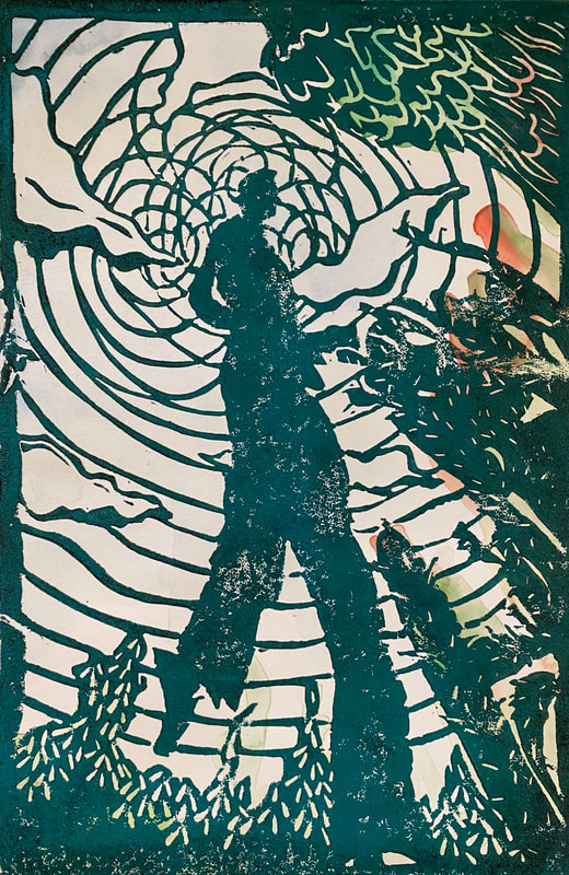
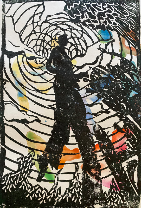
WATERCOLOR UNDERLAYER
|
SCREENPRINT UNDERLAYER
|
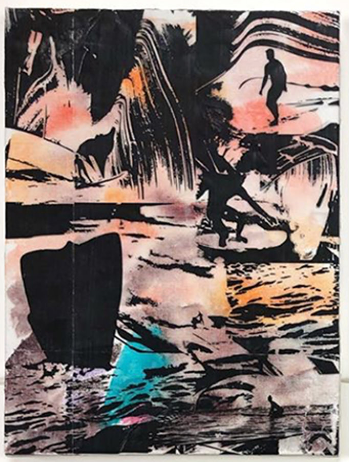
8+ Final Prints: 2 Types of Backgrounds, 1 Block Print on Top, + Extras
Minimum Requirement: 4 Colors on each print (3 in underlayer, 1 on top)
|
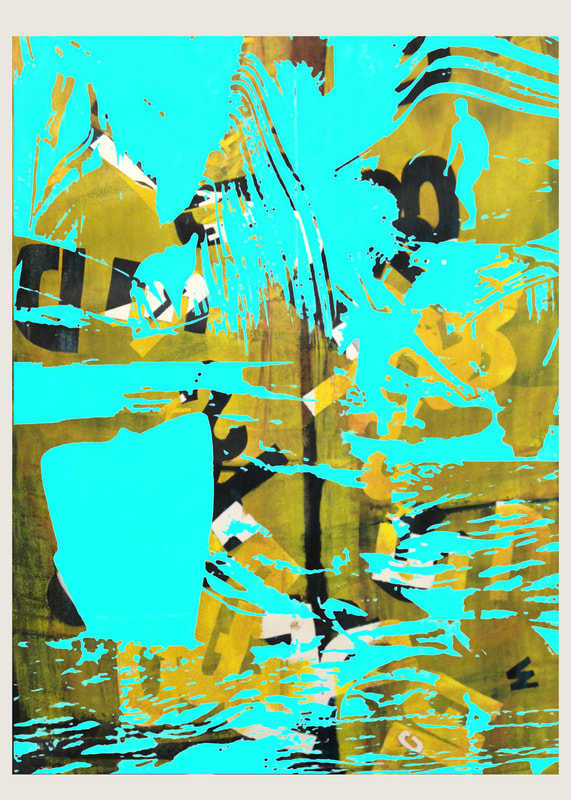
WATERCOLOR BACKGROUNDS
|
SCREENPRINTING BACKGROUNDS
|
OTHER BACKGROUNDS
|